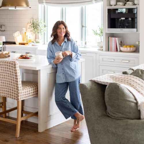
YAY!!!! The wait is FINALLY OVER!!! Love It or List It Vancouver is back with a brand new season!!! Did you guys miss me?!?! Well not to worry … you will be seeing more of me (and Todd unfortunately!!) every Monday night starting at 10pm E/P on HGTV Canada!! A perfect time to grab a glass of vino and relax on the couch!!
Stephanie and Chris were such a pleasure to work with although Stephanie was right, the house was a bit of a money pit!! There were a few setbacks (like the abandon sump in the back yard causing floods!!!) but Kenny and I did what we had to do to get them to stay even if that meant eating some of the reno costs ourselves to stay within their budget. We were SO close with this one…the only thing that was left off their list was the upstairs bathroom, but that only meant they would need to wait a little longer and save up to get it updated.
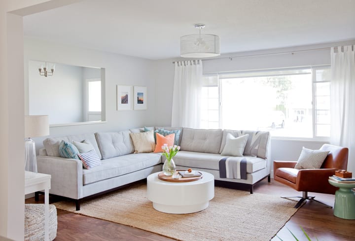
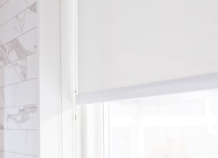
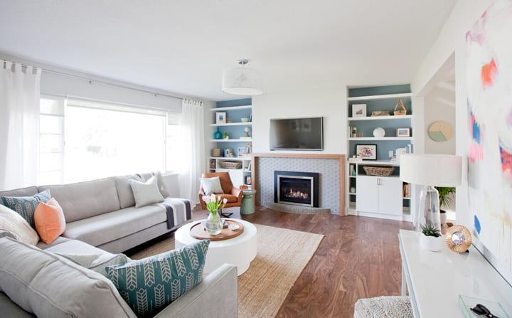
This particular home had a good amount of windows and one really large window in the living room, which I LOVE because of all that beautiful natural light! When it comes to window coverings it can be tricky … you have to be careful not to reduce the amount of light coming in, so don’t turn a blind eye to them 😉 Did you catch that?? … Blind eye … Blinds?? lol Anyways … the space we were working with wasn’t MASSIVE so we wanted to keep things simple and minimal and decided on a clean, streamline look for all window coverings on the main floor. We found some really good quality yet affordable roller shades at the Wholesale Blind Factory that offered privacy without sacrificing light. The roller shades were complimented by some white linen drapes to add height to the living room.
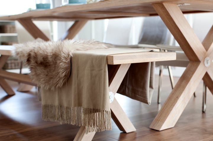
Now can we talk about that gorgeous custom dining table from Union Wood Co.??!?! I love mixing traditional and modern into my designs which usually means the use of some sort of exposed wood. It can be really difficult when shopping for furniture, to find that perfect tone of wood to match with the floors, accents, etc. which is why I tend to lean toward custom pieces. May as well get exactly what you want right?! We gave Union Wood Co. a sample plank of the flooring and they found a wood that matched the lightest colour in the plank. (To keep things as light as possible!!) Look how beautiful it turned out!!
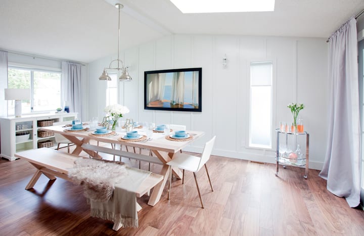
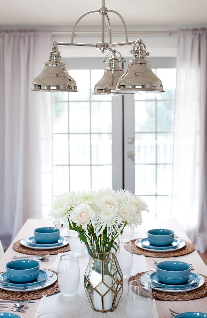
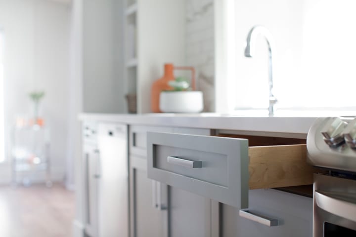
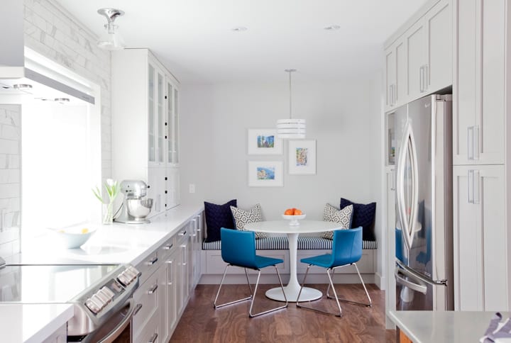
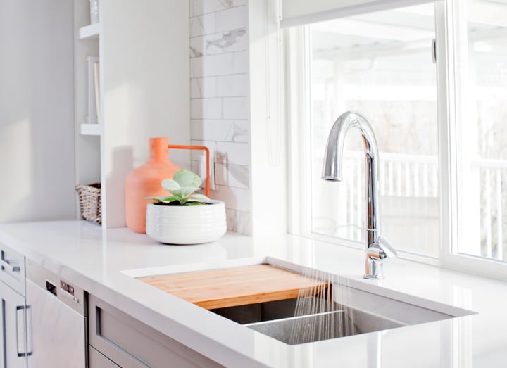
Since this home was an older build, and our budget was tight, we weren’t able to create the open concept kitchen that I am notorious for but we were able to extend the kitchen and create the cutest little breakfast nook. We contacted our good friends at Merit Kitchens to customize the perfect kitchen cabinetry across the entire length of the kitchen offering an endless amount of storage for the homeowners. I love the way this kitchen turned out, there is so much storage there is no excuse for cluttered countertops!
I’m so glad we were able to create a functional space for Stephanie and Chris even with some limitations. It was unfortunate that we had to use a good lump of their budget fixing other issues with the home, but now the homeowners can now rest assured there won’t be any more flooding and can really enjoy their new home!!
A big thank you as always to Janis Nicolay for the gorgeous photos!!
Visit HGTV Canada for more on this Love It Or List It Vancouver episode and to see more photos of the reveal click here! Also, be sure to follow Love it or List It Vancouver on Facebook for episode updates and more fun behind-the-scene photos.
Until next week!!!
xo
Jilly



Hey Jillian- We are searching for new furniture for our living room and have a similar living room shape including the pony wall but have a solid wall where they have the opening to their dining room. I was thinking of the similar style couch in the same placement but then stumped on what to do for the opposite wall… is having another couch on that wall too much? Suggestions are always appreciated… wish I could add a picture of our place to this might be easier to explain.
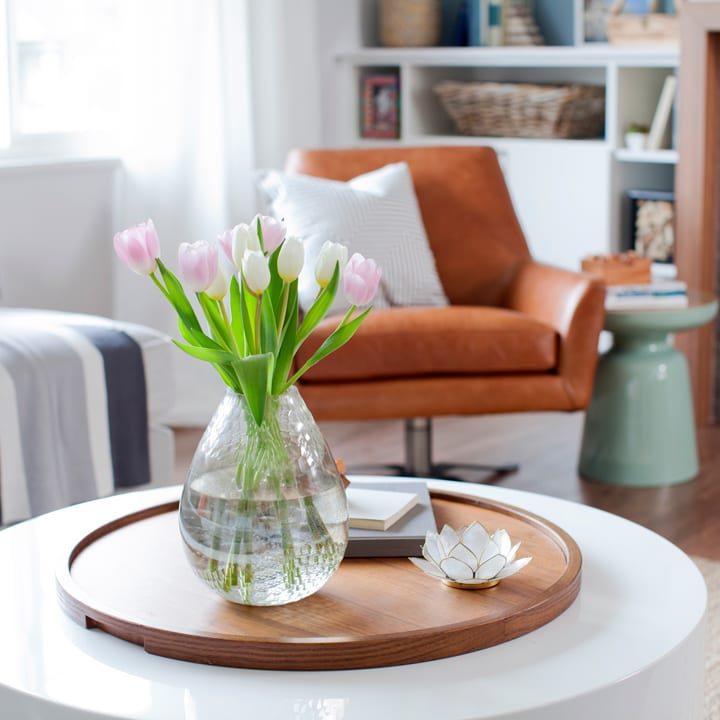
Lovely job. We also just purchased a sectional but for our family room downstairs and am trying to figure out the right coffee table. So many shapes and size choices, never mind materials. Why did you that one and particularly choose a round one? Thanks! Hope you have time to respond in between cuteness with Leo!
This reno was incredible, given the budget you had and the things that came up (the electrical, floors, sump, etc), but oh my god. This couple was the most horrifyingly obnoxious couple I’ve ever seen on this show. They bickered constantly, Stephanie never stopped just constantly talking/nagging/complaining, and they were ignorant “first-time-buyers” while at the same time being totally entitled. Yikes. Todd and Jillian – y’all are saints to put up with this!
Hi there, can you tell me where you purchased the round table in the kitchen nook. I loved the reno, so bright and airy. Thank you.
It looks like the Ikea Docksta. The chairs are Ikea, too.
Stephanie was rude while touring other homes and rude to the designers, seemed like an absolute spoiled brat.
What a beautiful reveal! Jillian do you know where the photo in the dining room of the curtains over the ocean is from? I’ve been trying to find that print for years! Thank you!