I haven’t shared a recap of any Love it Or List it Vancouver episodes in a while….so here you go!!! First of all I want to introduce you to the team behind it all…Francesca Albertazzi, Megan Bennett, Farah Malik and Gillian Hurtig. Without these ladies, none of this would be possible. All of these renovations take a span of 4 weeks, so me doing it solo is next to impossible!!! The plus side to working with such a great team….we work harder, it speeds up the process and guarantees a happy home owner!!! Francesca has taken the reigns on this episode…I hope you enjoy our transformation as much as we did!!!
EP2035 – Nicola & Michael
Nicola and Michael’s home was big… but you couldn’t appreciate its volume prior to the renovations as the main living space was cut in half due to a GIANT double fireplace! This incredibly dated fireplace also limited the view out to a gorgeous and often not appreciated panorama of Burnaby… In short, the fireplace was an eye sore as well a functional problem and Jillian and I agreed that there was only one solution: take down the monster and let the home breath!!!


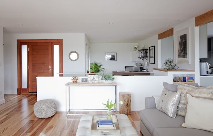
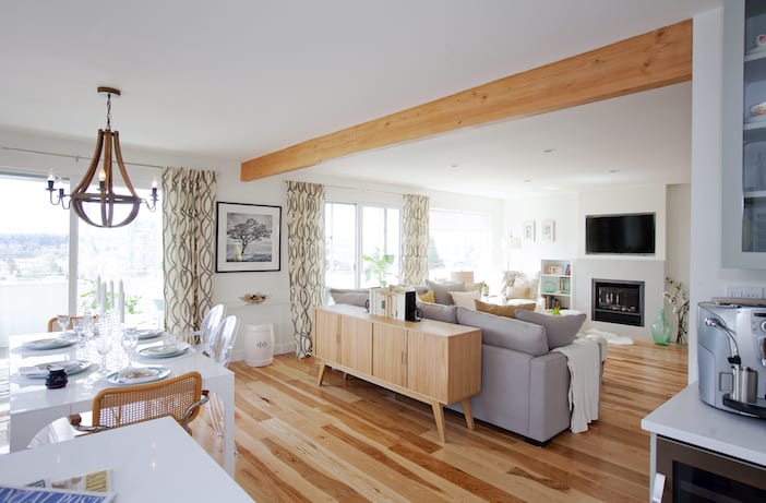
Once down, and with the dust settled, the immediate sense of space and volume was apparent and we all agreed that this made a marked improvement in the flow of the home. The view to the city was impressive and only needed some bigger windows to let it shine through. For the design of the space, Jillian and I took inspiration from Nicola who had been dreaming of a refreshed home for her family for years. When we met to discuss design direction, we showed her an inspiration image of a space with exposed beams and cozy, soft upholstery… she said she got goose bumps as it was the picture she had had in her mind for years ! We were in the right direction: “light and cozy” became our concept phrase for this renovation.
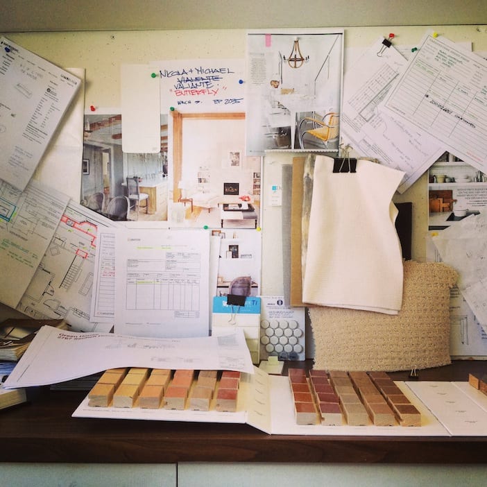
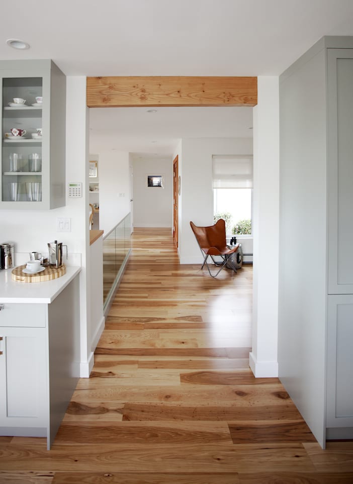
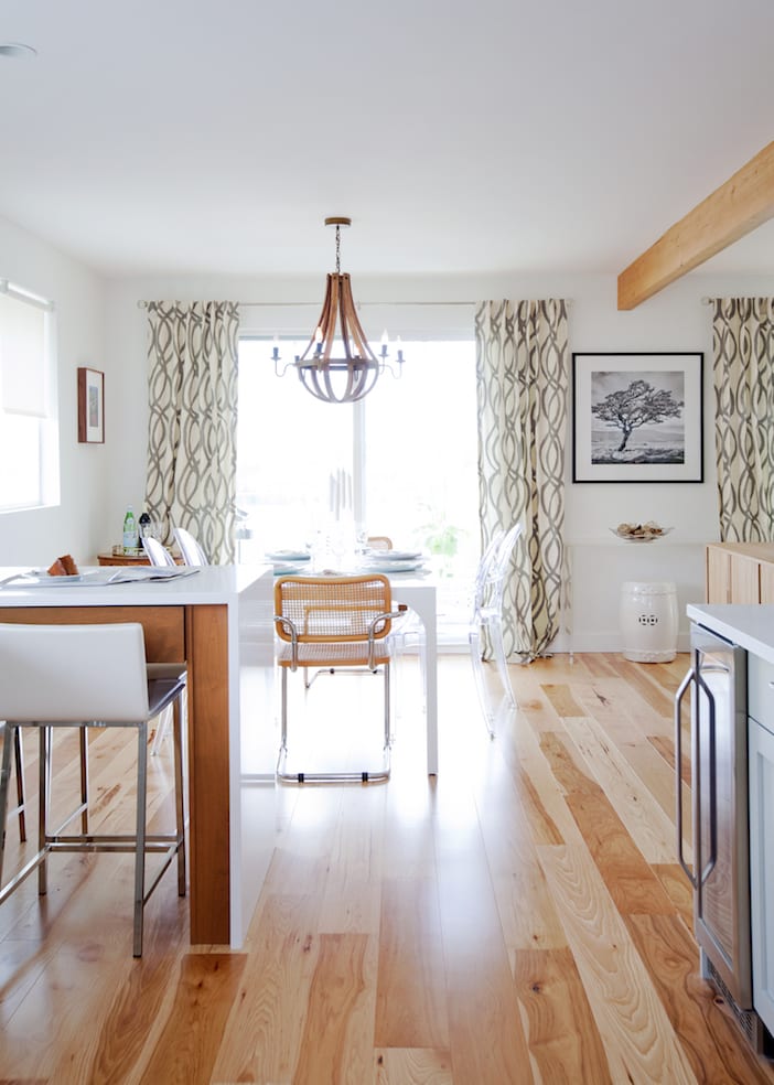
The first major design choice – in conjunction with the exposed beam – was the flooring: engineered hickory from Mercier – it had us smitten at first sight! It has stunning variation in the wood tones and definitely has that “cozy feeling” we were going for – it’s a floor that makes a statement but without overpowering the room. Perfect.
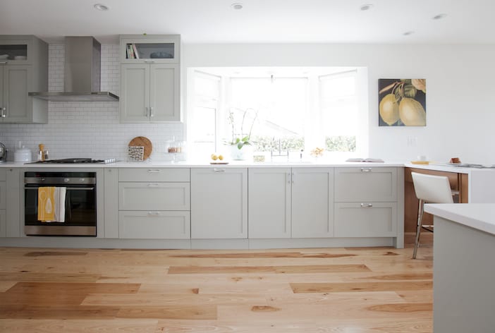
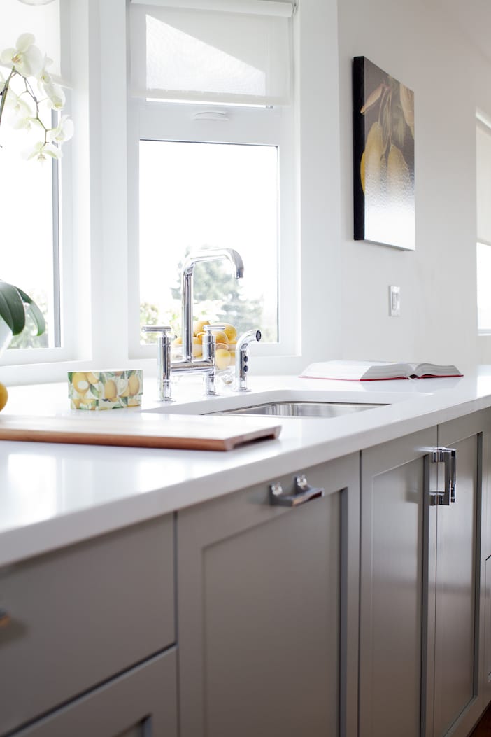
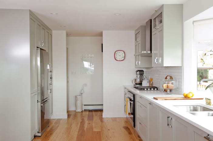
Next up was the kitchen cabinetry colour: we wanted to introduce light in the kitchen as the previous black cabinetry had given it a “heavy-feeling” but knew that a white kitchen wasn’t right for this house… We decided to go with “grey horse” from Benjamin Moore with its soft and dusty tones of grey/green complimenting the flooring wonderfully. Merit Kitchens produced a handsome and functional set of cabinets, turning what had been a dark, tight kitchen into an expansive and stylishly functional space – gracefully transitioning into the dining area by way of a waterfall eat-at peninsula.
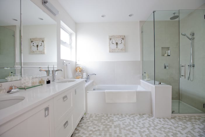
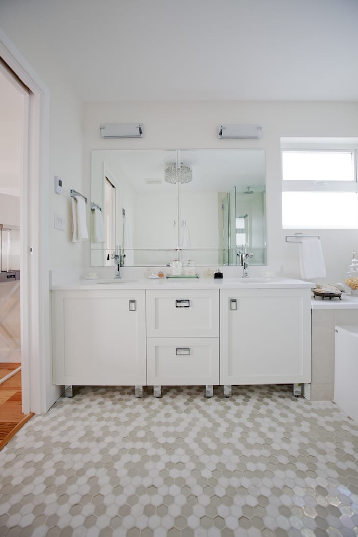
Another dramatic change in space was in their master ensuite – what was a cramped and poorly laid out space became generous and grand by taking over some of the location of real estate from the second bathroom (this bathroom was far too large for what they needed). With a double vanity, separate shower and tub and stunning floor tile from World Mosaic Tile to ground it all – the space now begs to be enjoyed !
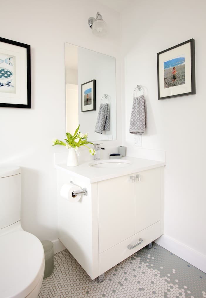
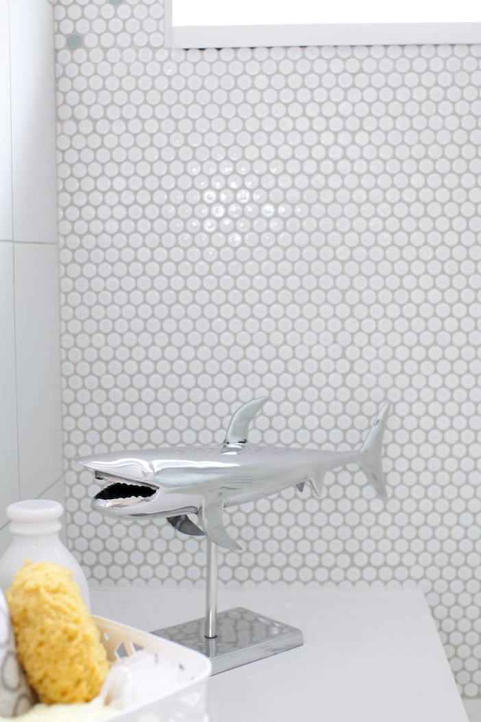
Creating a fun bathroom for their son that would grow with him as he got older was also quite important – we went with an inexpensive penny round tile in 3 colours from World Mosaic Tile and gave it a twist: having one of the best tile setters in the lower mainland…. We had the opportunity to do something fun if a bit painstaking in its undertaking… a mosaic of sorts !
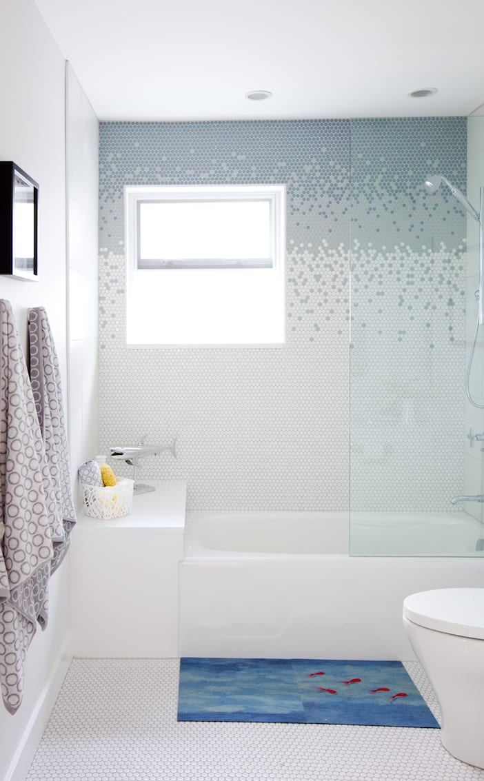

We had our skilled tile setter lay the penny rounds so that they gradated from dark to light toward the tub and light to dark from tub to celling – a stunning effect and one that can be appreciated by kids as well as adults !
In creating the final elements for the house, again Jillian and I turned to Nicola and reused some cherished items that she had collected over the years: the light fixture over the dining table, her mid-century hutch that she found at a bargain, and a large fir beam she had bought for her old fireplace – had it as a mantle – she loved this because it was a slight nod to the direction she wanted her house to go in… so we had Shilo Living turn it into a custom console piece and a side table. We love incorporating key pieces from a homeowners’ life – it expresses depth and character in your home’s décor and gives it that personal touch that makes it your home.
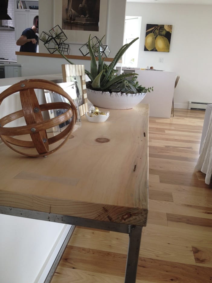
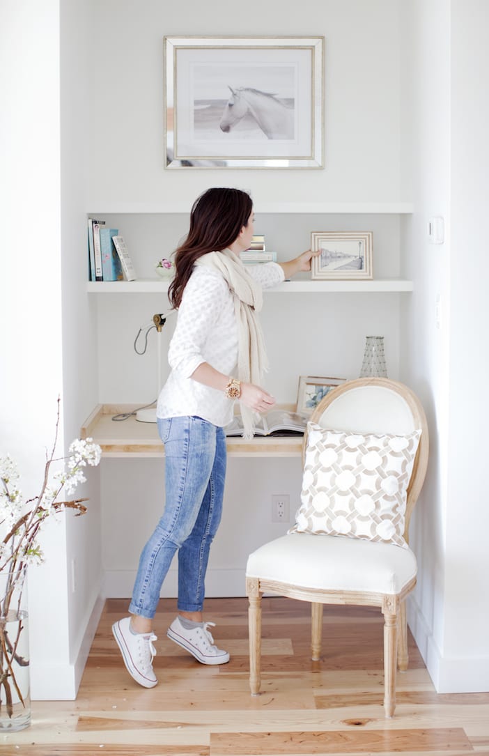
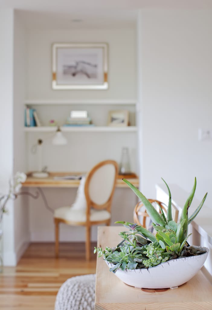
One of Nicola’s dreams was to have her own dedicated desk space. We were able to incorporate this next to the new Valor gas fireplace.
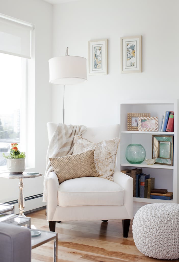
The desk on once side of the fireplace balances nicely with the reading nook on the other side, (custom recessed bookcase and cozy upholstered chair). Two dedicated spaces: one for work, the other for relaxation!
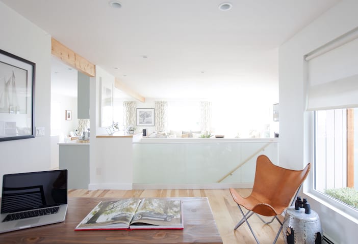
We didn’t forget about Michael in this renovation- sure, Nicola was the instigator and Michael was more of a “happy wife = happy life” kind of guy but we wanted to make sure he had his own space in his renovated home: an office space (in what used to be their dining area). Another gorgeous custom desk and solid wood shelving by Shilo Living paired nicely with functional storage units from IKEA. We think he’s a happy man at the helm of his new home, overlooking the vista of a new, welcoming space and to the view through the windows beyond.



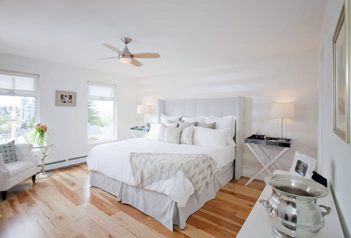

We also updated the master bedroom, giving it a stylish and serene look to it with horizontally placed wall paper and a new headboard with butler tables on either side. The walk-closet is every woman’s dream – and this one met expectations complete with sparkly min-chandelier and storage for all her pretty clothes (and his too!).
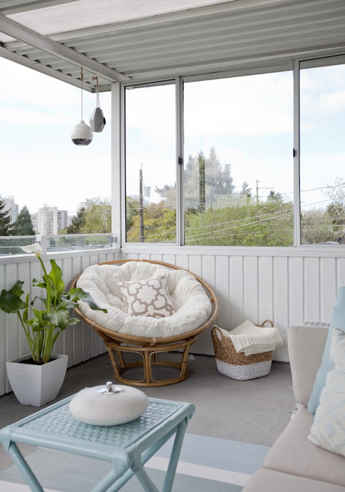
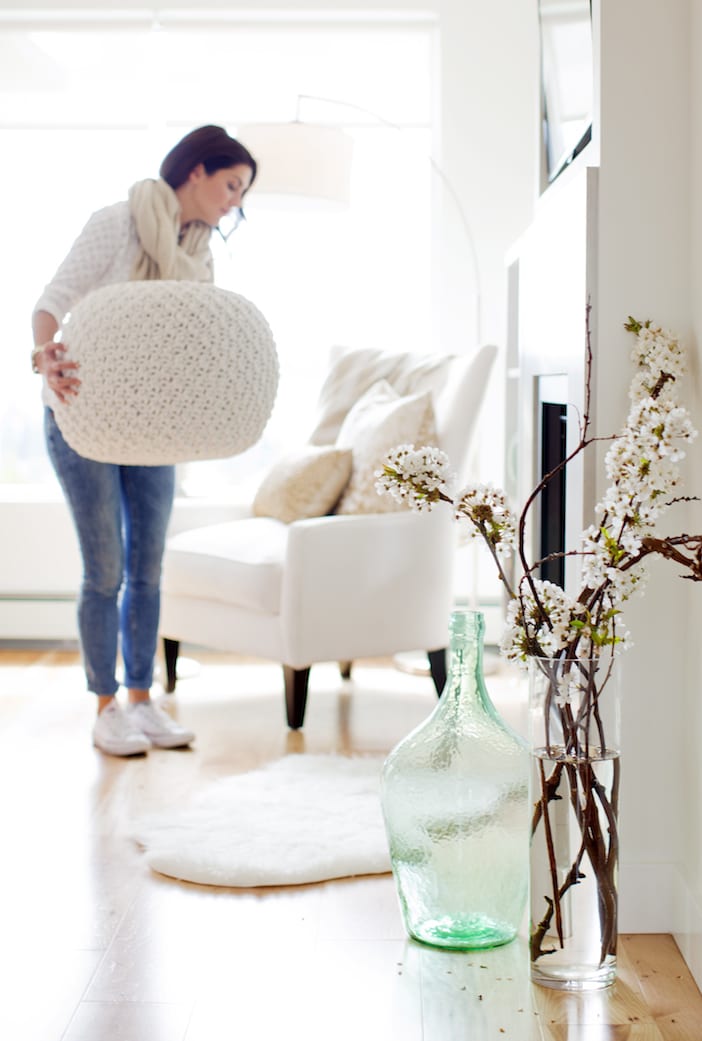
The final touches…
Would you have loved it or listed?? For a full resource guide, click here.
BIG thanks to the design team and the amazingly talented Janis Nicolay for the photos!





Can anyone tell me where that grey couch is from? I love it.
Dying to know the source on that sofa!
Yes please do tell!! Where can I get that sofa??
Love to know where the sectional is from!!!
Id love to know the color used on the walls in the kitchen. I also have grey horse cabinets and wanted to paint my walls white but the shade I chose isnt right. I think it needs to be brighter and crispier. Id appreciate any help!!
Also wondering where I can get the lemon art?