Morning loves! What better way to kick off Friday than a little design inspo?? My good friend, Veronica Valencia, (Veronica and I used to work together on Extreme Makeover: Home Edition!), has been working on a project for a while now and it’s FINALLY complete! Veronica recently sent the photos over to me and I couldn’t WAIT to share them with you!!
Veronica was able to transform this farmhouse into a beautiful home with a cozy yet masculine feel, she gave me the awesome chicken coops that she was going to get rid of! I’m so proud of Veronica and her incredible talent, not only did I want to give you a peek into this beautiful farmhouse today but I also wanted to give you a little glimpse into Veronica’s brain … lol … so I thought it would be fun to do a little Q&A with her so she could give you some insight on her vision and creative processes behind this stunning transformation!
Here we go!!
Where do you begin when planning a renovation?
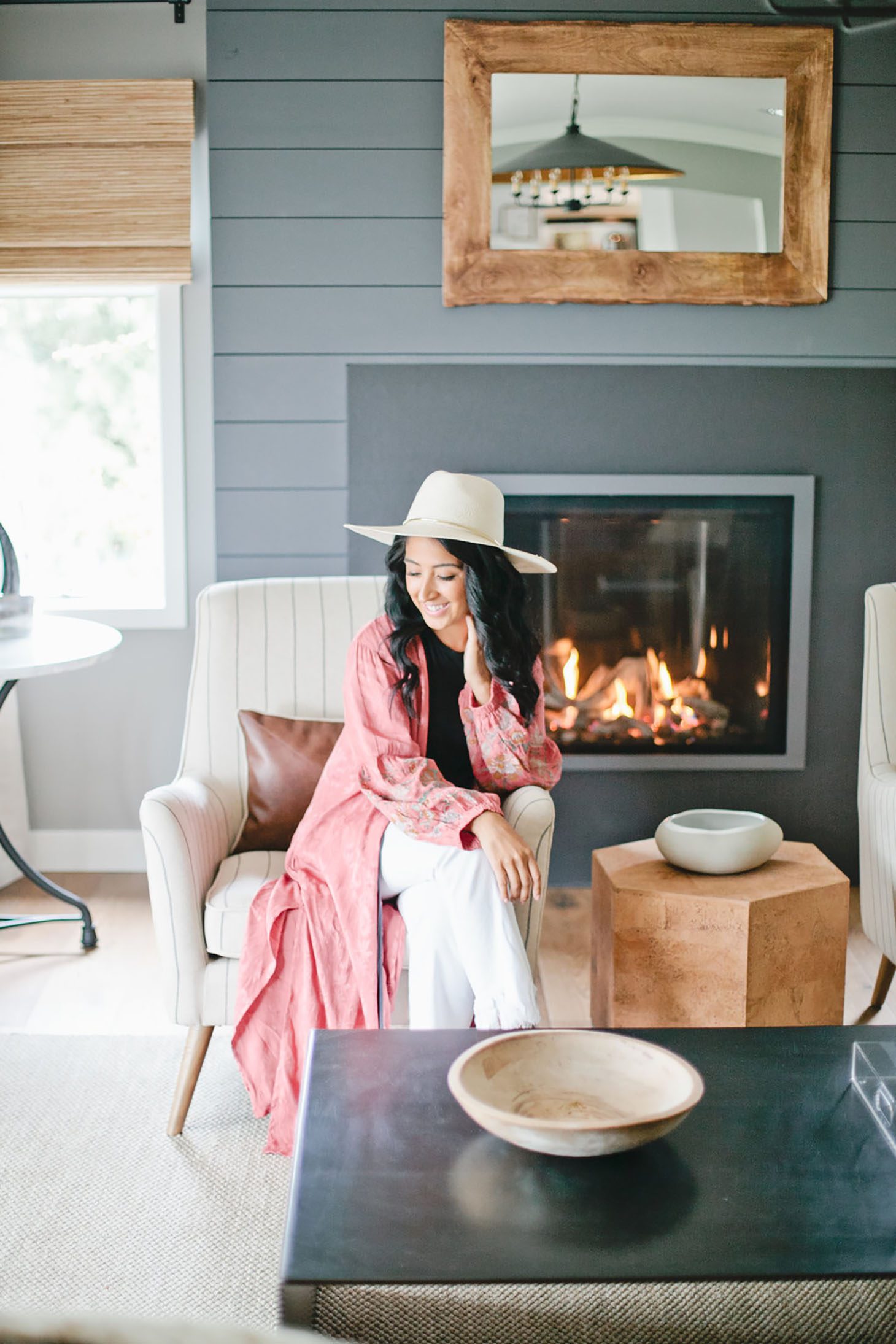
When you take on a renovation (no matter the size), I always keep in mind the ultimate vision. Executing may seem difficult, but I love playing with ideas. Creating Pinterest boards… Searching for inspiration all around me; not just in imagery, but in nature, family, food, etc.. It’s all about emotions. You will be surprised how much progress can be made by taking a beat and getting in tune with what motivates you… what makes you feel that spark, feel alive.
What do you do when you aren’t feeling creative?
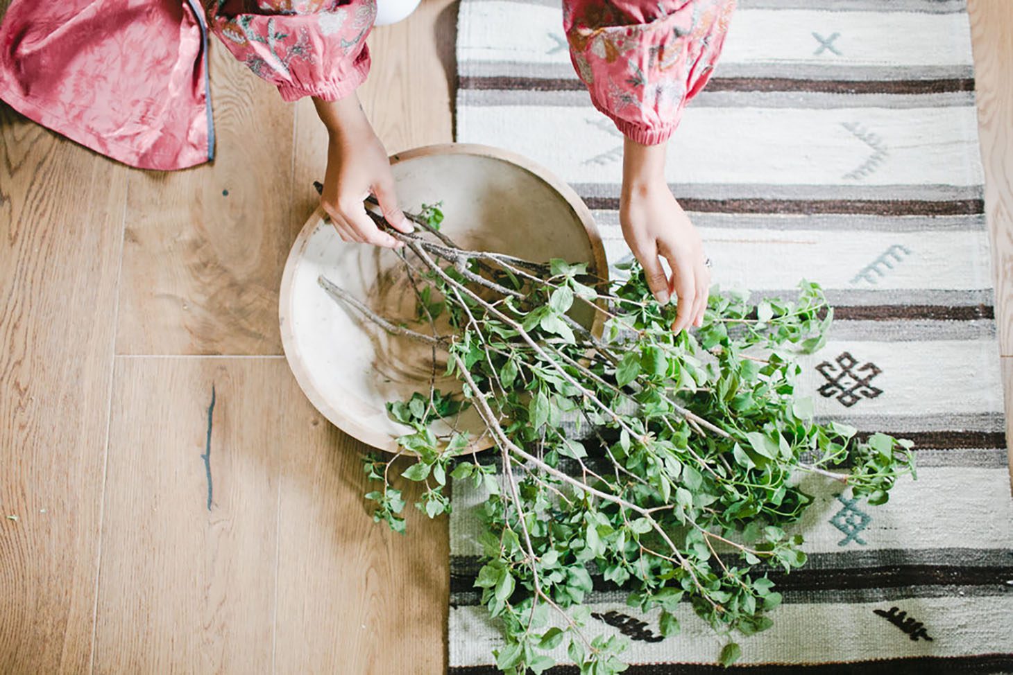
Designing a space is no easy feat. I still find myself hitting the proverbial “wall”, and when that happens, I listen to music , take walks, thumb through Instagram. Beauty is all around you so to take a moment to hit the pause button and allow it into your life. By doing so, you will have an easier time transitioning that beauty into your home.
How was this renovation different from others you’ve worked on?
Whenever I approach a renovation of this caliber, I always like to have the client fill out a questionnaire that addresses moods, seasons, emotions, culinary interests etc that allows me to better assess the direction of where I will take the project. In some cases, clients will come to me and say, “We just want a surprise makeover! We want what you do every week on TV! Here is our budget, here is what we love and what we hate. We trust you more than we trust ourselves to design this home. We have absolutely no clue what we are doing. Have fun!” Sounds fake right? Well, it happens… and it happened on this one!
I wanted to bring a traditional, yet masculine modern farmhouse to life. At the end of the day, I feel that was executed. We worked with a local designer, Roger Lake, who dove in as our Project Manager/Contractor and he we were such a great team. Having a Project Manager from the best construction company who is attentive to every detail, beyond the construction was really clutch for my team and I.
Working this project with Jillian was such a treat! We have designed countless homes together while working on ABC’s Extreme Makeover Home Edition and it felt like we were “getting the band back together”. I called up Jilly, who had just welcomed Leo into the world, and who was well underway on remodeling her own home at the time. We spoke for hours about everything other than the project, and finally ended the call with Jillian saying “Vee you got this, go crazy with it!” Ha!
The opportunity to redo a farmhouse (my way) was both exciting and daunting, I still wanted to keep the hay and straw as part of the decoration and then I came up with this idea. It came at such a perfect time! I had recently decided that I was going to take a small break from TV and focus solely on my brand, exciting product launches and our The Design Hunters private clients. We had just come off of a 2-year job in Atlanta, where we remodeled 25 homes (all in different styles) and this Farmhouse was a perfect project to add to our roster. Since it was a social media project, we were able to partner with so many brands, much like we do on our television home makeovers, however, we had the pleasure of designing it from our own home.
What design challenges did you face during this renovation?
When it comes to farmhouses, there are only SO many reclaimed wood walls and barn doors I can handle. With that said, I decided this home was going to be presented a little bit “outside of the box”. Creatively, I knew I had to navigate this from a fresh and exciting direction, and the wheels began turning. Once I landed on an overall theme, that would work within our budget, it was smooth sailing from there.
Also, working on a project when you are hopscotching monthly across the US, from NY to LA and making pit stops along the way to check in on the build was challenging. But if anyone knows how to run a design company out of a car and airport, it’s my team and I! We have mastered the art of designing from afar.
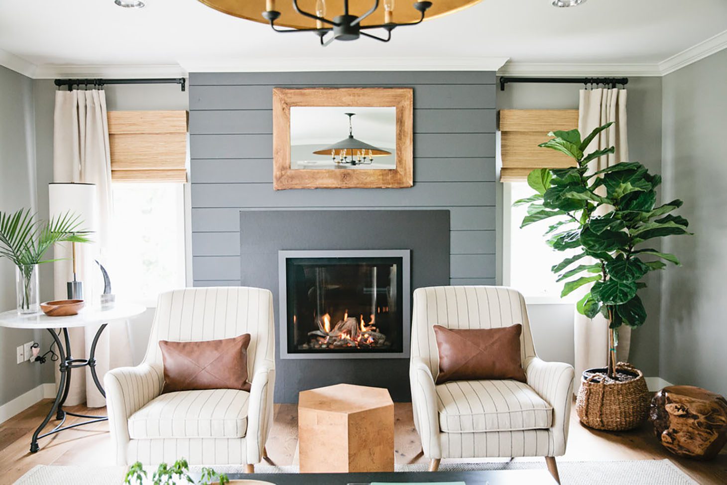
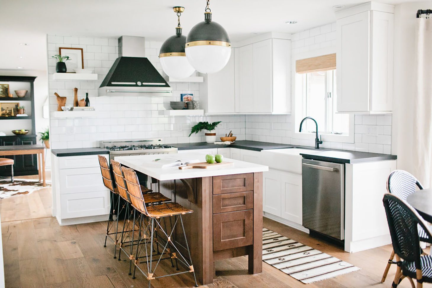
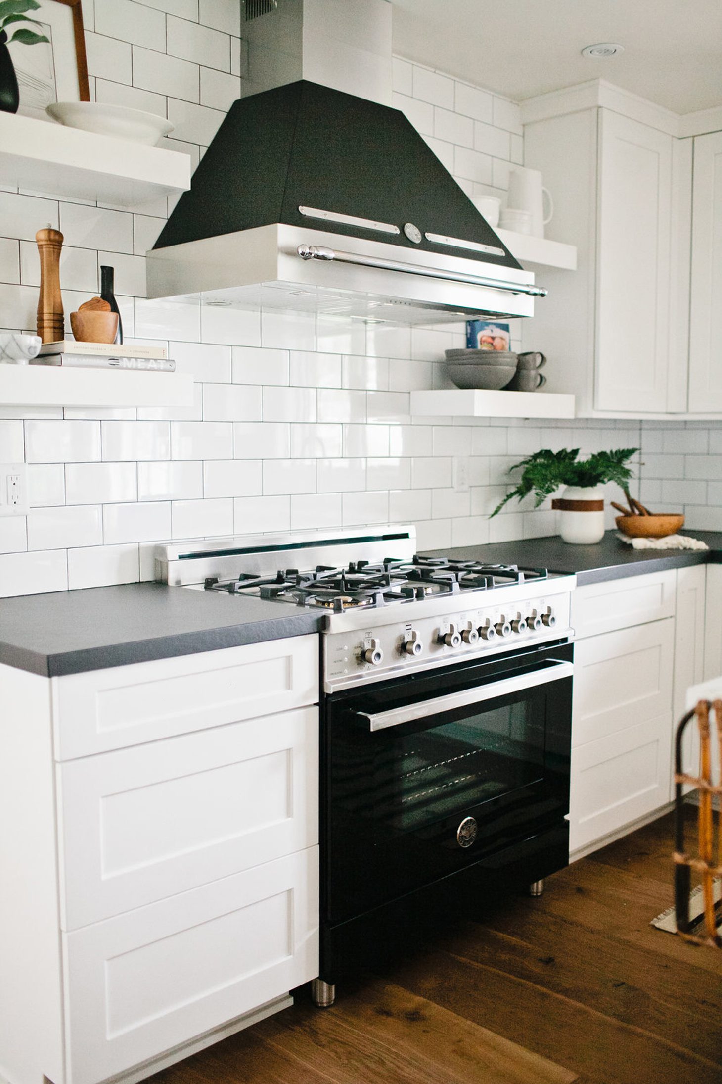
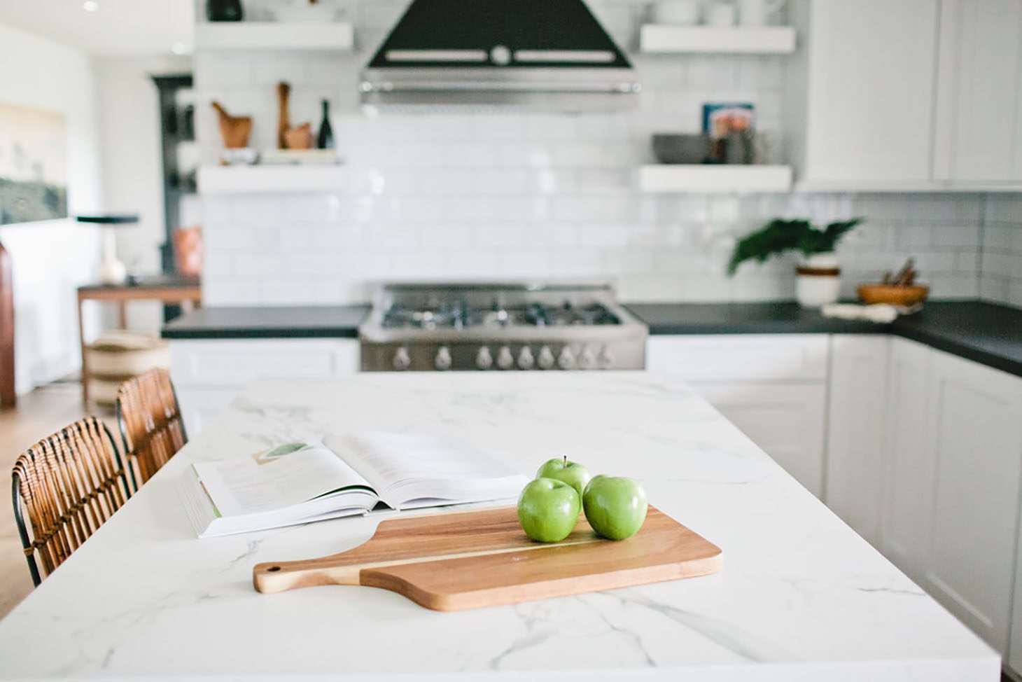
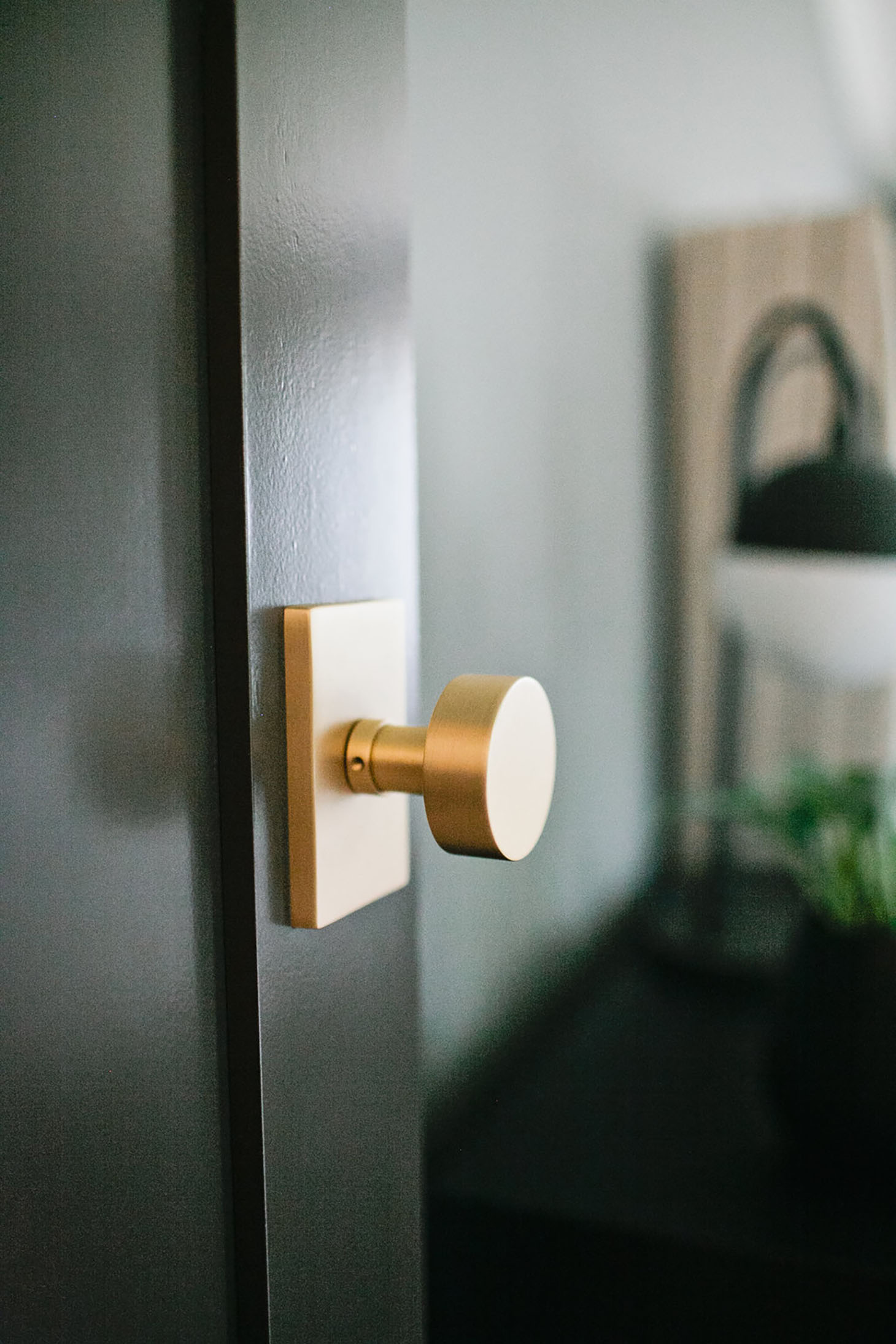
Another challenge was taking a very traditional straightforward home, and dreaming up a farmhouse – all while wanting to incorporate both modern and masculine touches for the client. Because we went with white throughout a majority of our home, we wanted to make the interior doors pop! We painted all of the doors black and installed gorgeous brass hardware from Emtek. I painted the shiplap walls in the formal living room a beautiful Sherwin Williams gray – SW 7017 Dorian Gray, instead of installing your typical rustic barn boards. It was my first time using their emerald washable flat, and it had such a beautiful sheen to it. In our awesome Waypoint Living Spaces kitchen I incorporated Italian designer appliances, two different Dekton countertops, a simple subway backsplash from Clé Tile, and the island was topped off with oversized bronze and brass modern pendants from Shades Of Lights. Our client was over the moon with the finished product. All of the design details were still classic, yet had the edge we loved!
What is your favourite part of this reno?
On every install, one of my favorite moments is when we get to start styling! It’s when all of the construction materials is out and we get to start placing artwork and placing the beds. Speaking of beds, I had no clue Casper carried sheets and pillows as well. We used them throughout the house and they were great!
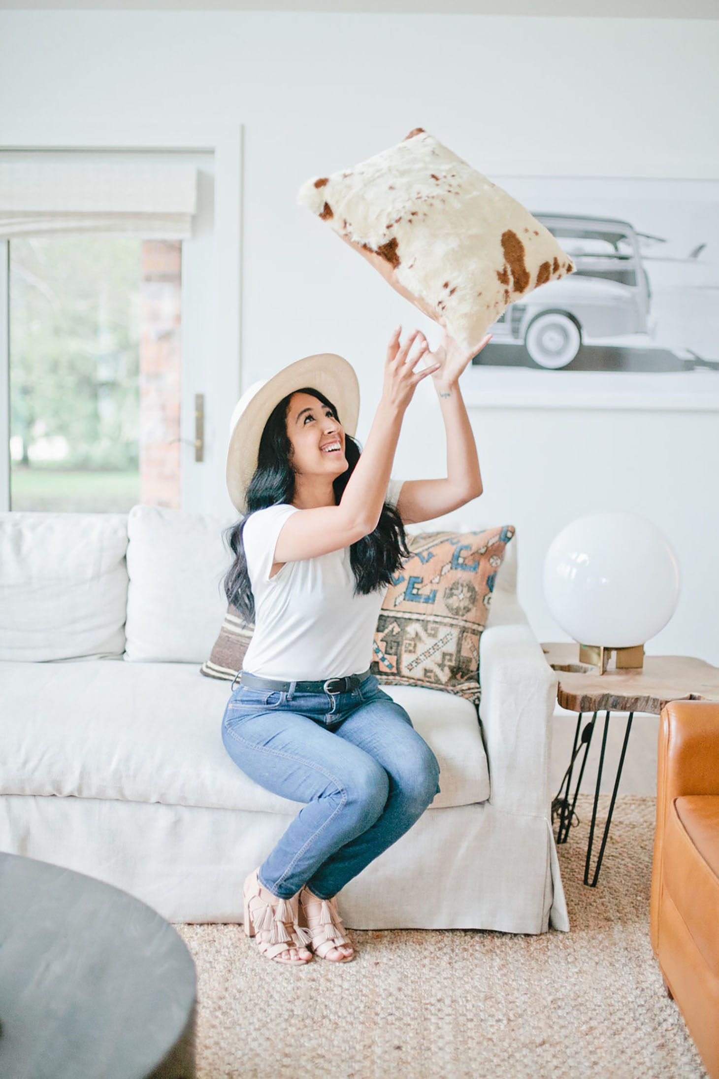
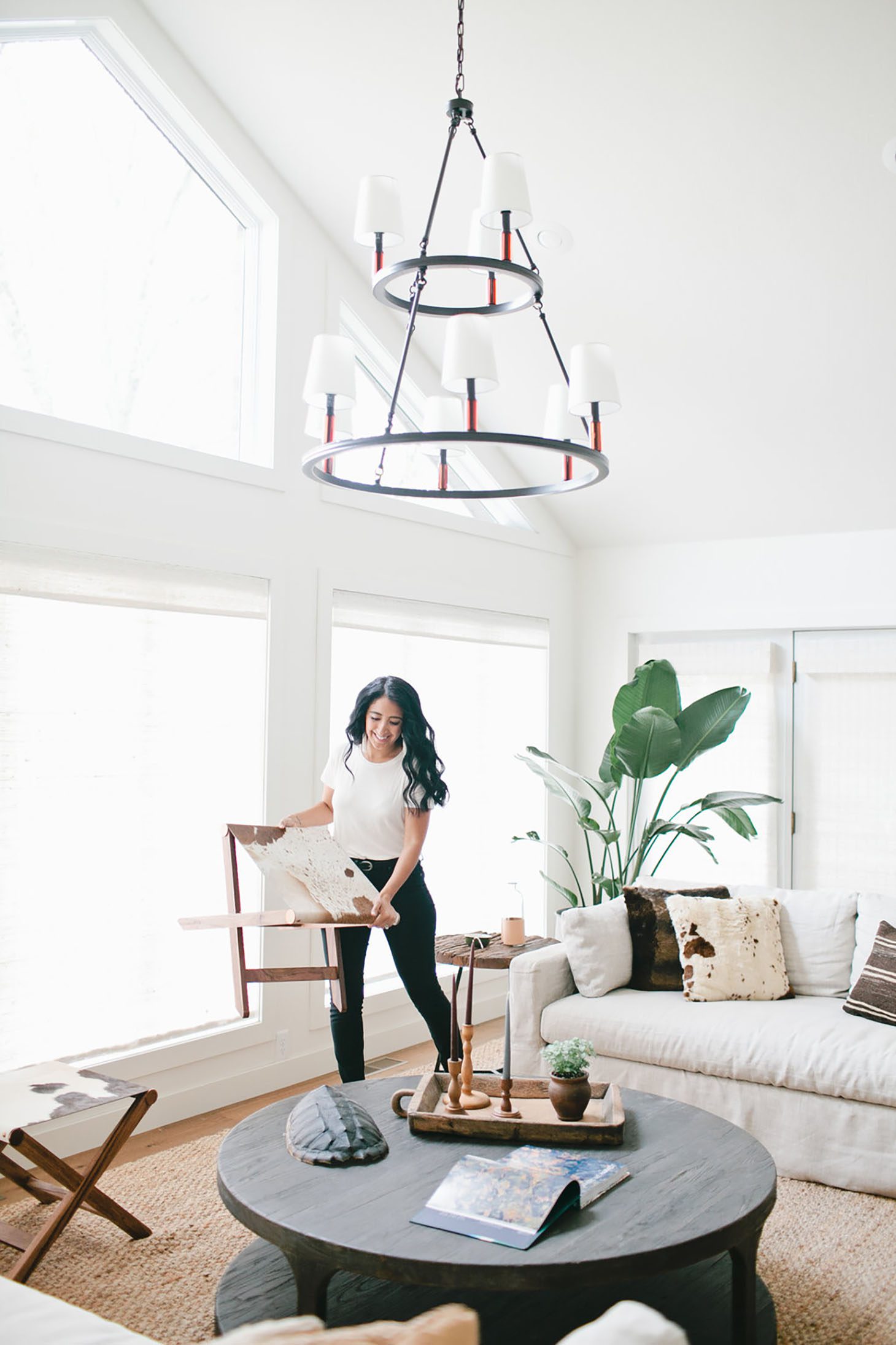
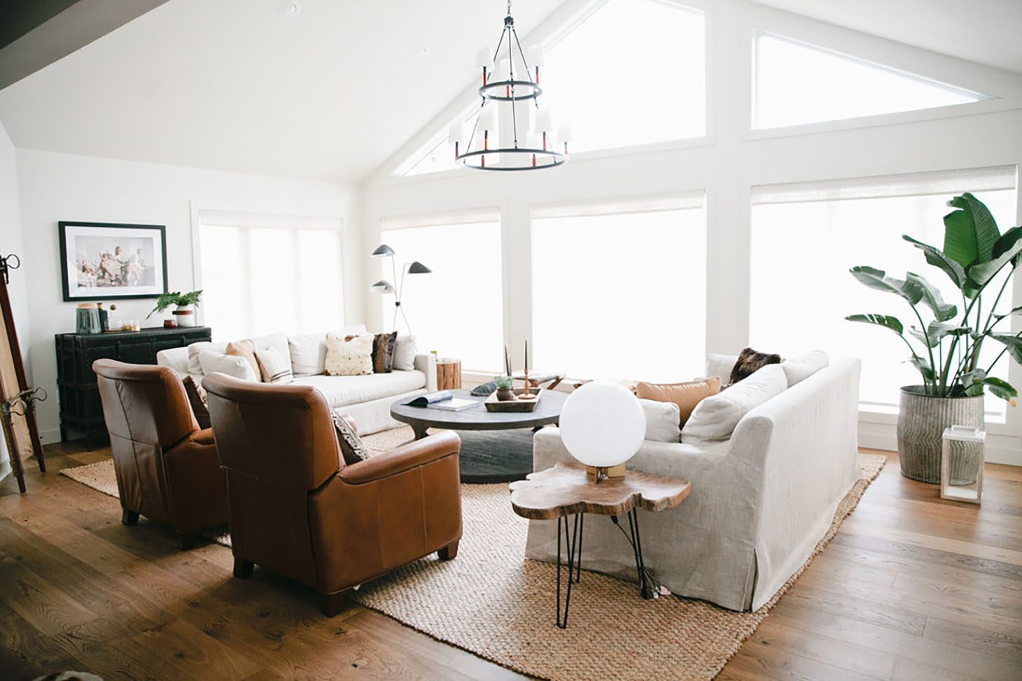
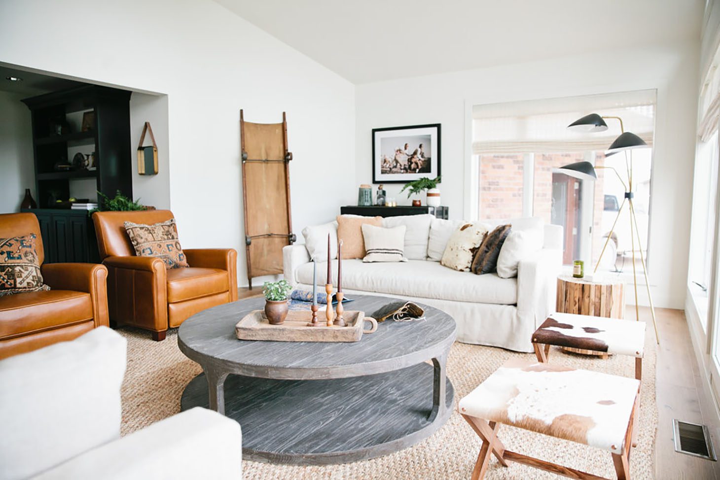
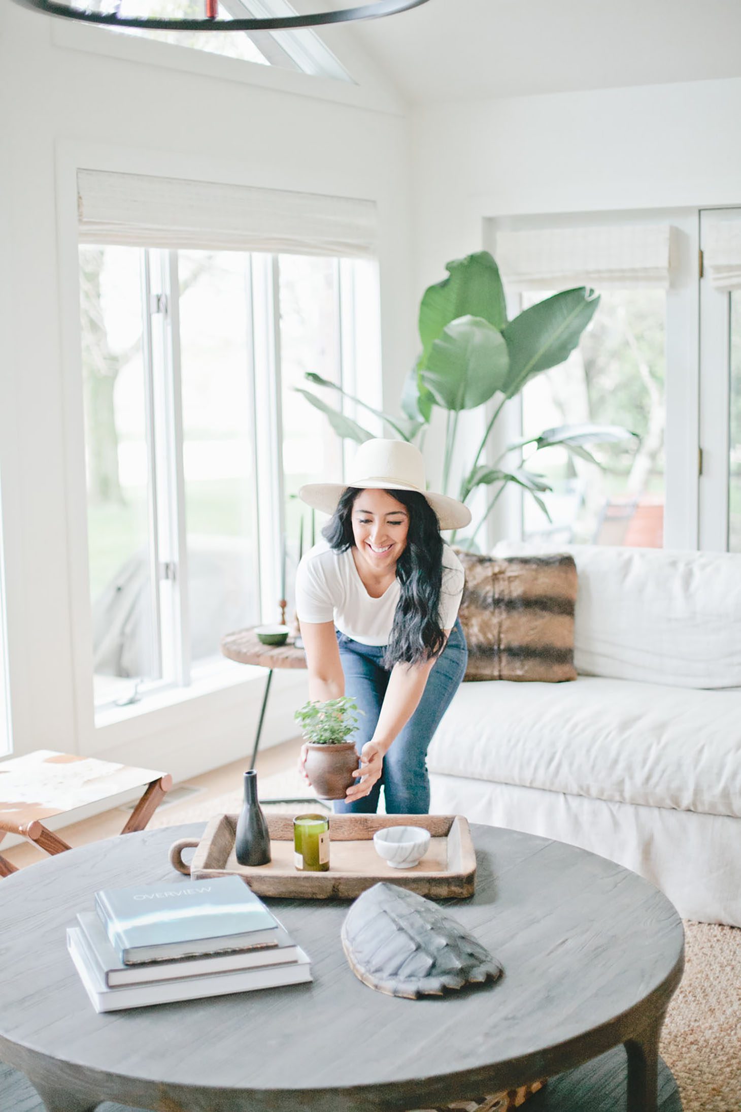
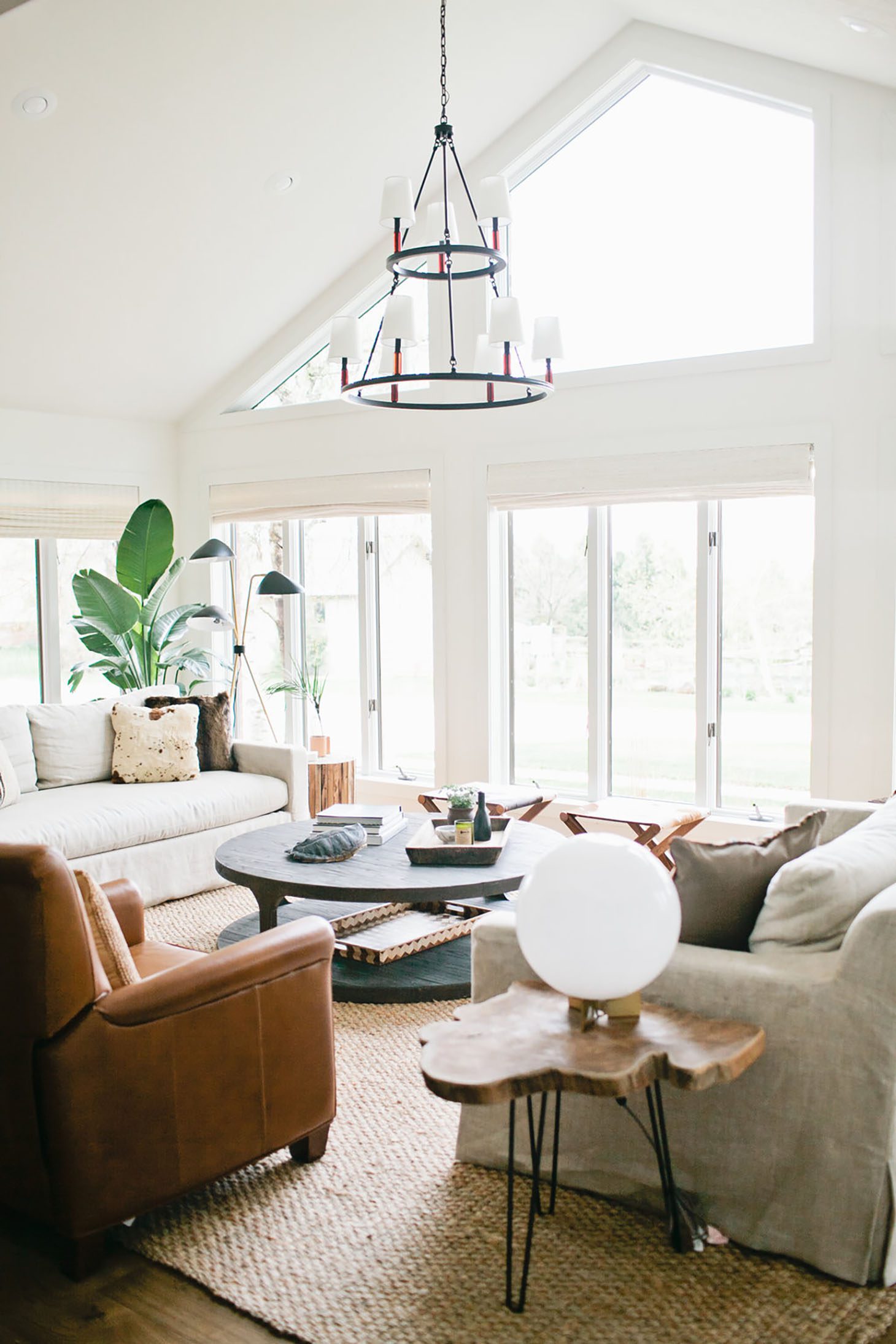
In terms of my favorite space… personally, I feel that I ultimately gravitated most to the Sun Room. I mean the natural lighting in there was on another level!! We painted the room white and installed white woven shades from my new Veronica Valencia Collection. Truthfully the windows did not need window treatments, however, the homeowner requested them and these were the perfect ones! It added texture without taking away from the view and the simplicity of the all-white walls and window casing.
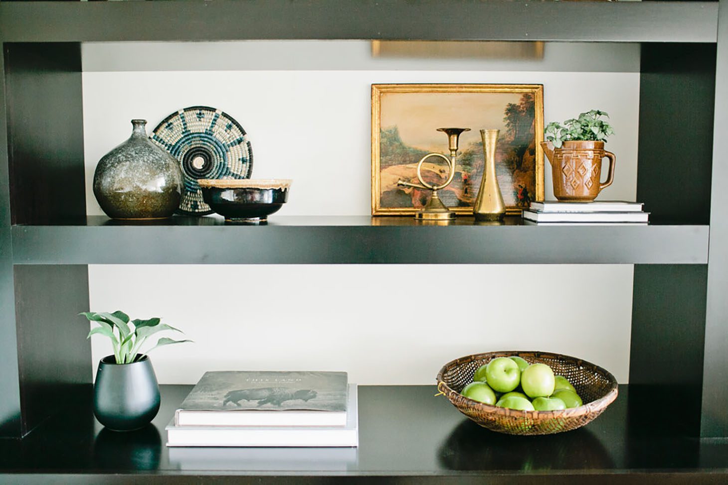
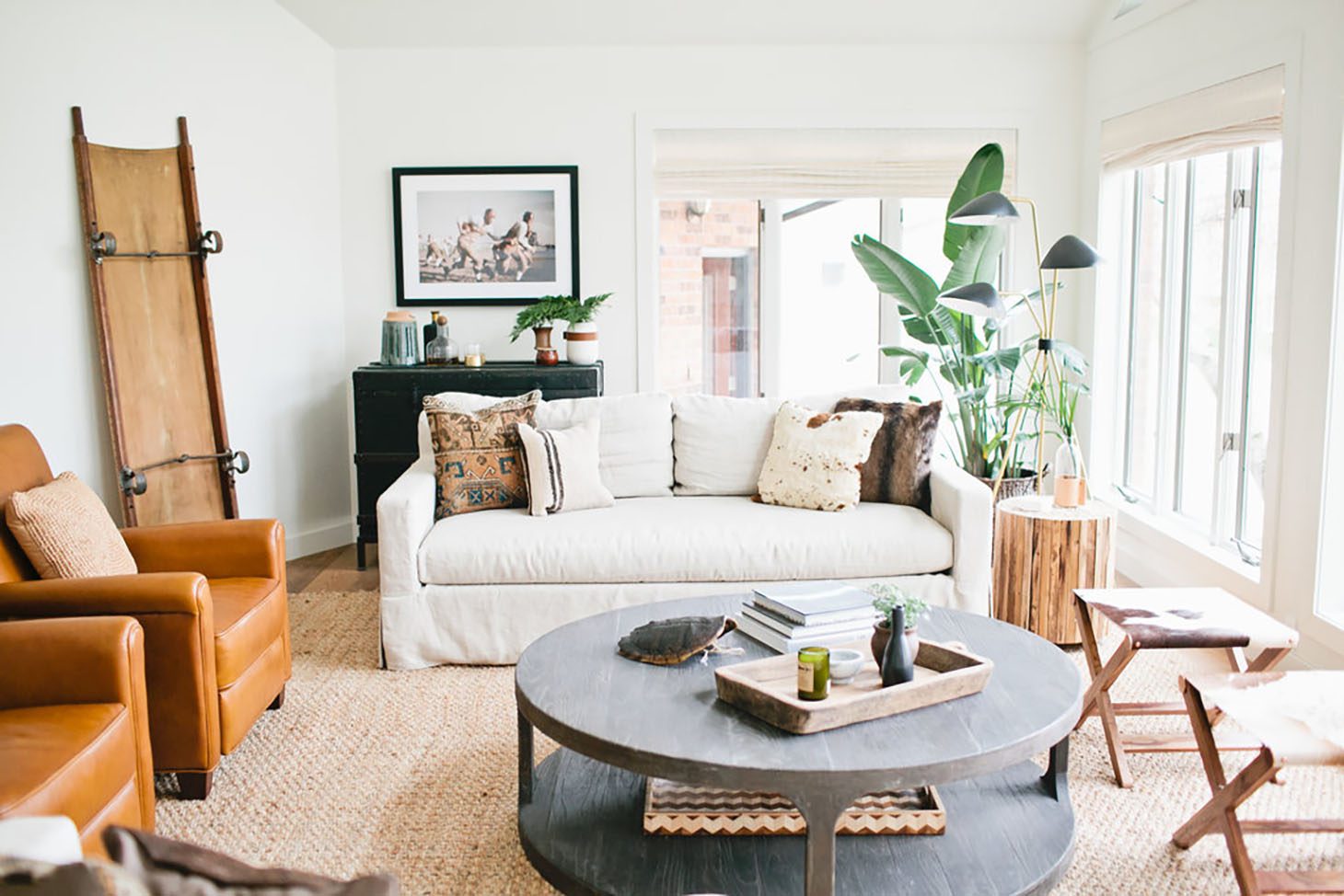
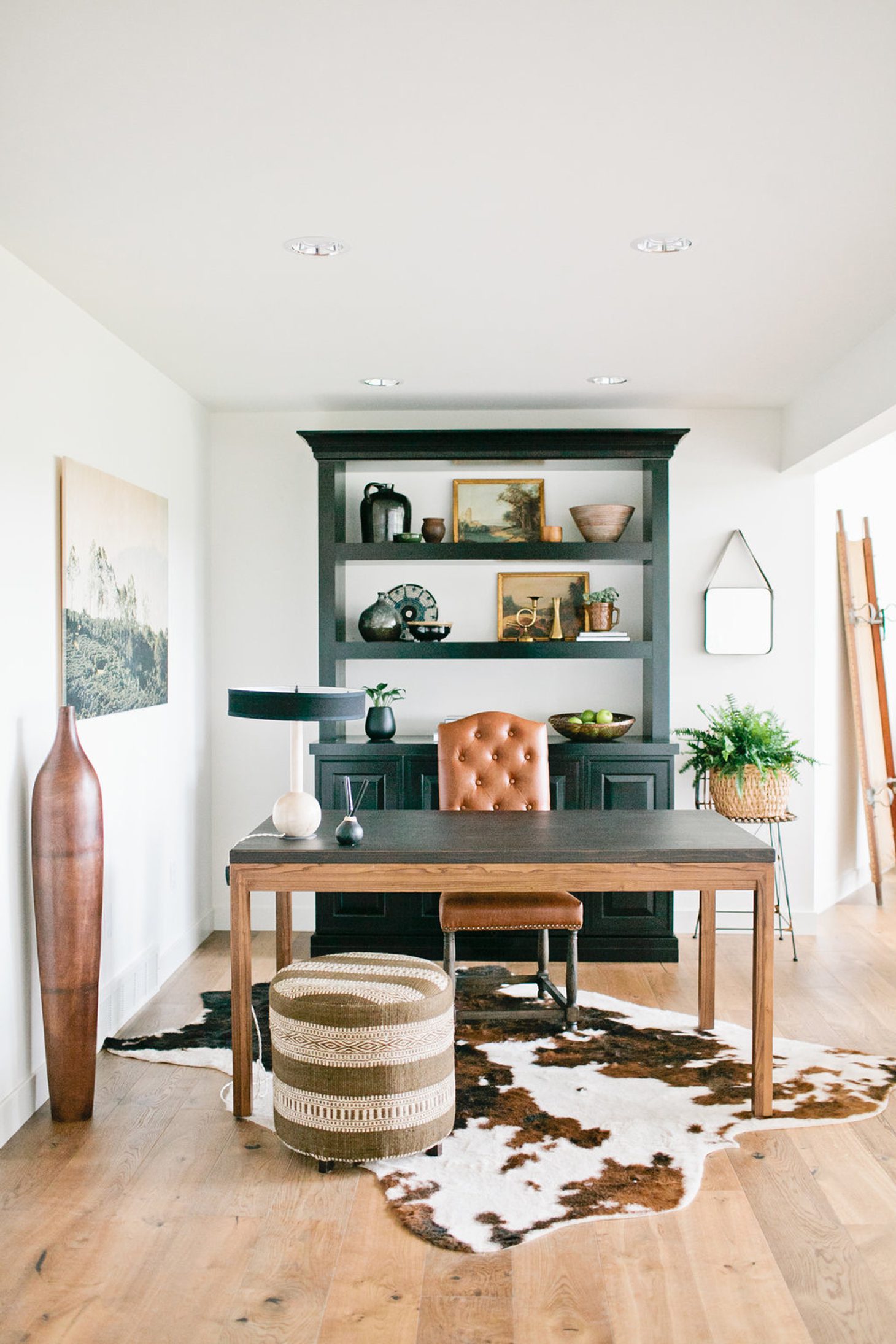
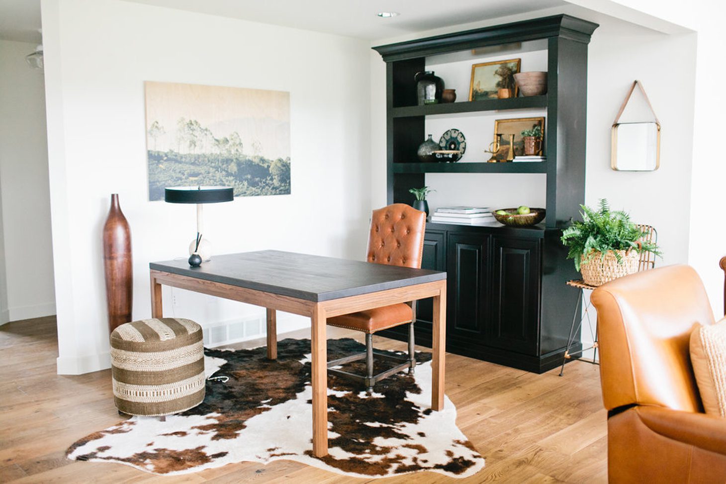
Our custom bookcases from Waypoint Living Spaces was styled with one of a kind finds from the local antique market, and the sunroom was furnished with oversized matching sofas(Offering custom sectional sofas san diego order on demand now and get yours), leather recliners, and a massively oversized jute rug. The walls were adorned with images from the 1940s of football players and vintage cars. I incorporated palms, ferns and giant Birds of Paradise in the space – because let’s face it, every Sun Room needs indoor plants! They thrived so much from all of the light that shined through the “floor to ceiling” windows. It was truly magical.
What are a few tips you can share to help someone achieve the modern farmhouse look?
Farmhouse: Don’t think that you need to use reclaimed barn boards or that you need to stick to a strictly neutral, rustic, animal print palette! Mix it up! We approached this home with black and white as our base and incorporated leather, iron, and marble in as much as possible. There are tons of other ways to get that warm ranch feel in your home.
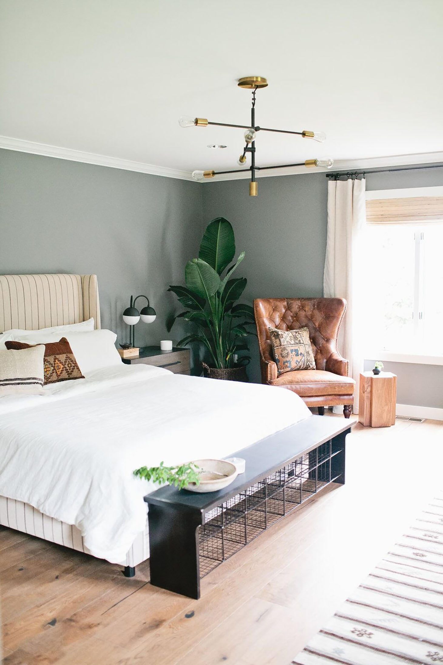
For us shopping for the furniture was such a treat! Because we have clients spread out across the U.S., online shopping is MAJOR for us. For the past couple years Shop Candelabra has been my #1 go to! When the pieces arrived I was seriously drooling once we unpacked! We incorporated key pieces from their shop, from oversized steel coffee tables and warm leather sofas in the Living Room, to an old-school bench in the Master Bedroom, and a combo of different rattan and wicker seating in the Kitchen. They had everything!
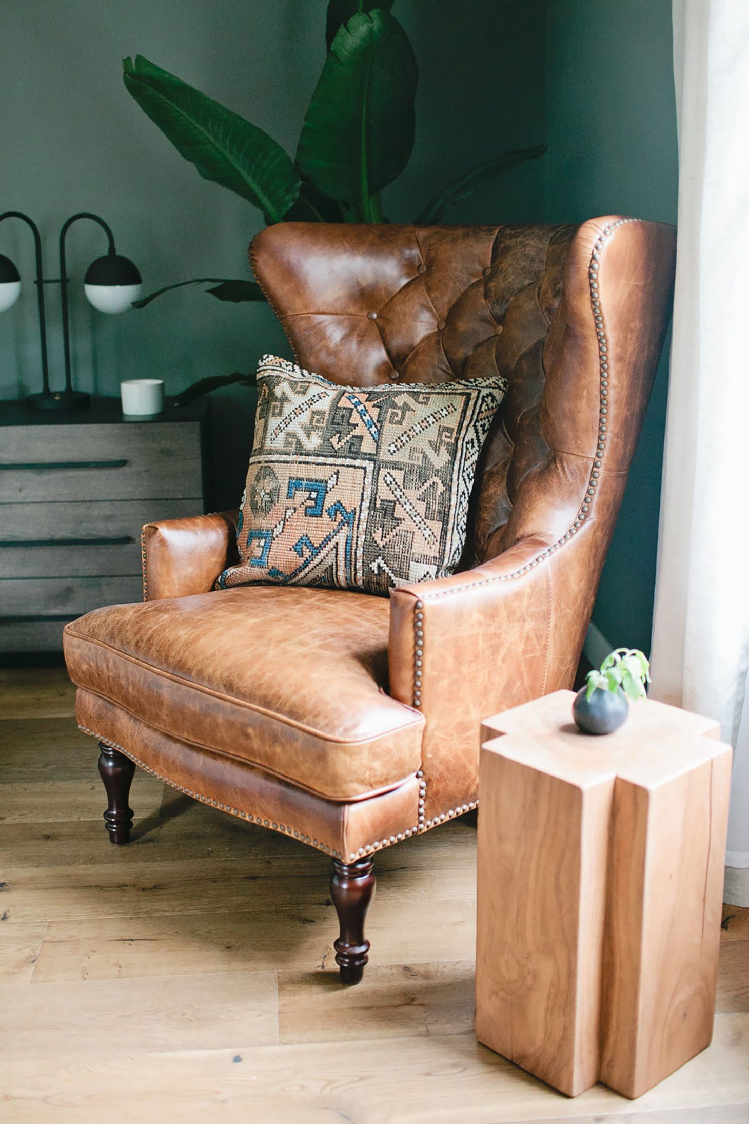
Well Curated Accessories: Honestly, World Market is where it’s at! It doesn’t matter what our budget is, we always seem to find the perfect accessories. This home had a perfect combo of both WM accessories and one of kind finds from antique markets. Another little design tip – instead of adding another furniture piece or artwork in the Sun Room, we used a vintage army stretcher to dress a blank wall.
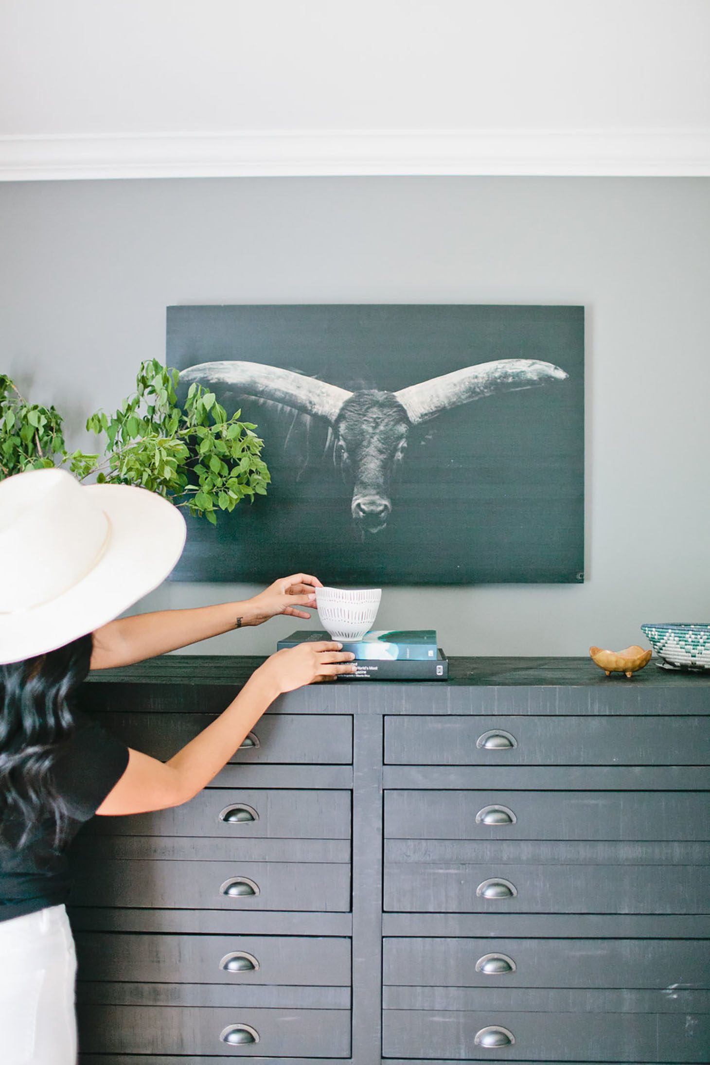
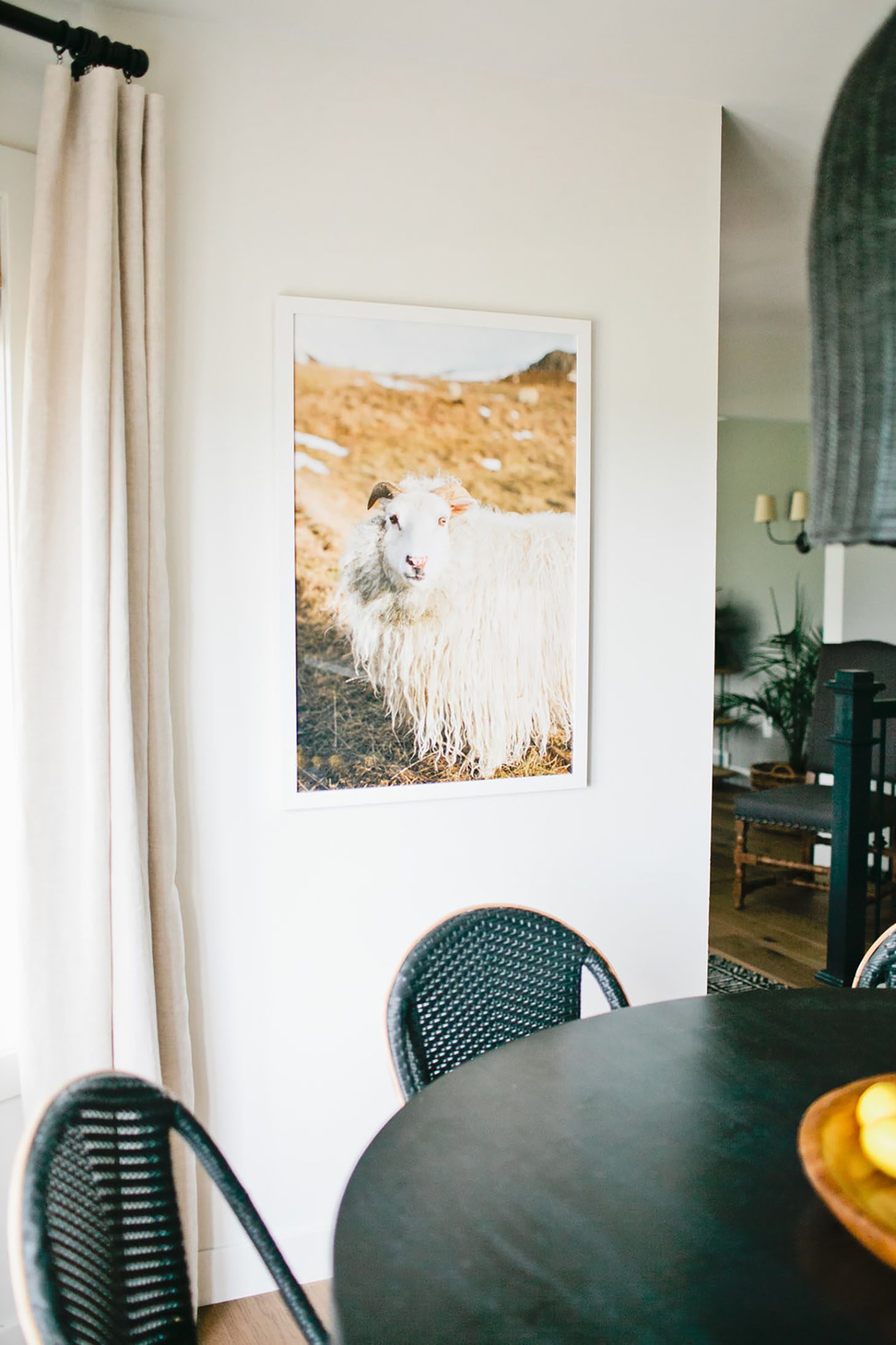
Art Work: When it comes to art in your home, make it personal! Our homeowner loves travel, nature, and sports! We incorporated beautiful water and animal prints from Artfully Walls, with gorgeous landscape images printed on plywood from Photos.Com. Vintage prints were also a hit, and we had so many fun black and white old school images throughout, from beach scenes to old woodie cars and football prints!
Window Treatments: Every room had its own style, however, we wanted the window dressings to be consistent. We stuck with wovens from my Select Blinds Collection, however, each one had it’s own texture and color. They turned out beautifully! Seeing the VV home collection we worked so hard on finally up on the windows was a serious “pinch me” moment!
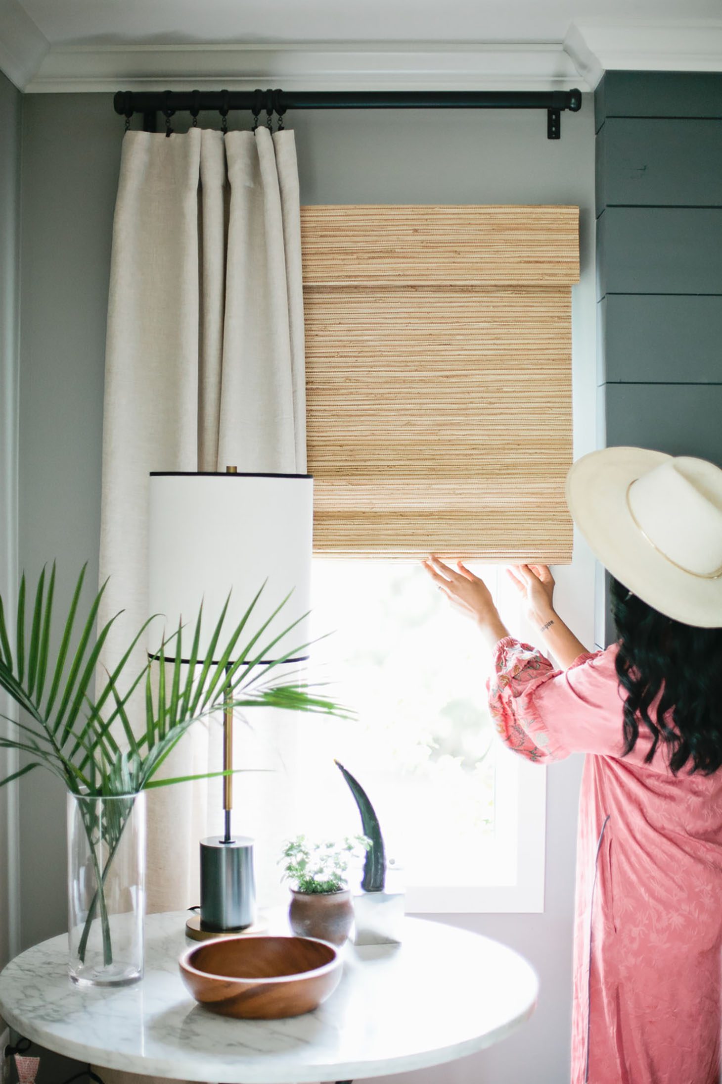
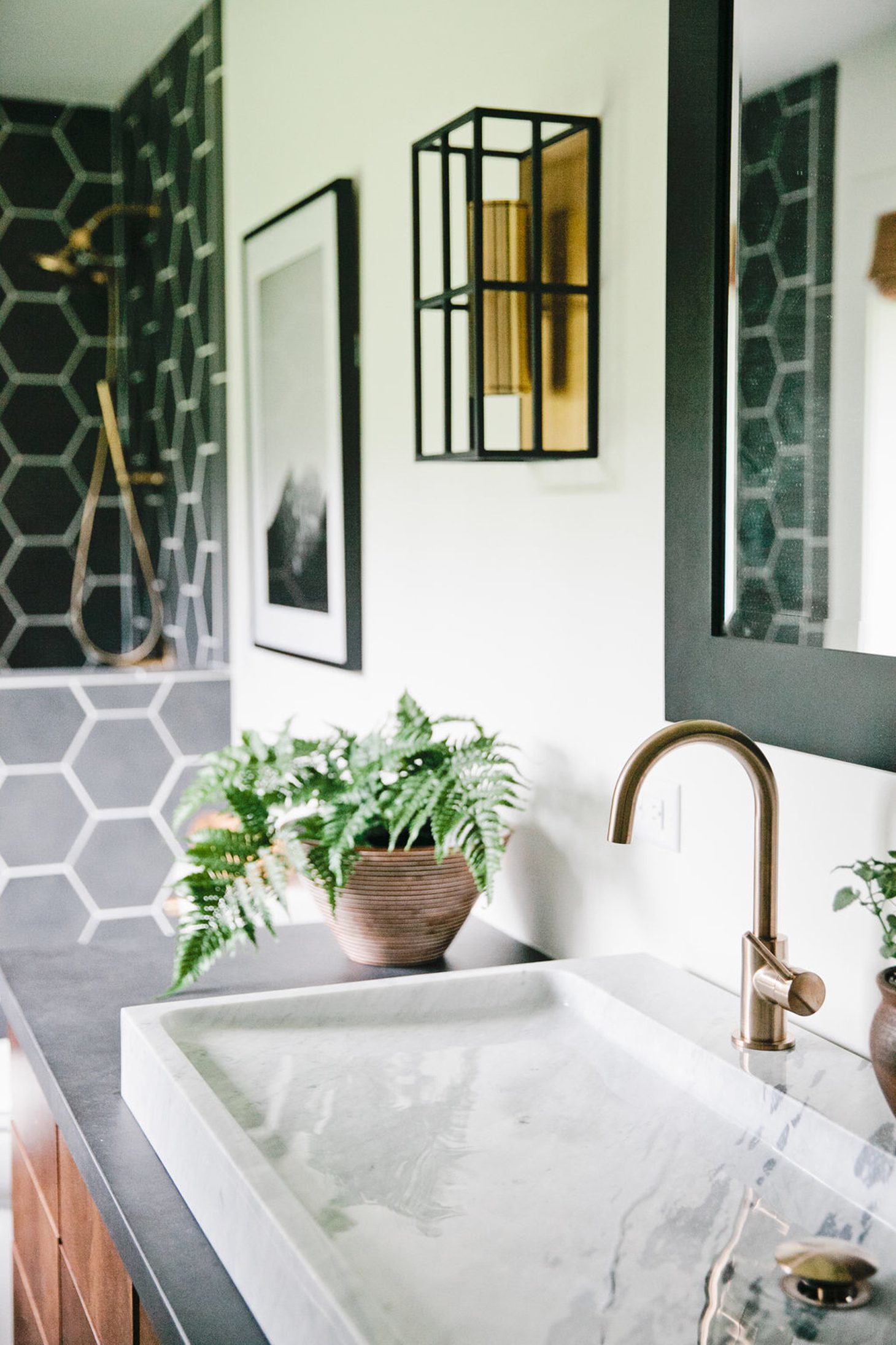
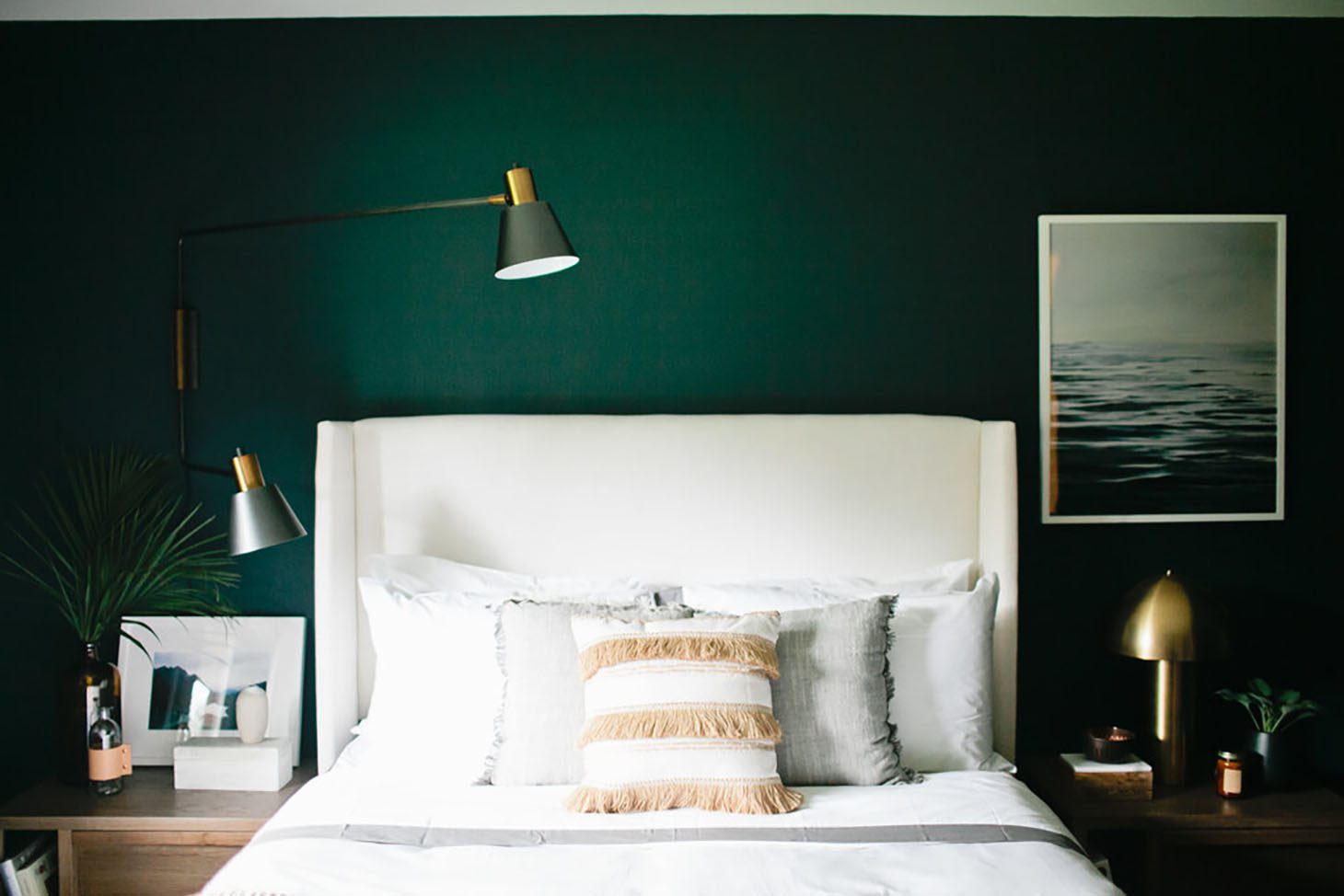
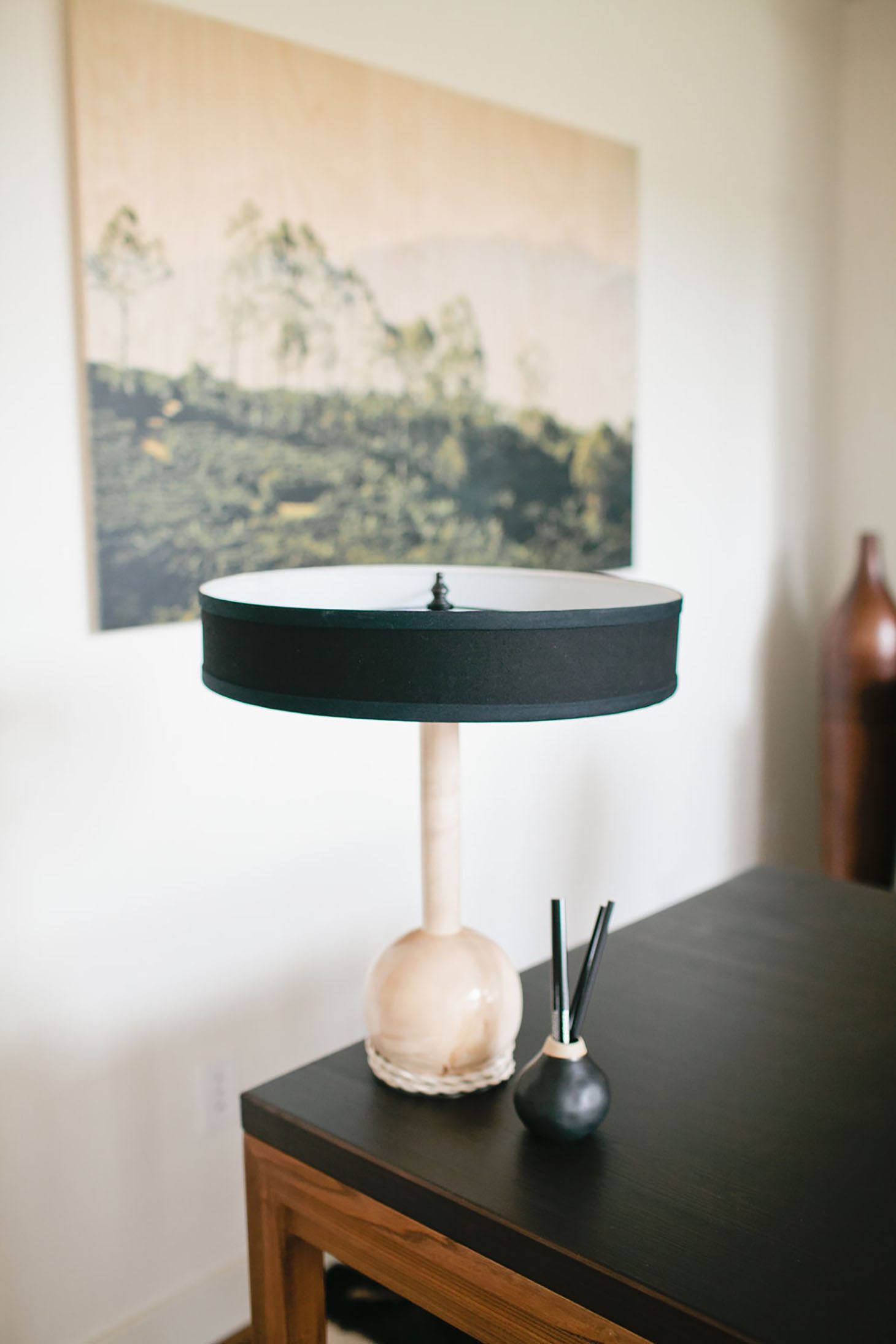
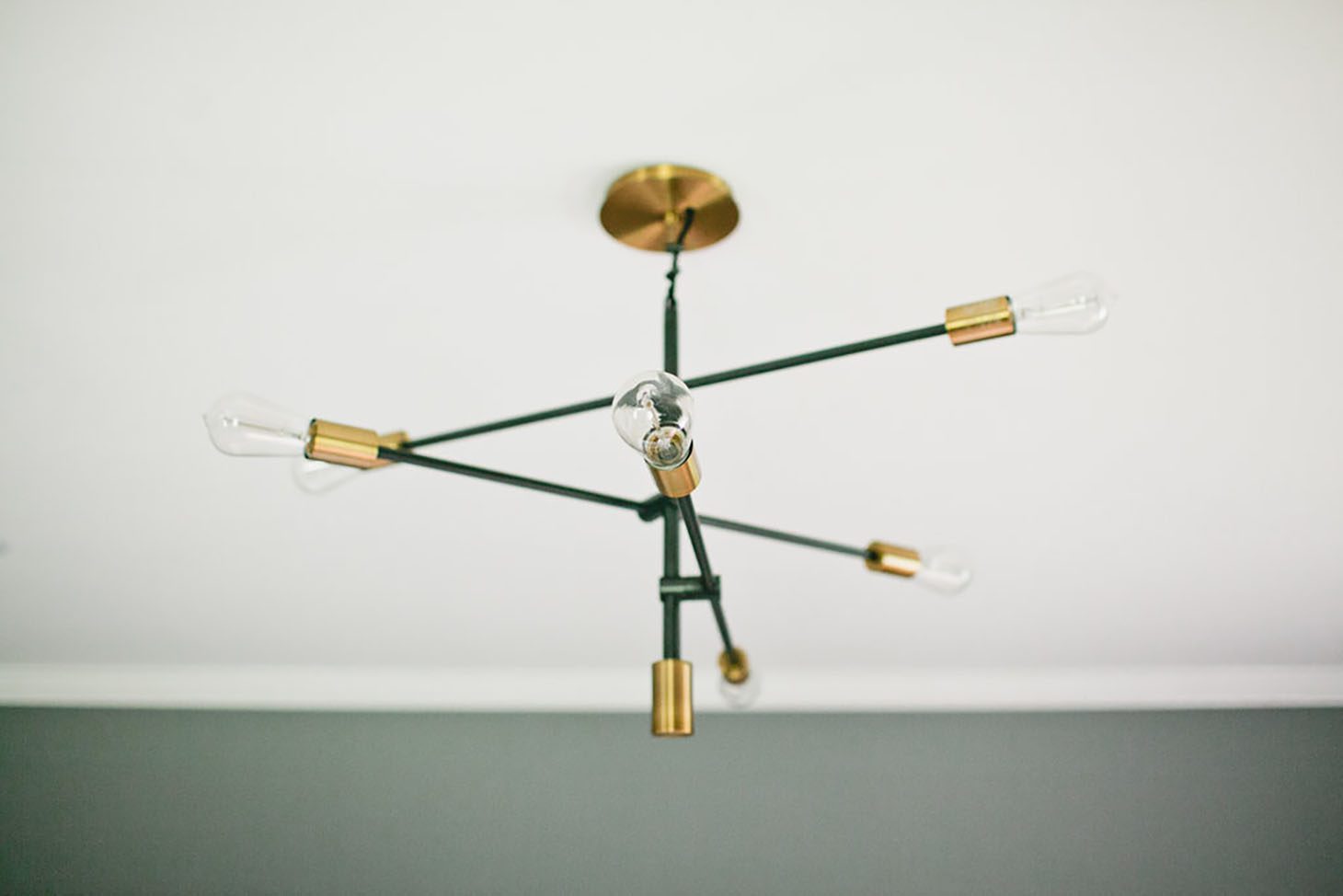
Lighting: Our lighting really helped give the home the modern, edgy feel we were going for. From our Parisian nightstand lamps to our black and brass gorgeous Living Room chandelier, to our custom desk lamp from Dylan Design Co. – we were more than pleased with all of our lighting selections! Oh, and our retro geometric Master Bathroom sconces from Shades of Light… all the lighting was pretty cool on this one!

I’m SO PROUD of you Veronica! This turned out absolutely STUNNING!! I’m seriously obsessed with ALL of the details!
What do YOU like the best about this transformation?? Make sure to leave your comments below!!
xo
Jilly


WOW this is a stunning transformation. I wish I lived in this beautiful home. Beautiful work Veronica!!
Hi Jillian,
Were can I purchase a “library” card cabinet that isn’t real expensive? I love them, but the ones I’ve seen are very expensive.
Thank you,
Joanne
The wood flooring and the beautiful kitchen are hands down my favourite! This is such a stunning place!
Gorgeous!! Can you tell me what product you used on the floors? I love them :). Thank you
I have been waiting anxiously to see the completed renovation. All I can say is stunning. Simply stunning!
I’ve been waiting for this! It turned out beautiful, I’m sure he loves it!!
What colour of white is the rest of the house for the walls?
Where did you get your kitchen table and chairs from? I need it on a smaller scale as my kitchen isnt huge. I love watching you and your family grow. Please keep your good heart growing and helping others with your platform.
Where does one find those fake plants?! I’m assuming they are fake! Does anyone know?
Such a gorgeous transformation. That flooring is beautiful !!!
This is one of the best uses of woven wood shades I’ve seen in a while! They go so well with this room and bring out the neutral colors perfectly. Also LOVE the light filtering roman shades. Hands-down one of the coolest living areas ever!
Hi Jillian, I love watching your magic on TV and your website is just incredible! Filled with amazing inspiration! I was wondering if you know which wood product this is? Thanks!!
Look so beautiful. I have a motivation to make more money to get it!
Jillian, I can’t believe this is the same house, Veronica did a wonderful job, I am sure he was pleased with the results.
I follow you, Veronica and Ali, I enjoy you all so much. Your home is beautiful, I have enjoyed the tour. Veronica did a great job with Ali’s home as well. You and Ali have a sweet family, now Veronica and Kris have their baby boy, how complete.
which brass/ golden door knob is it?
Where is the brass door knob from?
I love everything. I’m redoing our guest bedroom. May I ask what color paint you used in the bedroom? It’s beautiful. Love the big leather chair and ceiling light! Everything in there is beautiful.
Where did you purchase the storage bench at the end of the bed? I love and want one!
Love this space. What color/ stain are the floors?
Best blog nice!
I love it!
Best blog nice!
I’m especially impressed by the planks. It turned out great. Thks for sharing!
Beautiful sunroom! It’s spacious and love all the furniture in it, looks so comfy.