


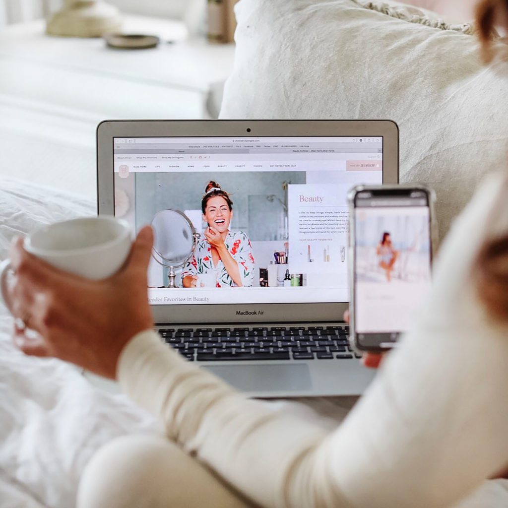
Hi everyone!! I’m sure by now most of you have had the chance to take a peek around our brand new website!! I have to say, I’m so extremely impressed with how everything turned out! It’s pretty crazy how a website and branding refresh can breathe so much life back into a brand!
I’m so thankful for not only the hard work of Team Jilly but none of this could have been pulled off without the incredible team from Tonic Site Shop!
All About Our New Website
To give you a little backstory, the girls and I had discussed a website revamp over two years ago … we sent numerous emails, compiled inspiration, and approached a couple of different companies to help us bring our vision to life. Well, with some additional back and forth, the months were passing us by and we felt what was being brought to the table wasn’t exactly what we were looking for.
Just as we were heading back to the drawing board about six months ago, we discovered the team at TONIC. We were immediately impressed by their stunning work and decided to hop on a call with them to toss some ideas around. Jeff and Jen were SO inspiring, creative, and out of the box thinkers. We were immediately over the moon with their ideas and vision and knew instantly that these were our people!
Jen got right to work and started sending concepts and fresh new branding our way … it didn’t take us long to give them the stamp of their approval, and we were off to the races! They did such a fantastic job bringing my personality, vibe, and aesthetic to life and I couldn’t have even envisioned our new site looking THIS beautiful!
So, now that you’re caught up to speed on our website makeover process and are familiar with the all-star team who created and executed it, I wanted to open this space up for the team at Tonic to provide YOU with some behind the scenes and valuable branding tips that you can apply to your own business if you have one … or, if you’re planning on starting one up!
PLUS … if you have checked out Tonic’s Instagram page (view it here!), you’ll know that they share some drool-worthy and stunning cocktails in that space, so as a little treat they’re sharing one here for you too!
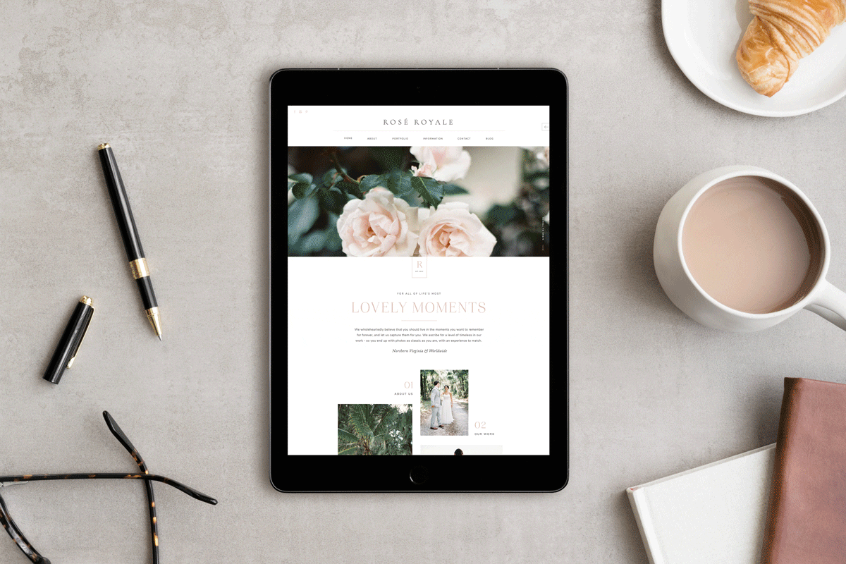
OH!! AND … Tonic has also generously offered to gift ALL OF YOU 15% of ANY design in their whole collection of completely customizable websites for the modern, stylish creative. The designs are all inspired by cocktails, which is so fun, and the Team Jilly favorites are the Rosé Royale, Amaretto Sour, and Limoncello! Just use the code TEAMJILLY for your 15% off.
Behind the Design + Tips from Tonic
Hello everyone — Jen Olmstead here! I’m the co-founder and lead designer of Tonic Site Shop (alongside my platonic design soulmate and fellow cocktail enthusiast, Jeffrey Shipley!) and I’m excited to walk you through the behind-the-design of Jillian’s new site!
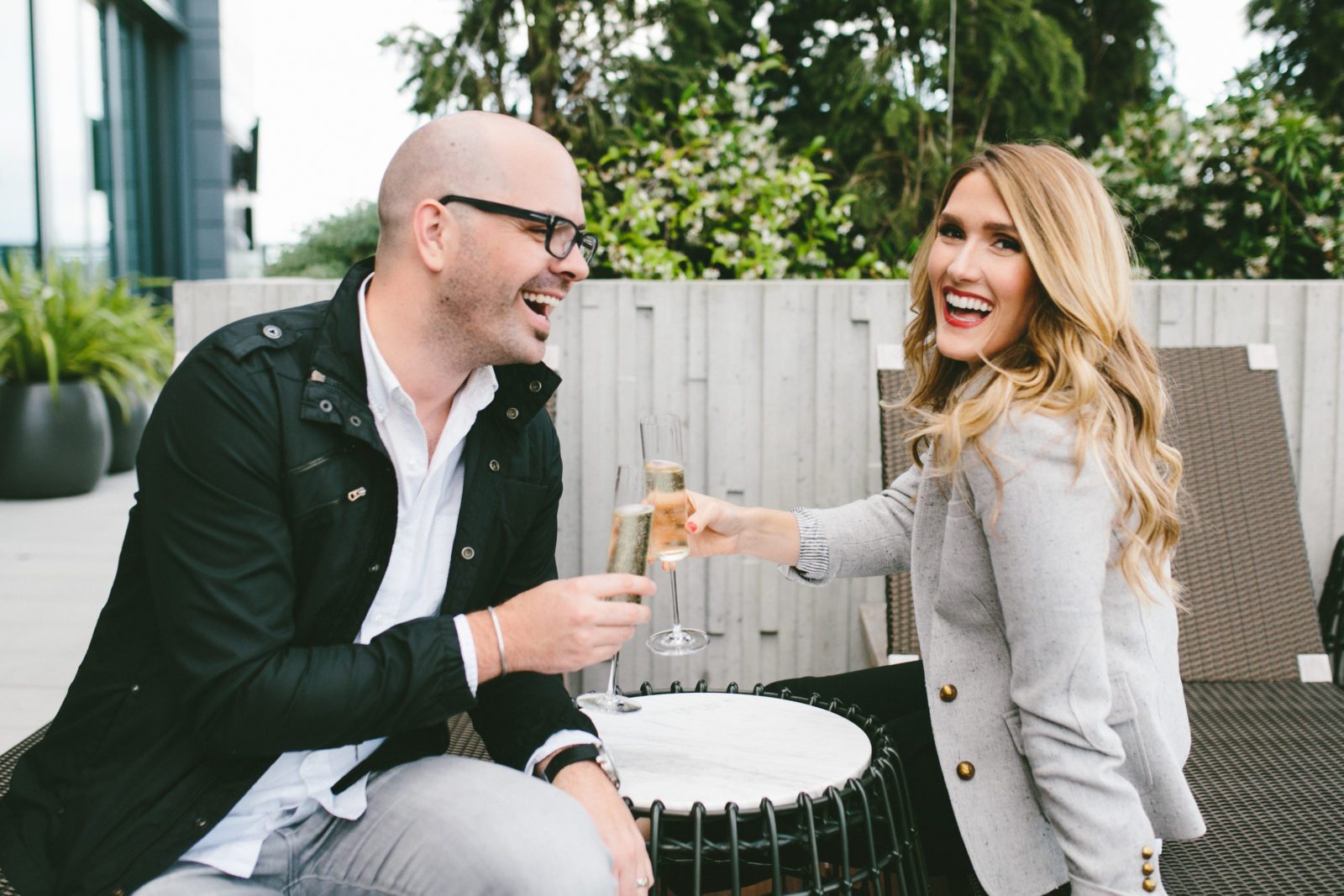
Jeff and I in our natural habit (cocktail in hand)
But first, how it all began: I was in Paris to speak at an event, having dinner near the Eiffel Tower (le sigh!), when halfway through yet another perfect baguette, my notifications pinged with an email… from Jillian Harris.
I nearly choked on my baguette, and as in all exciting situations, immediately texted Jeff. “Wait. Is this THE Jillian Harris? Am I really in Paris? IS THIS ALL A WEIRDLY VIVID AND DELICIOUS DREAM?”
Thankfully for both my sanity and my Parisian carb consumption, it was not a dream, and Jillian’s initial email couldn’t have been more gracious (of course!). She explained that Team Jilly was looking for a team to create something different online — a space where her readers and longtime followers would immediately feel at home, get to know her better, and have access to much more content than her old site. They’d seen our site shop and designs for other industry creatives like Jenna Kutcher and liked our style… were we interested in the project?
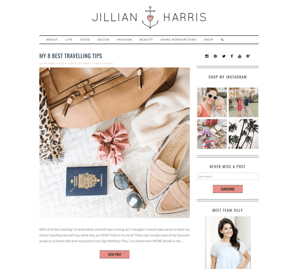
The homepage before, where you could only easily access the last 5-10 blog posts.
“WERE WE INTERESTED?!” Uh, yes, as you can imagine, we were! We quickly nailed down a timeline and logistics, Jilly’s team sent over their very well-curated collection of inspiration for the site and brand, and we hopped on a call to begin the project shortly thereafter.
Let’s interrupt this story with the first few of our tips from along the way:
Tonic Tips for Branding + Site Design:
1. Do your research.
When starting a website or branding project, or really, embarking on any project with any creative professional, first, take a deep dive through their portfolio and make sure they’re creating the kind of work you want for yourself. It sounds obvious, but if you don’t love aspects of what they’ve created for other people, you may not love what they create for you! Even a great designer isn’t the right designer for every project.
Also, do your research on your *audience.* Before you begin your design project, you need to know who you want it to reach. Your website may feel like it’s about you, but it’s really about who you’re hoping to serve, and ensuring your new site allows you to serve them well. The more you know about WHO you’ll be serving, where else they spend time online, why they’re following you, and what they want in a new site, the more you can tailor the end result exactly to them!
2. When you start with intention, you create with purpose.
Because Jilly’s team had spent time carefully curating inspiration that they loved AND made sense for the direction of the Jillian Harris brand, we were immediately able to understand the visual narrative they wanted to convey. Otherwise, it would have been MUCH harder for us to nail the visual look and feel of the site. Before you begin your design or branding project, spend time curating specific inspiration of how you want it to look AND feel — and make sure the inspiration isn’t ONLY from other websites! It can be anything, from living spaces, packaging, magazines… heck, we’ve designed a website based on a soap package we found at a boutique in Seattle and one from two pages I saw in a Greek inflight magazine!
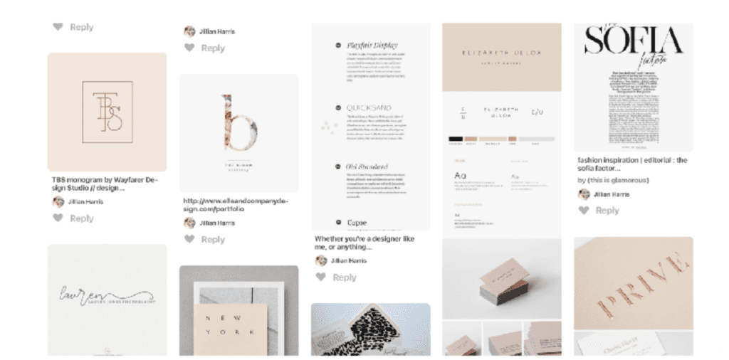
Some of the brand + site inspiration
Okay, back to our story. Here are a few of the BIG things we determined in that first call:
We wanted to create a space that felt like a natural extension of Jillian’s personality and brand… that didn’t feel “new,” but more like the website, she was always supposed to have. We were hoping your first reaction would be, “Oh, this feels just like Jilly!” To do that, the site needed to be warm, welcoming, clean, sophisticated, feminine, and above all, VERY easy to use on both desktop and mobile. We even wanted to keep aspects of her old logo (the little pink heart, and the J!) so it didn’t feel ALL-NEW.

The new Jillian Harris brand
Jilly’s shop was always accessible on her site, but it didn’t feel like an “experience” where she’d personally picked her favorite things just to show you! Now it’s easy to navigate through all of the sections of her shop, and get to her favorite things, collaborations, AND featured brands (how cute is the little maple leaf to indicate a Canadian brand!), and (we think) it feels like you’re browsing one of your favorite online stores.
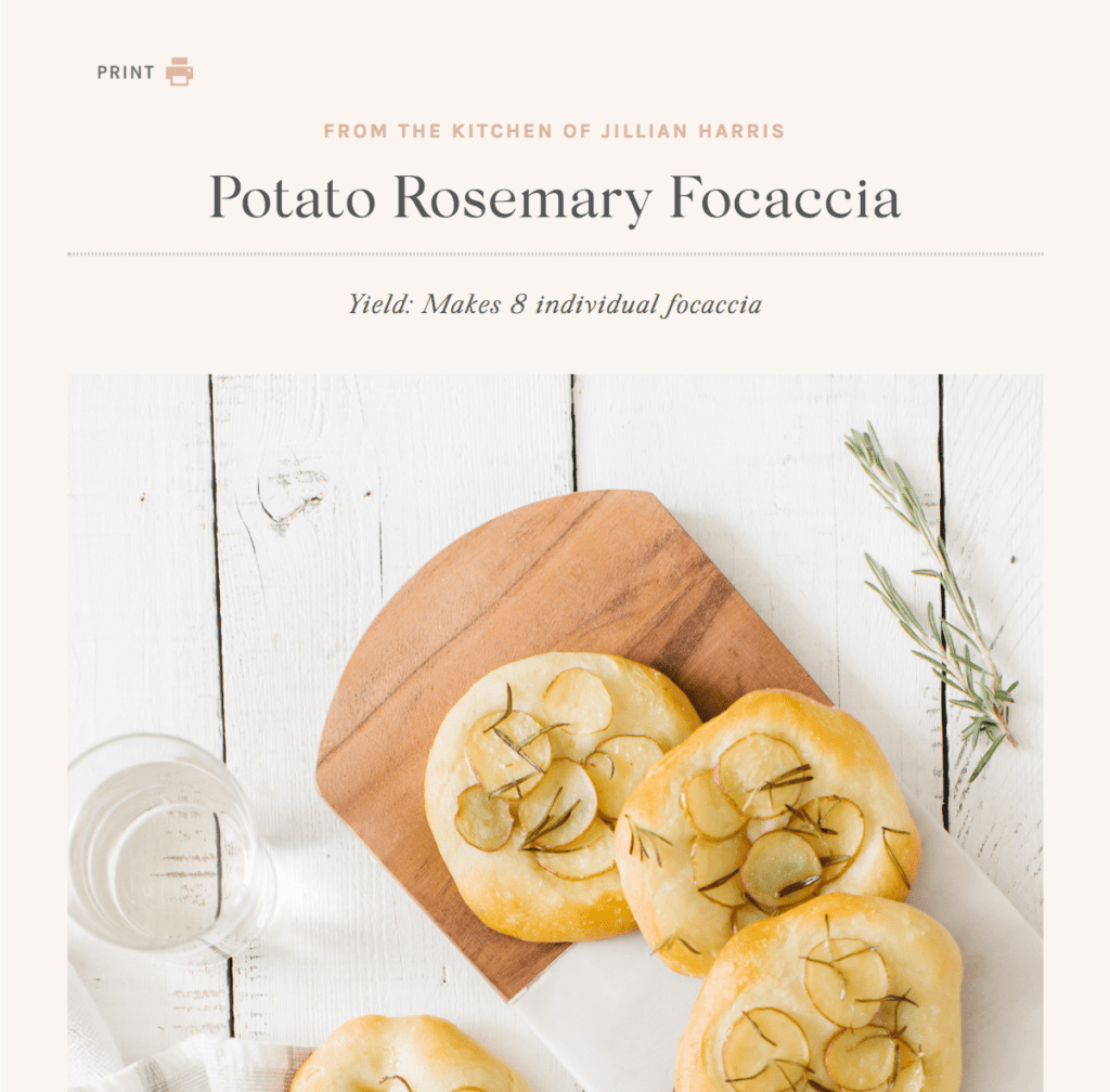
There are SO many great recipes on the site, but there wasn’t an easy format to browse them all and easily find what you wanted. Now the new FOOD section is way more user-friendly, and there’s even a really cute recipe design… from the Kitchen of Jillian Harris!
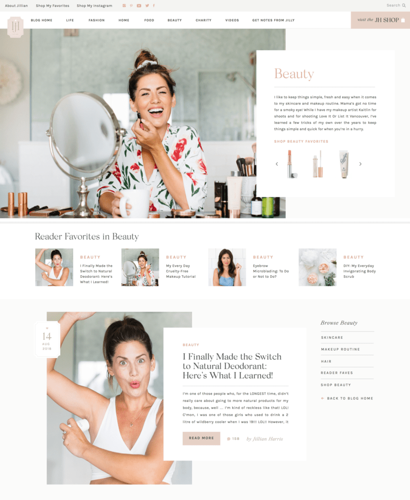
Lastly, we wanted each category page to feel like it’s own little mini-site, with a welcoming note from Jilly, her favorite shop items for that category, and all of the posts, plus a handy little “sticky” menu to navigate further.
So, we had our objectives in place (not listed: approximately 300 other ideas, because #teamjilly is on the ball, you guys). As we dive into the results, let’s do a few more tips, starting with a biggie:
3. It doesn’t matter how pretty it is if it doesn’t *work.*
Whether you’re redoing your website or your living room, think about the way visitors will interact with the space, how they’ll browse, and what they might be looking for. In design, we call that the “UX,” or the user experience. We spent so many hours testing the site on mobile to make sure it was a good experience, because, hey, most of you are reading this on your phones! And on both desktop and mobile, several things I’d designed originally CLEARLY didn’t make for a good user experience when tested… we actually designed a totally new Shop menu (seen below) only a few days before the site was finalized! Lesson? No matter how nice something looks, the moment you’re annoyed with the way it works (or doesn’t), you’re taken out of the experience. Pretty can’t fix that. 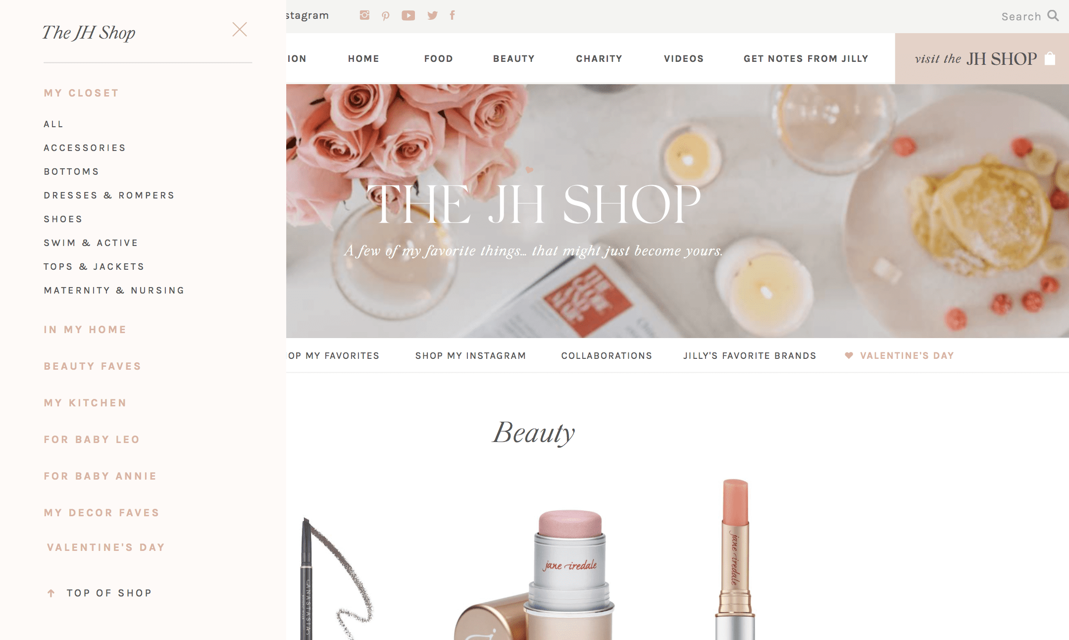
4. Accentuate your best assets.
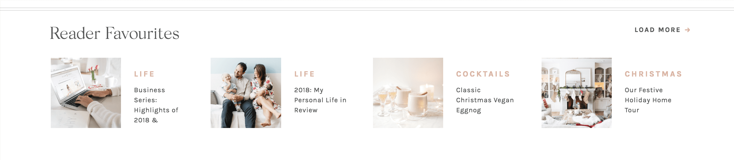
Jillian had over 9 years of incredible content on her site, and a lot of it was BURIED. We created the “reader favorites” section on the homepage and in every category so you could easily find some of the best posts you might have missed, and new visitors could easily get an idea of the kind of great content Jillian and her team create. When you sit down to create something new, start with the things you want people to see first — whether that’s a great chair in a room, an accessory in your outfit, or an area of your site — and make sure they’re actually the most accessible!
5. “People don’t buy goods and services, they buy relations, stories, and magic.” — Seth Godin
That’s one of my favorite quotes from branding genius Seth Godin, and basically, it means that people care about people (and their stories). There are a lot of blogs out there, and chances are if you’re reading this one, it’s because you care about Jillian and her team. That’s why we tried to put much more of THEM into this site… Jillian’s old about page was cut and dried: a short bio, photo and a quick mention of her team. Her new one has fun facts, some of the posts highlighting big moments in her life, Nacho, Peaches, Justin, and LOTS more about the lovely, hardworking ladies of Team Jilly. We poured as much personality as we could into every little aspect and area of the site so it would all feel like a natural extension of her brand, and you’d feel welcomed here by Jillian herself. Don’t forget: people care about people, so tell a good story (you’ve got one, we swear!) and create some magic.
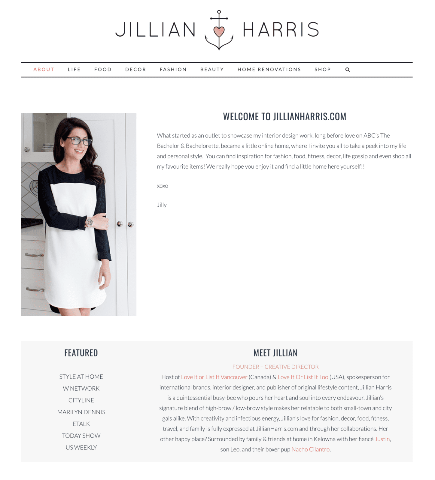
Jillian’s About Section Before
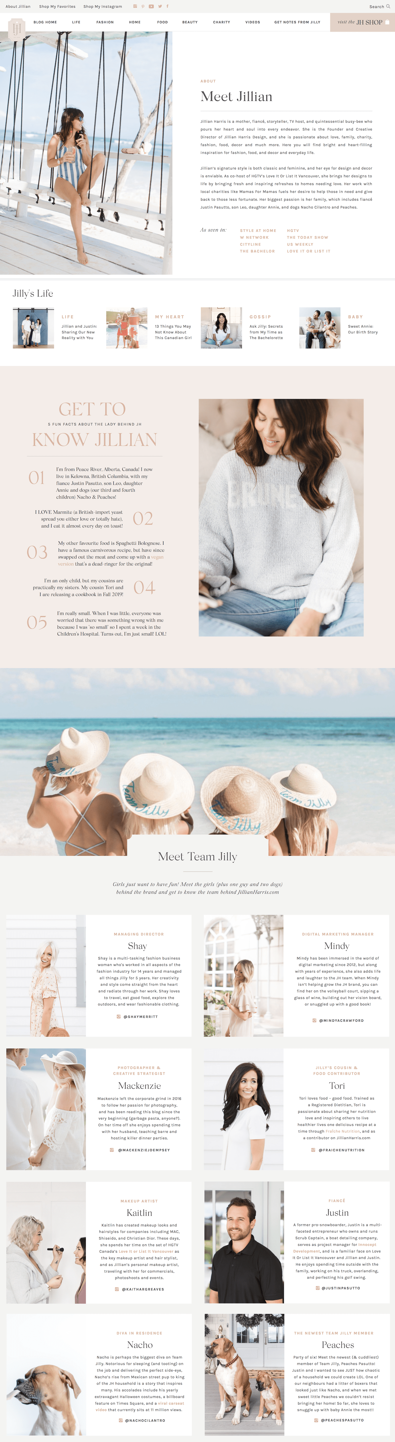
Jillian’s About Section After
What a fun before and after, huh? With that, I’ll close this little peek behind the website design curtain for now (comment if you have any questions!), but we hope you’re enjoying the new site we’ve all worked so hard to create for you! If you have any feedback or suggestions, we’d love to hear them, so make sure you leave us a note in comments! Otherwise, we just want to know – what’s your favorite part of the new site?
Lastly, as promised, here’s your Blood Orange Gin & Tonic recipe on us (just right click or tap to save it!)
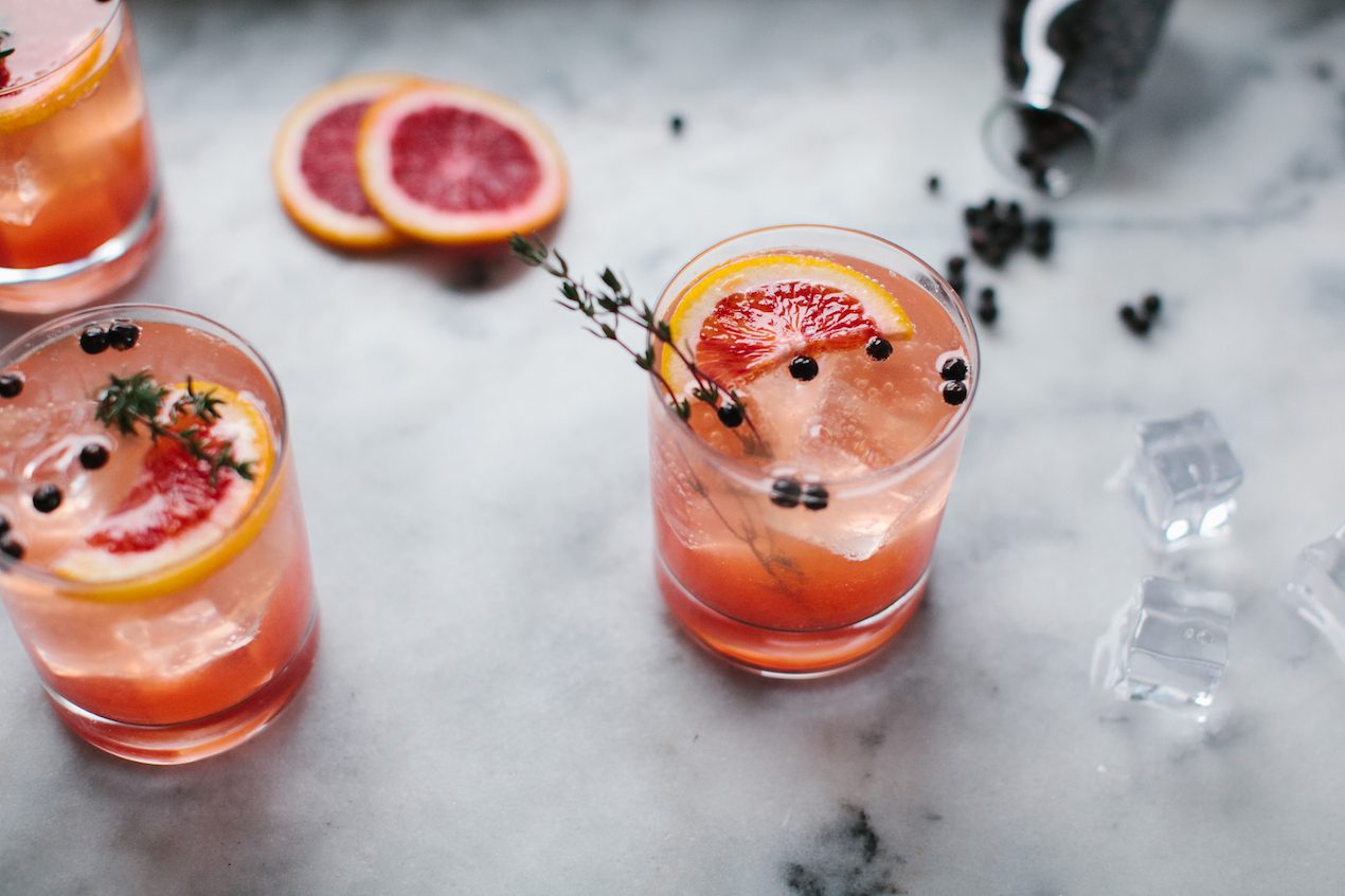
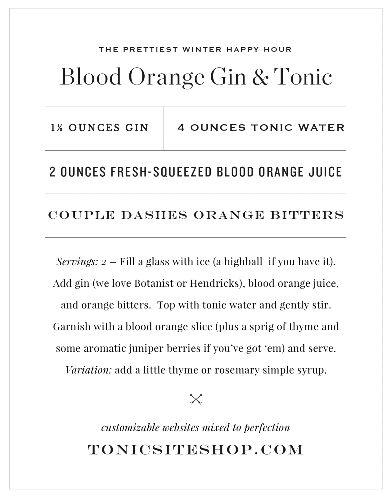
Cheers to You!
There you have it! I hope you were able to get some key takeaways from this blog to apply to your own biz! Don’t forget that Tonic is offering 15% of your any design in their collection of customizable websites for the modern stylish creative with the code TEAMJILLY, so make sure to take advantage of this incredible deal if you’re in the need of a stunning site refresh! Click here to visit their site, and tell them I sent ya!

I’m so, so, SO obsessed with the new site. It’s so visually appealing, very easy to navigate and it truly does feel like the website that Jillian not only should’ve had, but totally deserves to have! I can’t even pinpoint my favourite thing about it, because every detail, big and small is just remarkably well done. – Maybe it’s because I’m a graphic designer myself, but I’m totally aware of how complex this website must’ve been to build and to think of how well organized the site is now, is extremely impressive – I’ll absolutely be coming here for inspiration in my own designs. Congrats on the new site!!!
I love the new site, especially the little details (like the hearts that are sprinkled throughout with great care!), and your team page. I think it’s such a lovely representation of Jillian’s personality and the team’s cohesiveness that each person is showcased in all their radiance. Well done!
Genius as always, Jeff & Jen!! Love this transformation!! Xoxo!!
Awesome useful post. As we’re a startup and looking brand our business, here I got great useful tips to implement in our website design and marketing. Since our website is in under construction developed by a leading website design agency in Sunshine Coast, here I got useful tips to brand our business. Thanks for sharing.