Gooood morning loves!! This is one of those topics that I get asked about on a daily basis … HOW do I possibly create a cohesive and “pretty” Instagram feed with all of the craziness and business in my life. SOOO .. I have asked one of my favourite influencers, social gurus, and Instagram accounts to follow, to share her secrets with ALL of us. Erin Sousa, Founder and Creative Director of Sparkle Media is sharing how YOU can create a cohesive Instagram feed in 5 easy steps. Grab your cup of joe and let’s get right into this! Take it away, Erin!! …
Hey everyone!! Erin here!! Who doesn’t spend a solid chunk of time on Instagram?! I’m SO guilty! Not only does Instagram keep us inspired on the day-to- day, but creating an amazing Instagram feed can support your business and create exciting opportunities! Whether you’re building a personal brand, or a product/service-based brand, Instagram is a connector – I’ve learned about so many amazing products and met wonderful, like-minded people to not only be inspired by but in real life as well!
Over the years, and as my business, Sparkle Media grows, I’ve fallen in L-O- V-E with creating content – I not only produce content for myself but other businesses as well! Instagram really is such a powerful tool to reach your key demographic, and build an engaged community, and you can use an instagram statistics to calculate the progress you are making. The process can be a fun, creative exercise that incorporates your vision with styling, photography, and editing. To me, it really is a new art form! So, how can you get your brand to feel as authentic as you know it is while shining brightly and standing out? I’m sharing my pro tips for getting those #feedgoals locked down! Many people ask me how can I manage my customer base, I recommend CRM software click here to read more.

1. YOUR WHY:
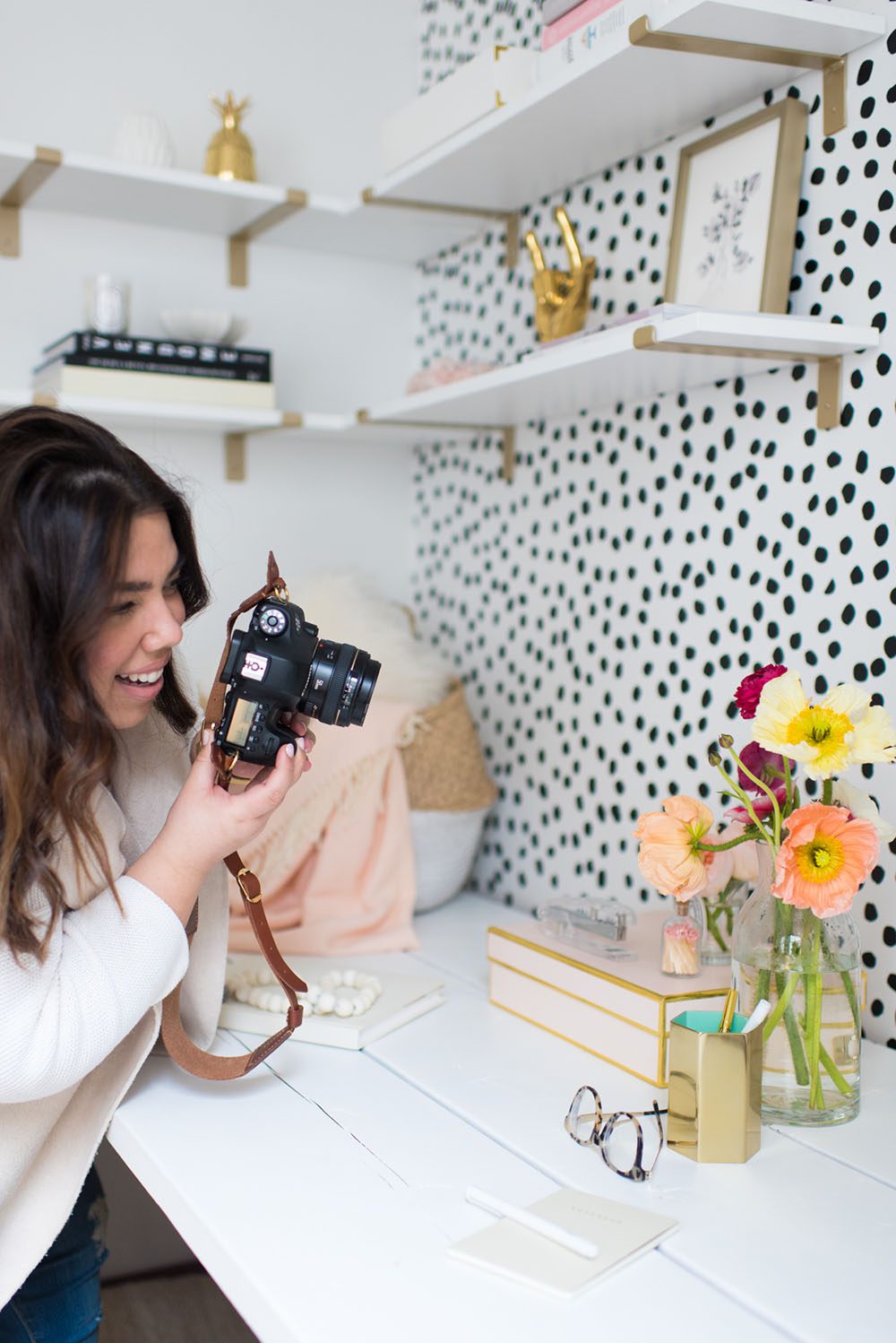
I always like to start with the WHY – what is the reason for the brand. What is the product, the end goal, the reason for being? This is a guiding light. I remember hearing long, long ago (ok, like 4 years ago), when Instagram first started picking up steam, that a post should do one of three things: inspire, entertain, or share information, and I use that motto to this day when I create content, captions and share images. This is an excellent place to start.
2. STYLING:
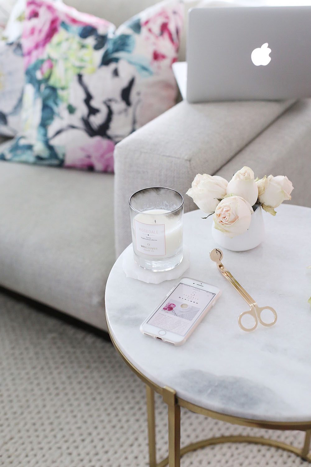
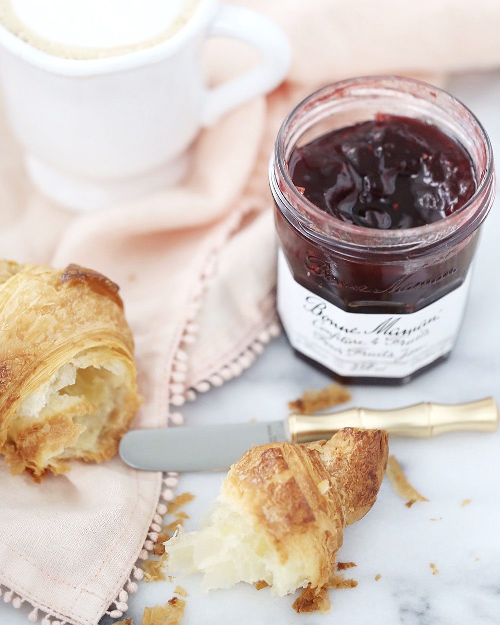
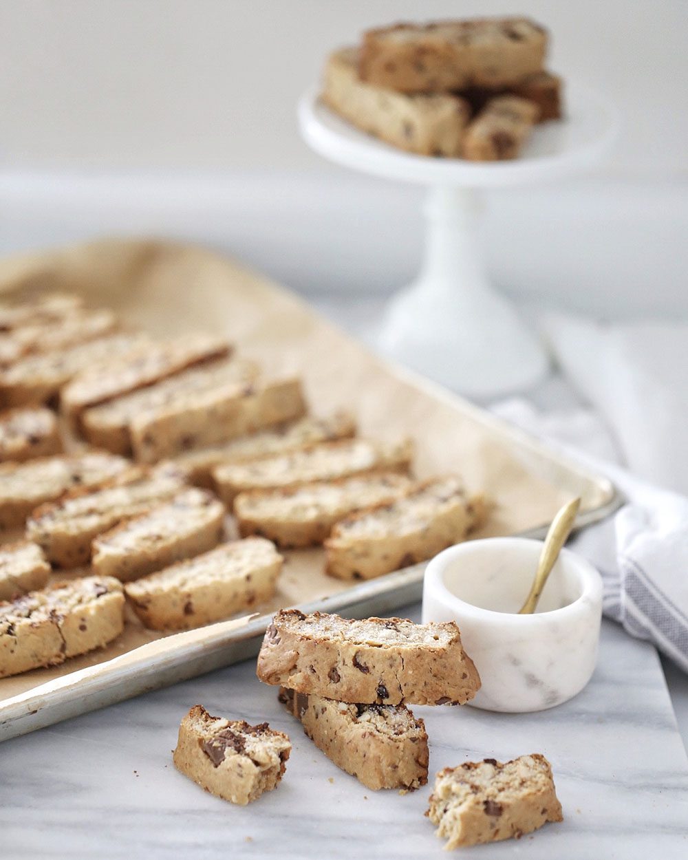
Picking an Instagram lane can seem daunting, but it will come naturally as you progress. Your content is based on your life/product, but also your taste and what you surround yourself with. All of these variables play into the style of your Instagram. Colours, angles, and mood all dictate how your style is defined, and if you are portraying a brand, this is even more important.
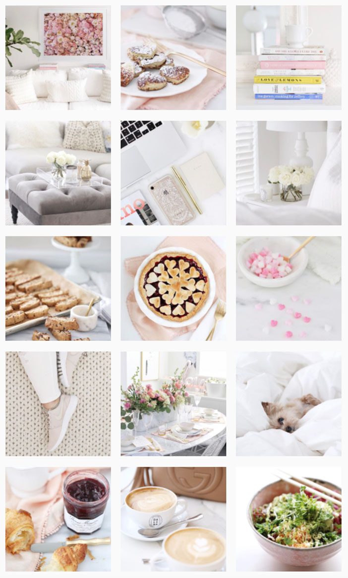
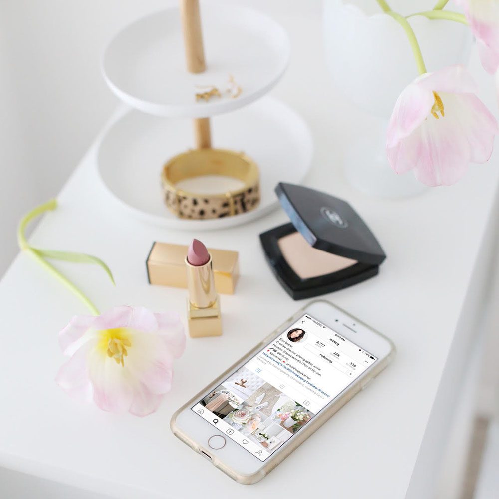
The best feeds have a recognizable colour feel at a glance! This is what draws you in and makes you want to stay around for more. If you look at my feed, you will get a feel for what my brand is – bright, with shades of white, blush, and pops of secondary colours. Creating content is what you make it! On-the- go shots on your iPhone can be just as successful as those shot with a DSLR (I love my trusted Canon with a 50mm or 100mm prime lens!), but you’ll want to make sure that you edit it to fit in with your feed.
3. AUTHENTICITY:
One thing I must mention – don’t allow fitting into a specific “style” to take away from your authenticity. It’s easier to keep consistent on Instagram when it’s your true vision! Making it too forced will take away the fun of your expression!!!
I like to have specific content shooting sessions to get a few visuals taken care of – and hey, sometimes we have those “doin’ it for the ‘gram” moments, which are all about getting that over-the- top styled moment, so just get creative and enjoy the process.
EXTRA TIP: Shoot plenty of images at different angles and perspectives during a sesh so you can bank them for later.


4. EDITING:
So, you got the shot, and now you need to get it all sparkly and ready to post. Keeping in mind your chosen ‘brand’ colour palette, editing apps on your smartphone will be your BFF for this. Some of my faves:
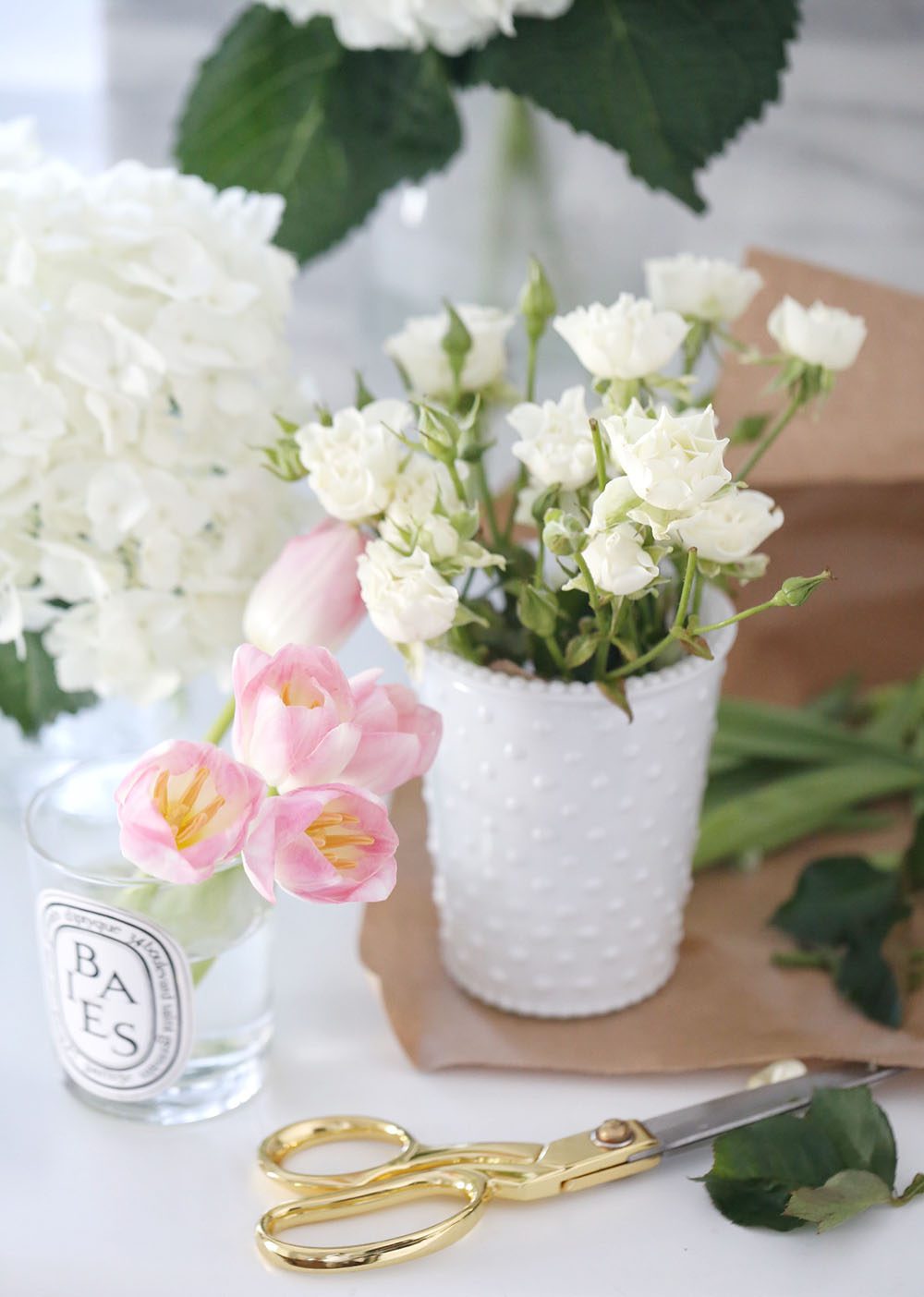
Snapseed: Ideal for brightening, colour correcting, getting the white balance right, I like to take off the yellow cast my iPhone shoots with which can throw off my entire feed (the struggle is REAL!).
Pic Tap Go: (I know Jilly LOVES this one, too!): The filters (props to “Lights On”!) give your image a boost, and can be amped up or dialed back for effect.
FaceTune: The best for removing imperfections like lint on clothes or surfaces or adding specific detail/brightening to only certain parts of a photo (that white tablecloth or flat lay, I’m looking at YOU).
5. PLANNING:
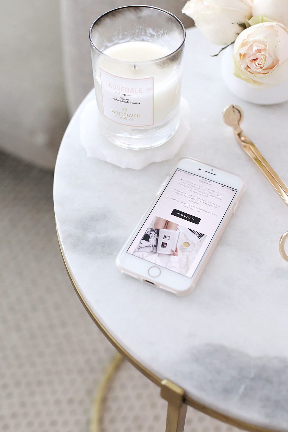
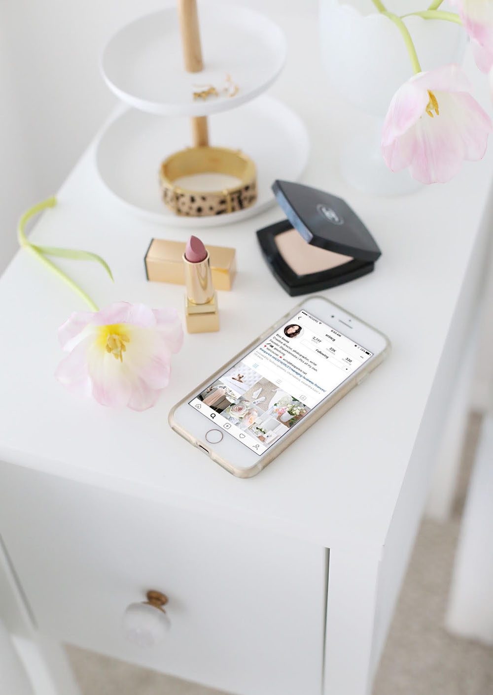
Oh, that elusive FEED GOALS moment! I used to map out content in a Word document for my clients (the horror! But, seriously, it was so. Much. Work.), but now I plan ahead in Planoly (I know Jilly uses this too), a useful web, and app based Instagram planning tool! I always start by keeping the brand style in mind, like we covered above, and considering what’s appealing to my instincts. When I’m planning a feed, I like to make sure that the perspective and type is mixed up, so wide shots, details, people, and fun quotes are laid out in a cohesive way – shots in the same perspective or category next to one another or above one another should be avoided. This can get a little tricky when you have to post something that is time sensitive, and it’s SO easy to get super picky and in your head about it, but go with your gut, try new things, and see what works! Remember, Instagram is supposed to be a little bit of FUN, yes? You can always delete a photo that bugs you and sticks out like a sore thumb in your feed later!
So, what kind of Instagram feeds are you most drawn to? I would love to hear from you in the comments! Until next time!
XO

How timely! My daughter and I are trying out a new Instagram page for her creative side.
How do you get the swipe up effect?
Thank you for the tips on the apps.
J
Thanks for the tips. Do the 3 apps you mentioned is in the iphone7?
My favorite feeds are desserts and scenic pictures. I think the apps will improve my etsy posting.
Have a great day
Lufianti
Love the tips, Erin!! ?
Lot’s of great tips here! Thanks so much for sharing Erin! I really enjoy your instagram feed! 🙂
I love feeds that inspire me, post various types of content, and that make me feel connected to the person behind the feed! 🙂
Just watched your instagram video….Renos can be so stressful! We went through it one year ago. I can’t imagine a whole house being redone. Anyway, the white kitchen renos that you’ve done on LIOLIV inspired me to go white with our kitchen reno. I love it! It’s bright and will never go out of style. What about doing a very, very light grey island, with white cabinets? Paint is cheap, you can always change that. The paint colour I chose for our house was Benjamin Moore Revere Pewter, and we love it! You’re the designer, but those are the colours I chose and am ecstatic with the results.
Erin is an Instagram master, that’s for sure. I like ‘pretty’ feeds, but if the colour palette is too limited it feels like there’s no life in it. Erin is really good at keeping her feed real, but I think some people get caught up in the white-blush thing and it gets samey and boring. I’ve been following lots of travel-themed instagram accounts lately and they can be super colourful which I love, and mine is quite travel/expat life these days, so lots of outside shots. When I was in journalism school and learning about running magazines, one of the things our instructors mentioned was thinking of 50-100 content ideas at a time to make sure you won’t run out topics – I think you have to do the same thing when you’re planning an IG aesthetic. Can you do 50 images in only light grey and pink? Will it be interesting? It is possible I think about these things too much…! 😉
Can you please give me feedback on my instagram post at : lufianti_handmade_cards? Greatly appreciated.
Thanks
Some very good information here. I find that I am always drawn into feeds that are light and bright, however, in my home I always lean toward dark, rich color. So in my mind I am thinking, which do I need to go with? Confusing …
I think I finally found my theme and I’m like 6 pictures in, I do love a cohesive feed but it took me forever to find my grove. This post is really helpful and I recently followed you on IG and I’m in love with your aesthetic.
xo
Pinksole
I love this blog post! My brand is very colorful and its tricky to have a cohesive look because I base the posts by scents we make and all the packaging are different colors. I try to do themes. I always dream of having an Instagram feed how you explain with soft pinks, greys and whites but that just isn’t my brand. Any tips? Thanks and Best
Victoria England
Tulip
Here is a silly question how do you shoot the phone with everything else looking so beautifully. I try and its like one or the other is focused or dark
Monic
Love the pictures!
Most people get it wrong focusing on how it all looks, but it’s also about the strategy. I use Plann (have you seen the app? It’s awesome!) to make sure I get my strategy just as good as the images.
Thanks for the tips:) Just downloaded Planoly and I’m pumped!
xoxo
Hollyn
Hi there! You have so nicely explained everything! I was having a crazy time thinking what to do to make my feel cohesive. Honestly speaking I still don’t know what and how I want my feed to look… many because it’s a travel related & every place, every architecture, etc are so different from each other…
Hi, I’m planning to open a takeaway food…can you help?
Thanks
Edward
Choose one of our different work plans to suit your website and budget and start watching your website’s rise step by step!