Cindy and Chris had a townhome with big-house feel but the rooms were terribly dysfunctional thanks to some dated design choices (like a corner fireplace in the front room and a tight u-shaped kitchen). Cindy and Chris needed room for the extended family and friends to enjoy the home – nothing that couldn’t be fixed by the Love it Design Team!
The tiny u-shaped kitchen was located at the back of the house, in a large space but with a split personality: kitchen and family room with a little art studio in the corner – oh, and the dining room was at the other end of the house – it was DYS-functionality at it’s best! We called on our friends at Merit Kitchens to help these homeowners out and together we designed a modern chef-worthy kitchen large enough to have the whole extended family cook together!
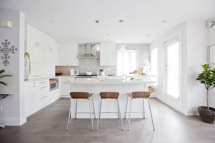
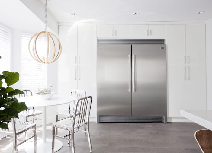
Did you see the side by side fridge and freezer?! Now with a generous island with seating and an eating nook for small gatherings, this kitchen satisfies any host and hostess’s dreams.
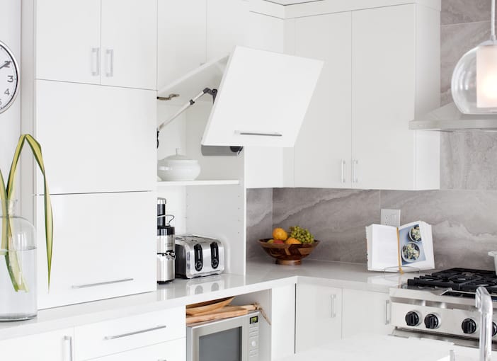
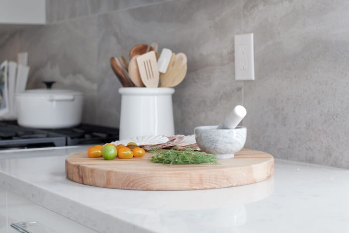
Also key in this kitchen design was getting all the small appliances off the countertops – double “appliance garages” did the trick here and finishing them off with stylish chrome cabinet pulls from Emtek – it’s now a pleasure to pull out the blender!
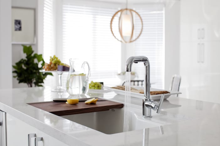
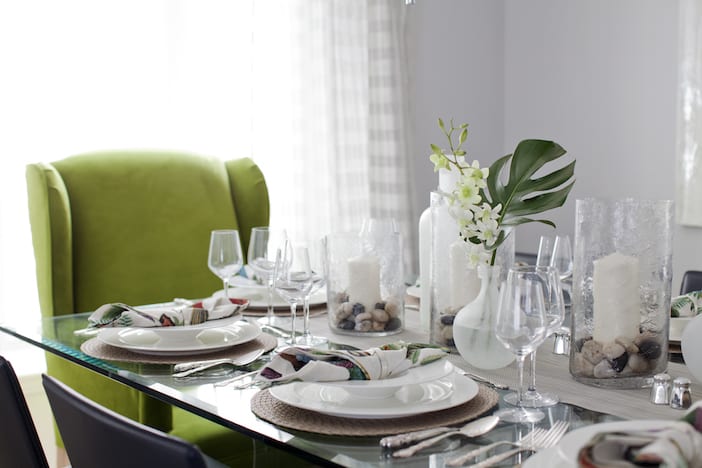
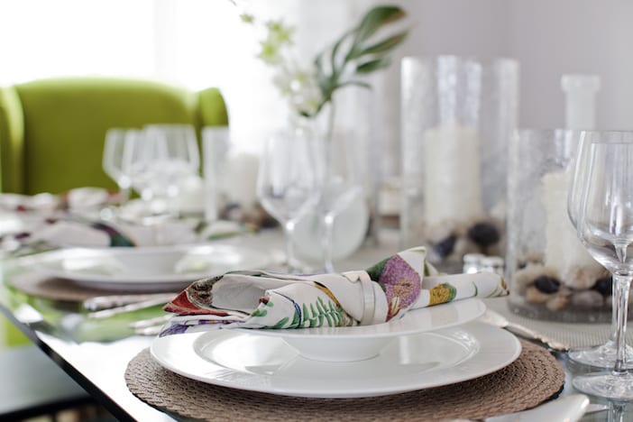
Relocating the dining room so it is now adjacent to the kitchen was also critical, we re-used their stunning glass table and upped the room a notch with grass-green upholstered king and queen chairs – statement pieces in an otherwise neutral room.

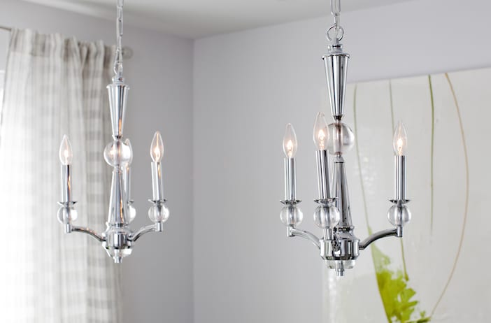
Design Lighting supplied us with elegant twin chandeliers for the dining room – a touch of traditional in with the modern keeps things from looking too cold.
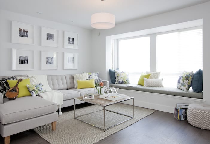
And, finally, the living room – we relocated this as well back to the front of the house where it belongs (having removed the dated corner fireplace which had previously prevented a sofa going anywhere), this space feels elegant but still welcoming with neutrals playing a lead role, punctuated by Cindy’s favourite grass-green colour and complimentary touches of blues and purples.
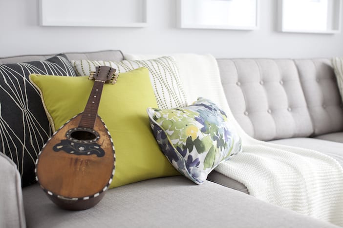
The spaces in this home now work together, flowing easily from one to the next and each is large enough to function as well as enjoy – whether it’s cooking in the kitchen, eating at the dining room or relaxing in the living room – they are all roomy yet cozy and certainly welcoming.
A big thank you as always to Janis Nicolay for the gorgeous photos!!
Visit the W Network for more on this Love It Or List It Vancouver episode! To watch the full episode, click here and for more before and after photos, as well as a full resource list please click here!!!


So pretty! What is the paint color?
I love those appliance garages so much that I want to design a kitchen solely to incorporate that detail! I also really love the couch and am in the market for a new one. I don’t see the resource list up for this episode yet, but I’ll check back!
What is the living room wall paint color?!
Where is the sofa from?
I would also love to know! 🙂 Beautiful space.
Great question! I’d love to know as well!
Great episode-as always! I cannot believe they listed it…it is STUNNING Jillian!!! Fabulous job
Oh and can we just talk about that appliance garage~brilliant!
Hi Jillian, where can I get the tiles for the kitchen backsplash? It’s not on the resource list. Thanks.
There’s no resource list to be seen on the website