I absolutely loved working with Lorraine & Geoff on their bare bones home that had a ton of potential for improvement. It had the cutest most out of date kitchen I’ve ever seen … something I like to call “country chic” lol!! But … it was in a great neighbourhood and had an amazing view onto a gigantic park. Their choppy floor plan of course wasn’t ideal, which for me was on the top of the list to fix for them so that they would both fall in love with their house again.
It was extremely unfortunate that we ran into so many issues and weren’t able to tick off all of the things from their list. BUT it is amazing what a simple open concept can do for a home. It’s the first thing that they see when they walk in and the room where they spend the majority of their time. How could they not LOVE the bright, light, fresh, and airy transformation that I managed to pull off!?!?! Yes, an ensuite and laundry room are also both important rooms in a home … but with a quick coat of paint and a few fixture changes you can spruce it up enough to make it worth staying.
I have to hand it to Todd though. He managed to come through and find them exactly what they were looking for. A brand new house with an open concept kitchen and an amazing ensuite. The only thing lacking was the back yard privacy. He really did take me for a run for my money. I want to wish Lorraine & Geoff all the best with their gigantic house warming party that they can now throw. As well as all the best at raising their grand kids in the amazing park just steps away!!! Sorry Todd, what’s that now … 2 – 1?!?!
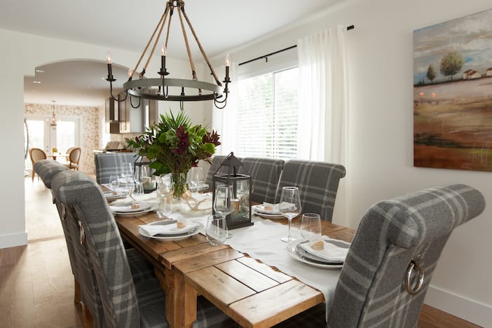
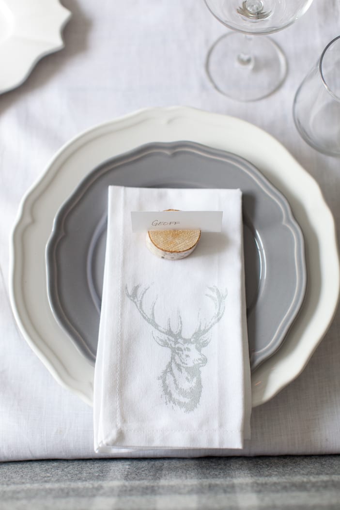
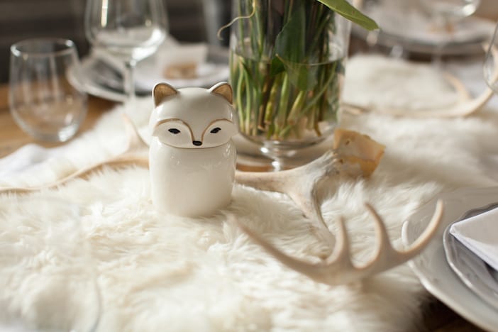

The hardwood floors that we chose to use from Mercier Flooring completely transformed the space. They lightened everything up and tied in the nod of country chic that they had in their kitchen previously. We continued this flooring throughout the revealed spaces so everything was consistent.
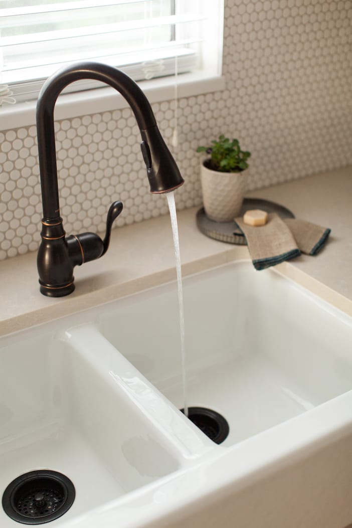
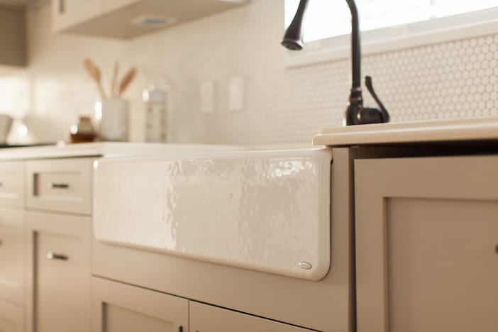
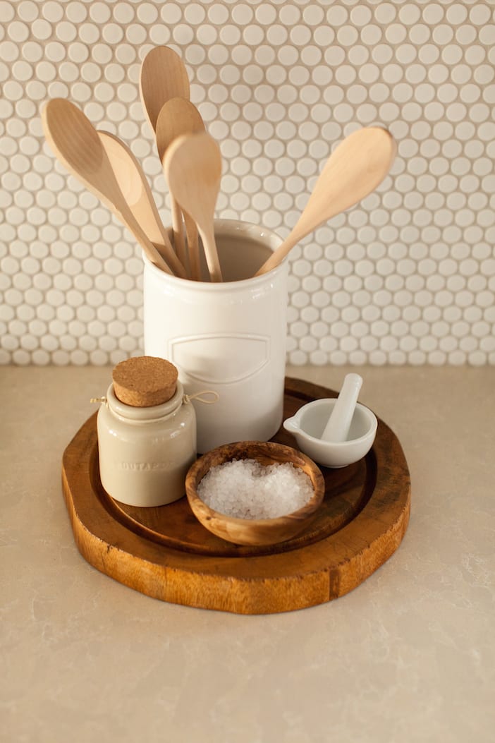
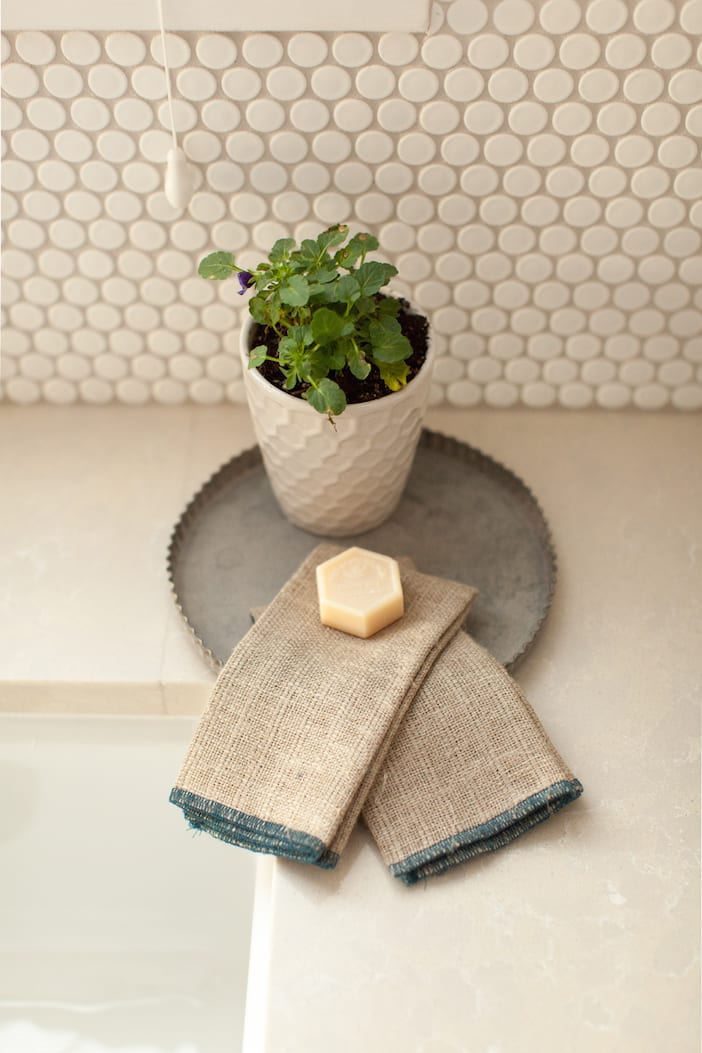
I absolutely LOVE these Silestone countertops and they immediately came to mind as soon as I saw their periwinkle blue ones. I tend to always lean towards a lighter countertop if I want to achieve a bright and fresh space. It is very RARE that I use a dark countertop.
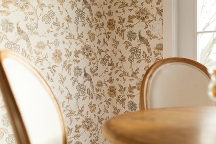
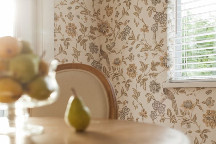
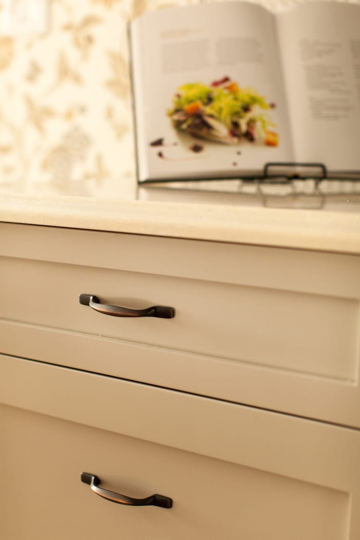
I always like adding in a feature wall of wallpaper to a space … whether it’s the laundry room, the bathroom or even this kitchen nook!! It adds that extra bit of spunk and colour but still keeps things classy and casual. It transformed the space into feeling homey and eclectic. We found this amazing neutral and subtle gold pattern at Crown Wallpaper.
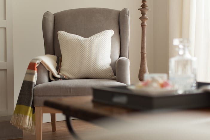
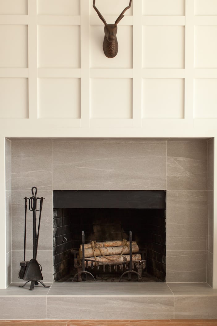
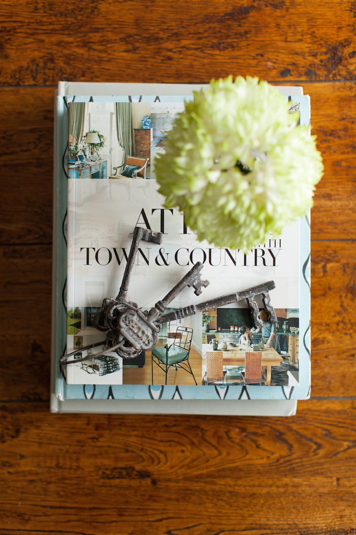
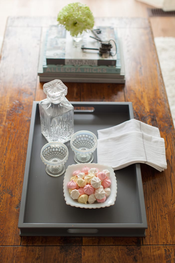
A big thank you as always to Janis Nicolay for the gorgeous photos!!
Visit the W Network for more on this Love It Or List It Vancouver episode! To watch the full episode, click here and for more before and after photos, as well as a full resource list please click here!!!
See you all next Monday night!!!
xo
Jilly


Beautiful! I seriously love all of your designs!
Love!!
Lovely to look at, wonderful to hold, stay in this one, on J’s design, be sold!
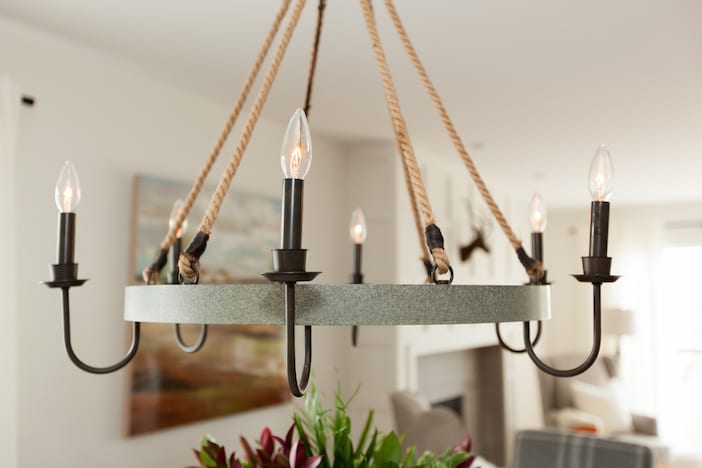
Could you share the source for the dining chandelier? Love the mix of rope and metal!
Lovely!! Would you share what color the cabinets are? Thanks!
I would also be interested to know where you got the dining chandelier from? It’s magnificient!
Hi
can you tell me where dining chairs were purchased?