Violet & Rob have a townhouse in one of the most coveted neighbourhoods in Vancouver – one block from the beach and park and a five minute walk to a bustling street full of trendy shops and tasty restaurants…but their split-level townhome had them running for the hills – the kitchen was too cramped for two avid cooks to function and the stairs blocked a lot of the natural light from the skylight. Jillian and the Love it Team had some solutions for this tiny but charming renovation.
Merit Kitchens was the go-to supplier to help us make use of every nook and cranny this townhouse had to offer. We flipped the location of the kitchen with the dining room, making use of the old pantry under the stairs as an appliance garage and tucking a “magic corner” mechanism into, well… the corner! All this function and in one of the richest colours we’ve every done on Love it or List it Vancouver: military green.
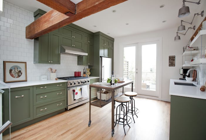
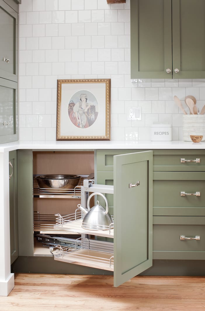
We selected the dusty green colour for the cabinetry in order to compliment the red tones in the gorgeous exposed beams and the refinished oak floors as well as Violet’s family collection of eastern European pottery and classical artwork.
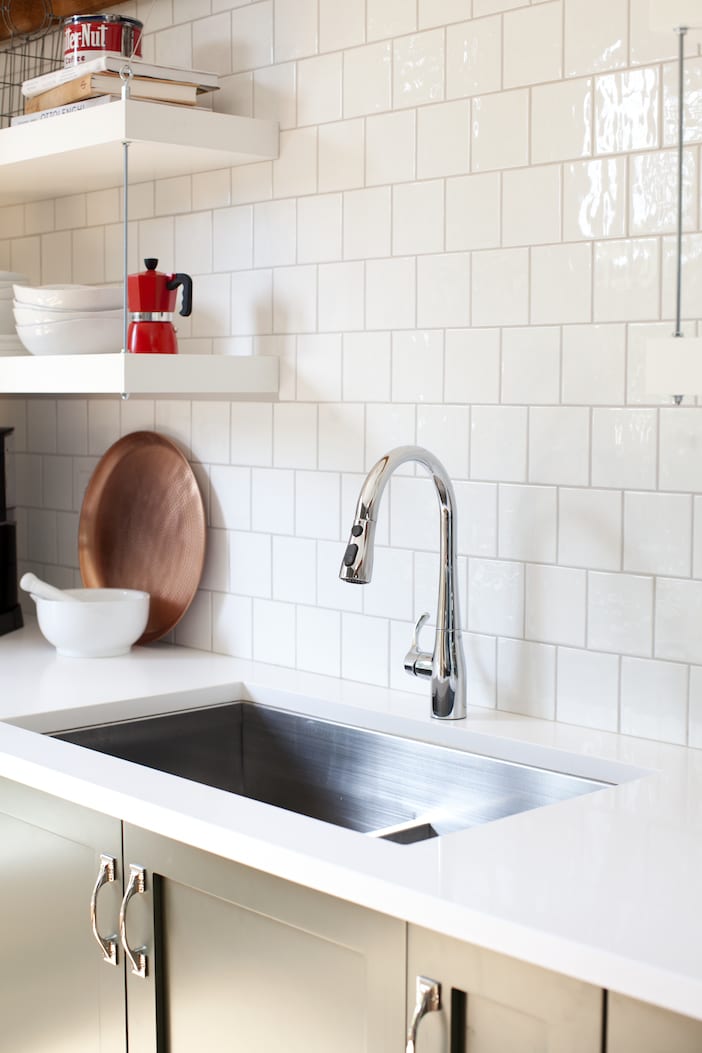
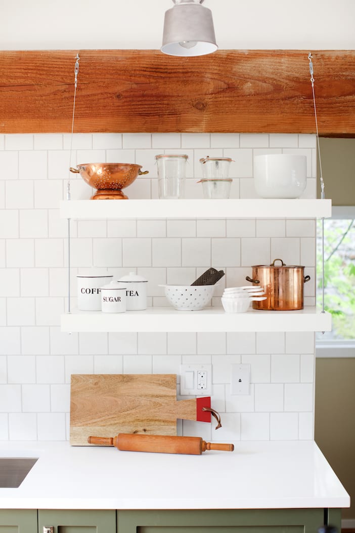
World Mosaic supplied us with a lovely white square porcelain tile which we took right up to the underside of the beams – the slightly undulated surface of these tiles gives the backsplash some depth and it reflects the light coming in from the double French doors that lead to the sunken patio outside.
To compliment the industrial feel of the beams, we selected some equally industrial-looking sconces from Pine Lighting. Situated over the sink, these 3 fixtures in a galvanized steel finish hold their own paired with the weight of the exposed beams, their functionality is great as they are each adjustable at two points.
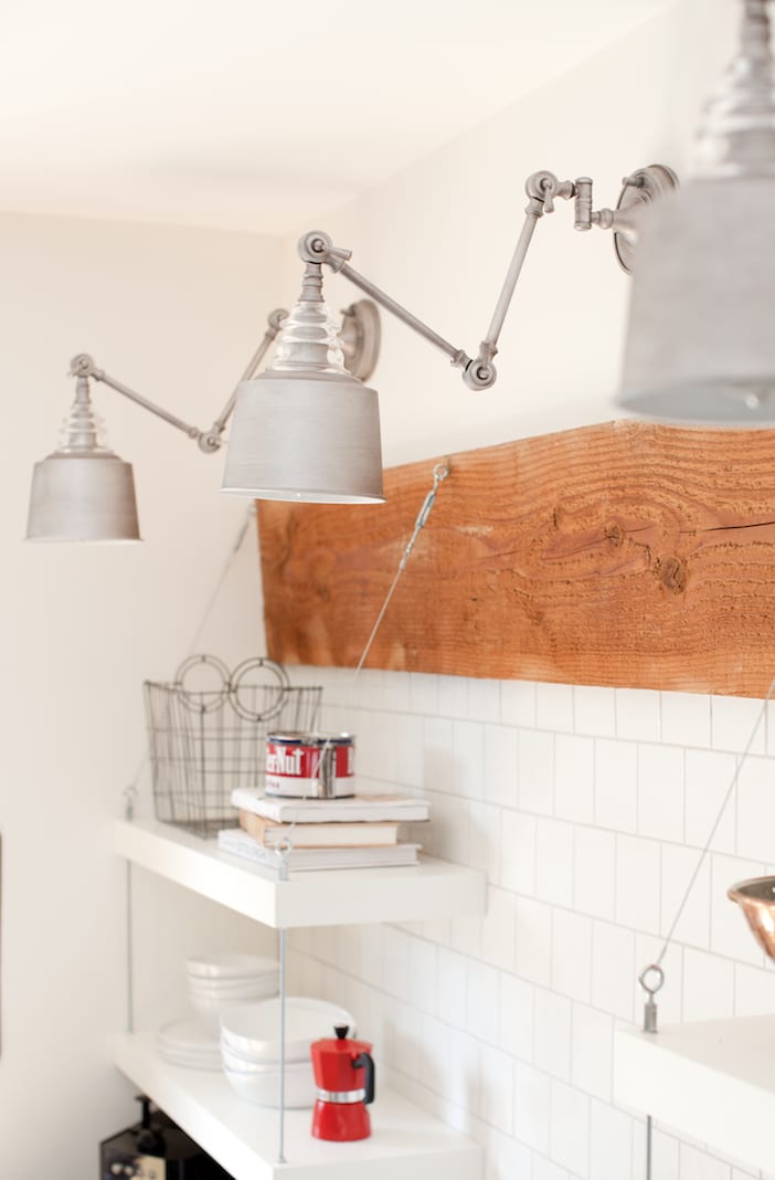
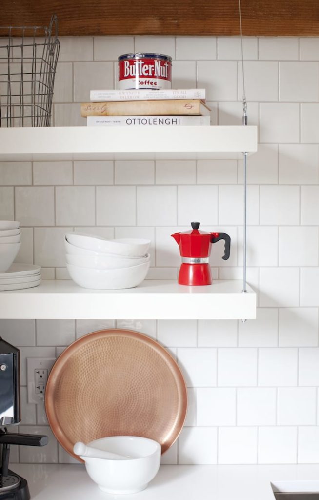
Propping out a kitchen is always fun – this one especially as we knew we had to stay white with most of our props so as to not over-power the space what with all the colour in the cabinetry. We used mixed in touches of red and copper to add interest and depth, mixing both modern and vintage elements to stay in line with the feeling of the home.
The dining room, located in the space that had been occupied by the kitchen, is a quaint corner for intimate dining. Surrounded by the couples’ collection of classical art, this corner of the house is both familiar as well as central to the home.
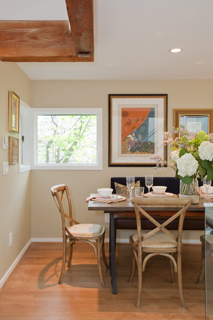
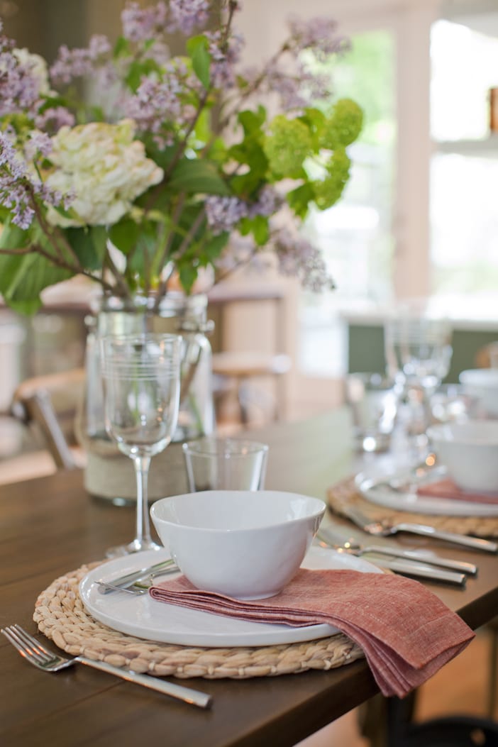
Getting a view in this split-level town home was difficult before with a dark kitchen and solid railings blocking most of the light – we opted for glass railing around the new dining room and up the stairs to allow both light and view to shine through.
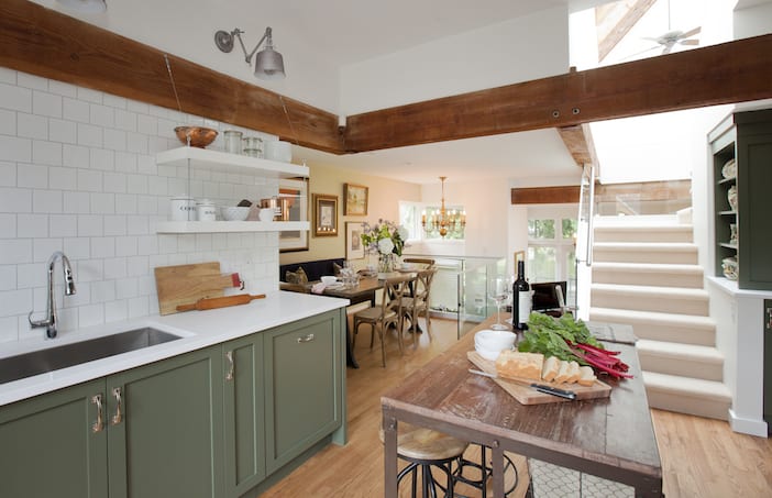
Now guests and hosts alike can enjoy the full breadth of the space with views to kitchen and dining as well as down to the living room. No matter how small the space there are always solutions to making it better!
A big thank you as always to Janis Nicolay for the gorgeous photos!!
Visit the W Network for more on this Love It Or List It Vancouver episode! To watch the full episode, click here and for more before and after photos, as well as a full resource list please click here!!!


I love this home! So much gorgeousness in one space!
Her Heartland Soul
http://herheartlandsoul.com
Yay for colored cabinets!!!! Tired of the all white look!
Right? I’m so over it too!
Love the olive green color on the kitchen and that red splash around the house with little red items!! 😉 Nice job!!
NEW BLOG POST!! Today we talk about “TREND ALERT: CULOTTES” – Fashionista’s new favorite pants!! Options & looks of 2015 spring trend!! Check it out!!
http://www.influencerdiaries.com