The Love it Design Team always wants the homeowners to stay in their home – we do everything in our power to get them all that they are hoping for – and then some! With Stephanie and Darrell there was no exceptions! They were in desperate need of a functional kitchen, a functional and accessible deck and a proper space for the family to hang out in the family room – I think we delivered!

First up was the kitchen: though the previous owner had recently renovated it, it didn’t function for a family of five with a live-in nanny. We rearranged some windows and took the wall down between kitchen and dining to make the most of what the space had to offer. Merit Kitchens outdid themselves with the white shaker cabinetry and the walnut veneer accent cabinetry – not only does it satisfy all the storage requirements one could have, but it’s a pleasure to be in this space.
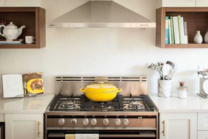
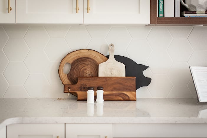
Brushed gold hardware and white hex tile backsplash give the space a mid-century nod.
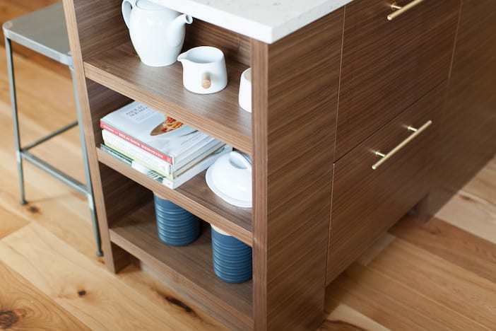
Now open to the dining room, the kitchen and dining spaces lend themselves to gatherings. We moved the deck access to off of the dining room – not only does it improve flow on to the deck but it lets in a lot more light in to the dining space, making the dining area feel larger than it is – we use all the tricks we can!
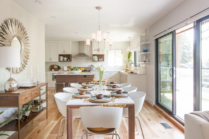
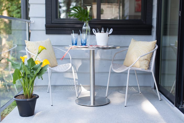
Northshore Windows supplied us with stunning black vinyl sliders to maximize the light and access onto the deck – without making the deck any larger, this improved circulation makes the deck part of the space. And now Stephanie and Darrell can keep an eye on their kids playing in the cul-de-sac.
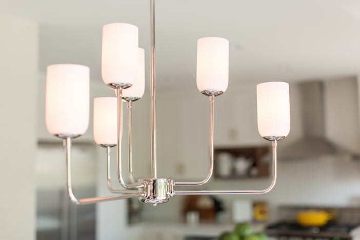
We continued with the mid-century look with the dining lighting – generously provided by Design Lighting, this brush nickel pendant really makes a statement without over-powering the room.
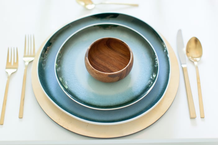
Gold accents are always great for warming up the space!
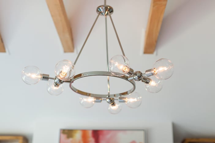
Half way through the renovation, Stephanie and Darrell approached us with a teeny tiny request: to VAULT the ceiling! Not usually something to tackle part-way through a project, our amazing construction crew didn’t even flinch – and what a statement it makes with those exposed collar ties!
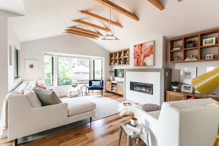
We updated the fireplace feature (it was a dated white stone with black mortar!) thanks to Valor Fireplaces who supplied this stately linear gas fireplace. A simple modern surround makes this feature a focal point without drawing the eye too much.
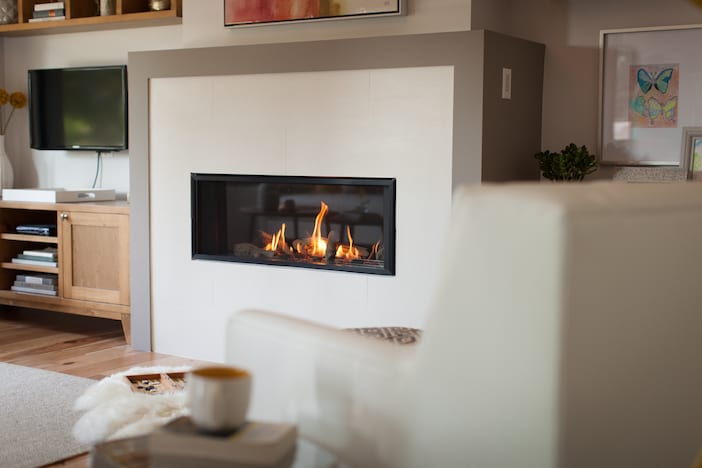
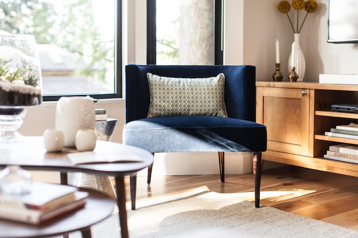
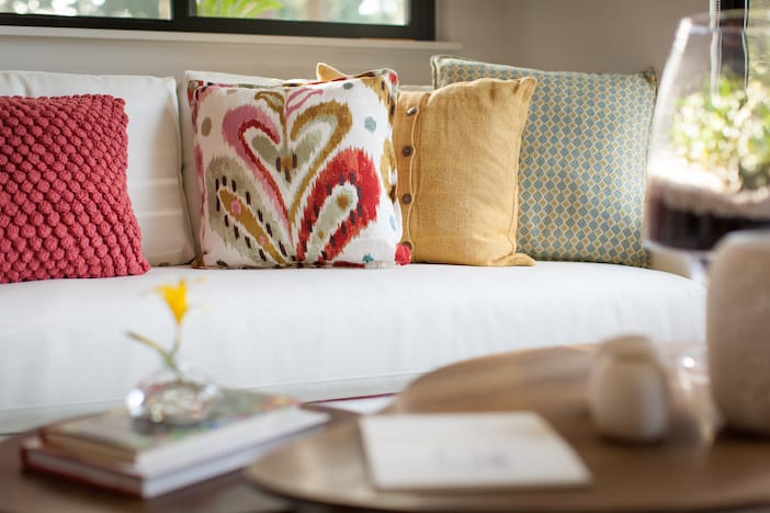
Understated colour in the pillows and furniture make this space fun and family-friendly but still elegant.
Another gorgeous light fixture from Design Lighting is a stately accent to the vaulted ceiling.
We think the family will love their new spaces – they certainly function so much better than they used to and – ahem – if we do say so ourselves… They LOOK so much better and function + beauty is what we aim for!
A big thank you to David Strongman for the gorgeous photos!!
Visit the W Network for more on this Love It Or List It Vancouver episode! To watch the full episode, click here and for more before and after photos, as well as a full resource list please click here!!!

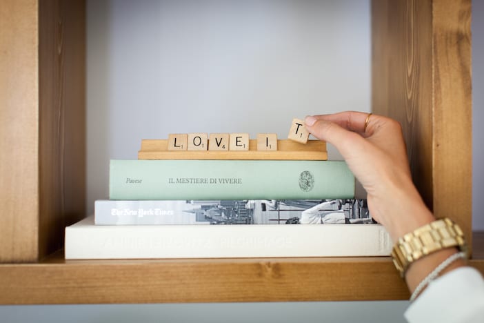

I love that first scrabble picture! Too cute!
What material did you use for the kitchen countertops? It’s so pretty and I’m redoing my white kitchen so I’d love to know – thanks!
Can you, please, tell me about the wood floors?! Brand/style/etc. Thank you!
Such soothing colors! Happy for the lucky tenants.
Where is the art from over the fireplace? And the gold hardware in the kitchen!
I’ve looked every where for these sort of Hex Tiles, where are they from? Also I clicked full resource list and it does not come up, goes to WNetwork but no listing.
found the listing no tile
That light fixture! Love, love, love it!
I would like to find the source for the art above the fireplace.
Please come and design my home. Im so bored with it.