Two years ago Christine and Chris and their three children moved across the country in search of a more relaxed lifestyle. They chose Vancouver out of their love for the ocean and mountains and while they loved the West Coast lifestyle, they quickly realized it comes with a hefty price tag. This family of five purchased their 100-year-old heritage home and discovered it certainly was not as functional as they needed it to be.
In order for this family to stay put in this house for years to come, there were a few items I needed to get to work on, starting with the kitchen and dining room! This once was small, dark and cramped space wasn’t exactly the dream kitchen Christine had hoped for, with the lack of counter space, storage, and natural light, it only took tearing down the dining room wall to allow the natural light to pour into this home and instantly feel more inviting!


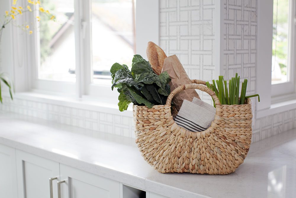
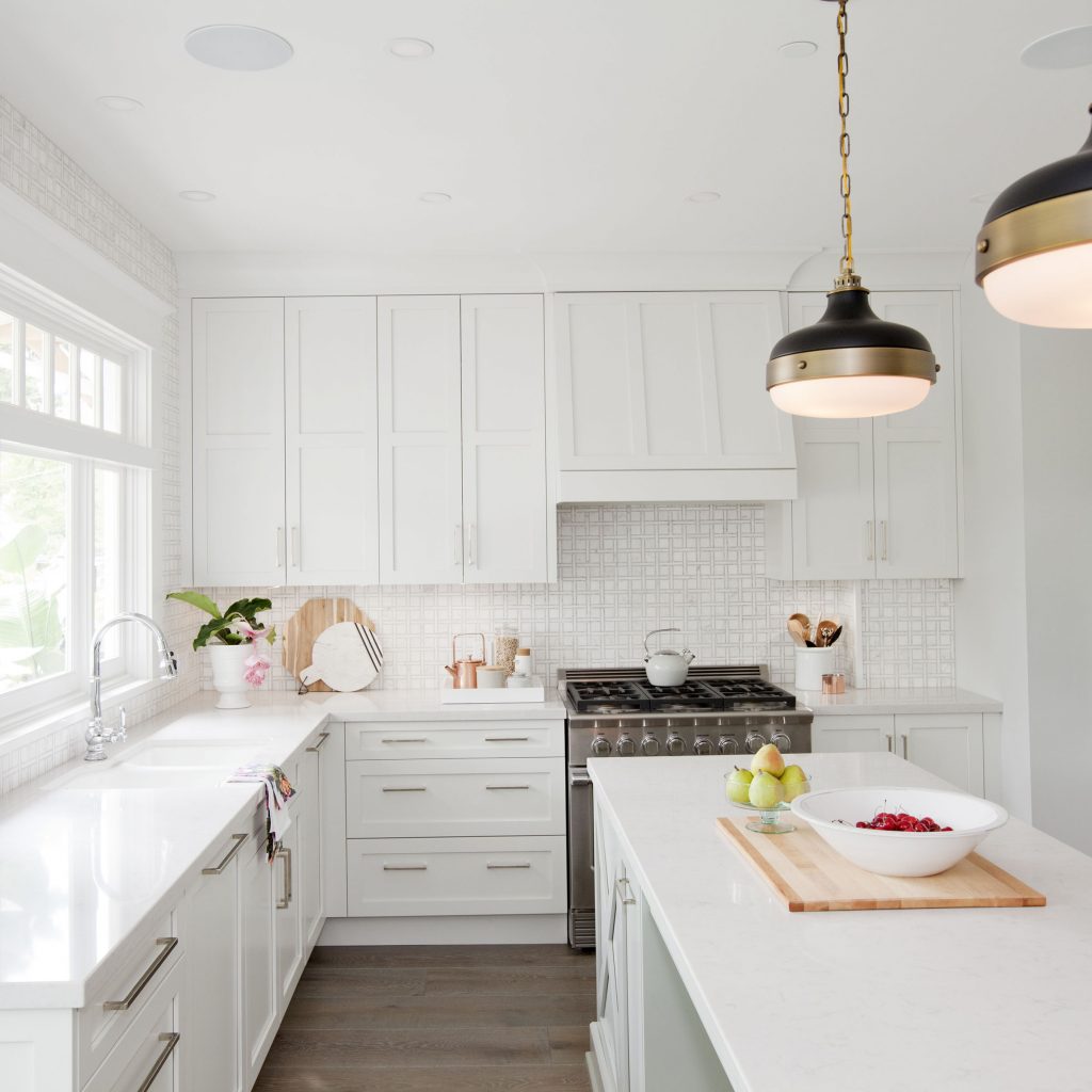
Using the space from the once was mudroom and TINY deck, we were able to take over this underutilized space and enlarge the kitchen. We installed lots of cabinetry (which the fridge is beautifully integrated into) complete with modern cabinet hardware provided by Schaub and Company, a beauty 10-foot island, quartz countertops, new light fixtures, a large window and stunning basket weave tile to pull this kitchen together!!

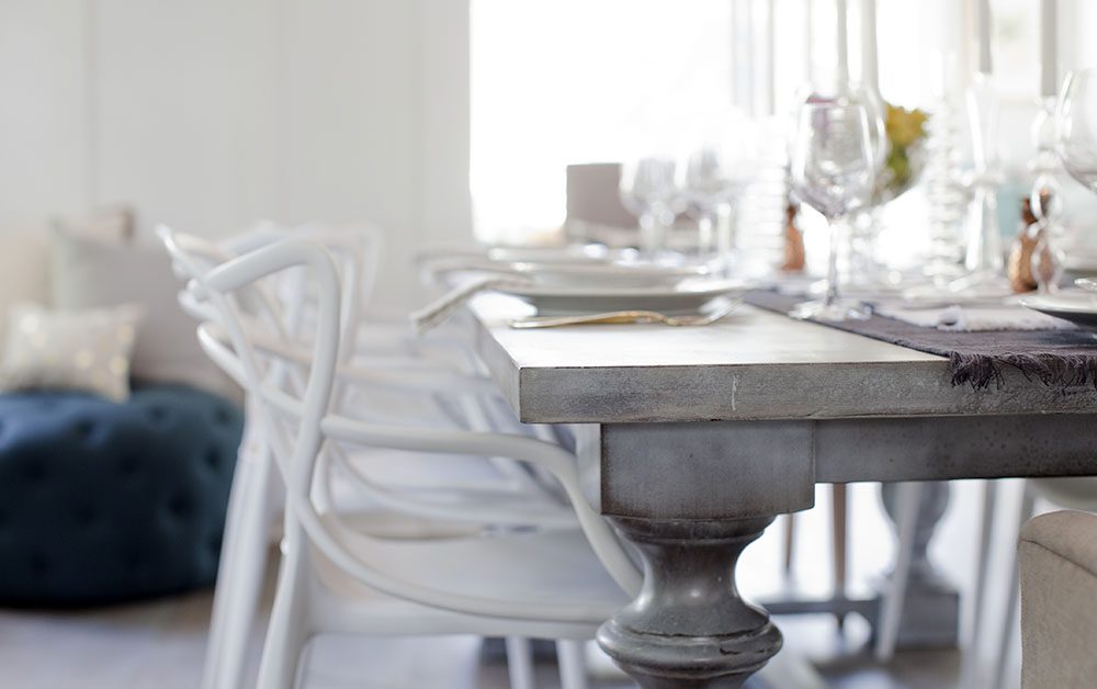
Can we talk about how gorgeous this custom dining table is?!?! This was beautifully crafted by a local artist from Revamp Furniture Garage and is the perfect addition to this room! The team from Eclipse Architectural installed a folding door system which is so sleek and provides easy access to the outside from the dining room…which also leads on to their newly upgraded deck, built with composite decking which should continue to look just as great for many years to come!

We also opened up the entry way and removed the pre-existing office to create this open area which overlooks the backyard complete with a sun bench which is perfect for enjoying the view of the backyard, or cozying up with a blanket and getting lost in a good book. With a couple of unforeseen setbacks I wasn’t able to give this family the large, separated mudroom they were in need of but we compromised and took advantage of this space by equipping it with lots of storage for the kids to use when they enter the home through the back door.


The original powder room was condensed just a smidge as we had to move the original staircase over a bit to make room for the kitchen enlargement but it’s still perfectly functional and adorable, complete with this heavenly vintage mirror!
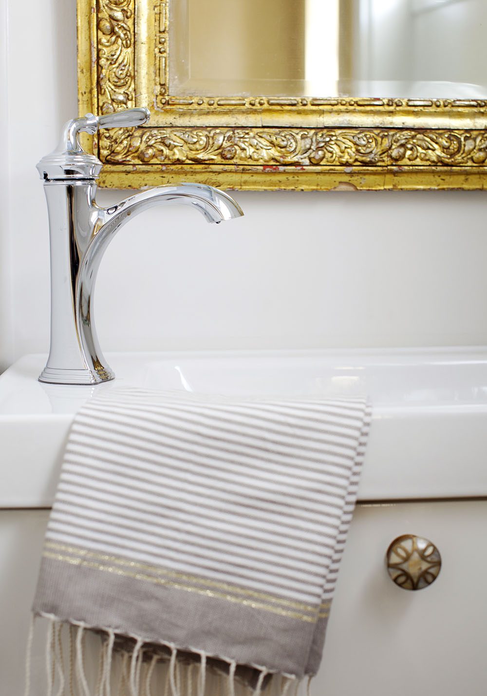
It was such a heartfelt moment for me when I brought Christine and Chris through their newly renovated character home, needless to say, I think I did a pretty damn good job of transforming this into the romantic home they desired but it’s pretty hard to compete with the ridiculously perfect modern home that Todd just HAD to raise the bar with … LOL …
A huge thank you goes out to the talented Janis Nicolay for the gorgeous photos, as per usual!Make sure to visit HGTV Canada for more on this Love It Or List It Vancouver episode! To see more photos of this reveal click here! Also, be sure to follow Love it or List It Vancouver on Facebook so you don’t miss a beat.
The countdown to next week is on, and Talbot better be prepared for me to pull off a big win!!
xo
Jilly




You’ve outdone yourself again!!! Love the wall color in the dining room 🙂
Me too!!!! Absolutely love it!! The colour is ‘Harbour Grey’ flat CA195 from Cloverdale paint. XO
I really need to know where the lights are from…the pendents over the island
What an amazing transformation. Great job to you and your team!
Thank you so much!!!! XO
So beautiful! Do you mind sharing the source for the pendant lights in the kitchen?
Yes!!! Of course!! Feiss, 2-Light pendant (P1283DAB/MB), those are from Design Lighting. XO
Everything about this is amazing! #homemakeovergoals
Thanks Lori, it was a stunning reno!!! XO
LOVE!!! Seriously, fabulous job!!
Thank you Sarah!!! I was in LOVE with it too!! XO
Where did you purchase the basket weave tiles for the kitchen backsplash please?
Isn’t is GORGEOUS?!?! The backsplash is from World Mosaic Tile!!
LOVE those collapsible doors to the outside!
OMG I know!! They are soooo amazing!! XO
Just amazing every time Jillian! I wish you worked in the Northwest Territories! Do you mind sharing where the dining room chairs are from? Thanks!
Beautiful. I love the floor–can you share the details?!
Hi Jillian, Looking for the name/profile of the wood the trim you used around the doors and windows
Do you know the name of the quartz you used for the counter top?
So bright, airy and open! I love it. What is the wall color around the sun-bench and the folding doors? It makes it seem to extend out forever!
I just watched this episode on repeat tonight. You truly did a beautiful job. That color pallete in the kitchen and the light is stunning. I was actually stunned. But that Modern design was spectacular. It shows a lot of how great a job you did that, despite all the setbacks that house had, your main space was enough to make it a hard choice between theirs and that modern showstopper.