Hi everyone! It’s Tori (Jilly’s cousin) here! I have some exciting news, our renovation is FINALLY complete, and I am so happy to share the space with you here today!
Let’s get right into it, grab a cup of coffee and come on in!


Kitchen & Dining
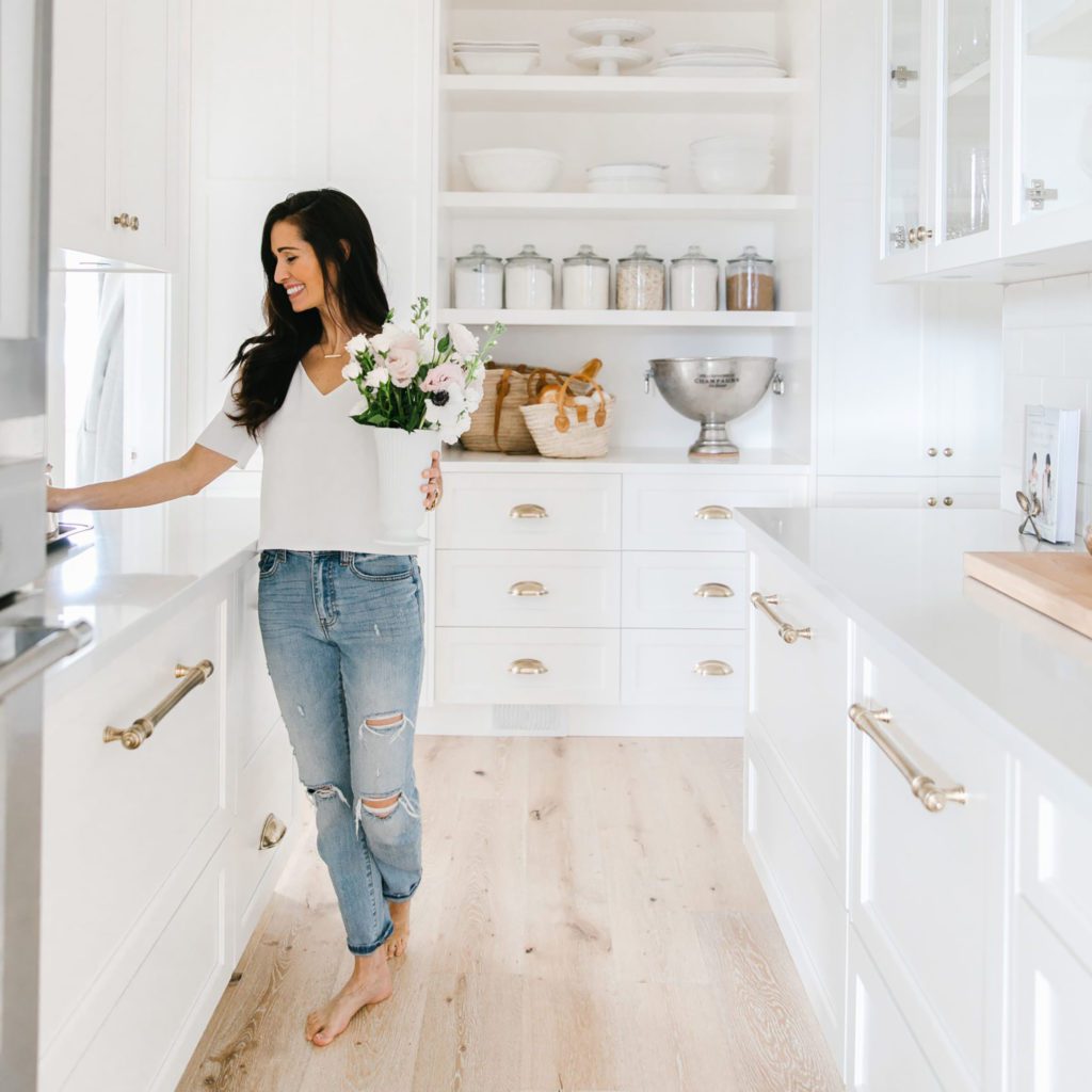
Our kitchen is the heart of our home, and given how much time we spend here we spent a lot of time designing the space for ultimate functionality. We worked with Norelco to design a symmetrical open layout with a large integrated hood fan and double fridges (also integrated): all of our appliances are Fisher & Paykel from Coast Appliances (love them for the record). Our entire home is painted Simply White by Benjamin Moore, from our cabinets to our wall colour and I would do it over again in a heartbeat. After much contemplation we went with a French Antique Brass hardware by Emtek and I couldn’t be happier (we used the Norwich knobs and the 4” brass cup pulls). Our backsplash tile is Frost by Fireclay Tile.
One of the best things we did in this space was to create a wide space between the range and the island, leaving heaps of room for walking through even when the dishwasher and oven doors are open (there are 6 feet). If you’re in the process of designing a kitchen check out this post on Our Top 14 Kitchen Features. The counter tops through the whole house are Silestone in Statuario and the faucets are from Kohler (Artifacts collection). We flanked the island with two oversized gold lanterns, and even added extra storage in the island with hidden cupboards for items that are rarely used.
We had Holly from Shed Design custom make a kitchen table for us and I am so in love with it! Our window coverings are custom made by Q Design Centre in 100% linen in Oyster with brass hardware. The hardwood flooring in our entire home is from Shaw Floors and is Castlewood Oak (I would do it again in a heartbeat).

Living Room
Our living room is open to the entrance and kitchen, but the large fireplace surround by Dreamcast Design anchors the space. Our rug is the Kira rug from Caitlin Wilson, and the couches and arm chairs (all slip covered) are from CF Interiors in Vancouver. Our coffee table was custom designed by Shed Design.

Pantry & Office
The pantry offers an extension of our kitchen, and is my favourite room in the house! From the arched doorway to the antique chandelier from Sadie Ann McMurray and bar area (that happens to lead into my office, talk about good planning lol), it is functional and beautiful and cozy. We added two cool drawers by Fisher & Paykel for keeping drinks and milk cold and highly recommend them.
The office has a big wall full of built-in shelving for props and my favourite dishes, cookbooks and a hidden slide-out drawer for my printer all designed by Norelco (the cabinets are Classic Grey by Benjamin Moore). The shade is the Murray Stripe in Macadamia by Q Design Centre.

Laundry Room
Our laundry room is attached to the pantry, and is bright and airy with tons of space. Charles ordered a larger window than I anticipated, so we had to lower the counter on the one side… which I love! It is awesome for folding clothes (I’m not tall). We added an oval window with shiplap from Metrie and warmed up the space with a buffalo check window shade by Q Design Centre. The large floor tiles are amazing and durable – they are from Olympia Tile. Our laundry room was completed with a stunning reclaimed wood linen closet from Lakehouse Home Store set against a buffalo check wallpaper feature wall.

Bathrooms
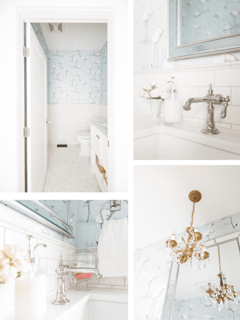
Out of all of our bathrooms, the powder room is by far my favourite. It is the most fun room out of them all, with the vintage flamingo wallpaper and the Fireclay tile (in Tusk) that was brought up the wall for impact. We added a tiny vintage chandelier from Sadie Ann McMurray and Norelco custom designed a vanity with an open shelf on the bottom (painted Simply White). The hexagon marble floor is from Olympia Tile and the faucet is Kohler from the Artifacts Collection. Our master bathroom has the same tile and a Kohler clawfoot soaker tub that I’m in love with! Our closets and vanity were custom designed and installed by Norelco.
Entrance & Foyer
The entry makes the first impression, so we chose a Metrie moulding and had a floor-to-ceiling design installed to give the vaulted space some dimension. With an over-sized chandelier to anchor the space (so hard to find for the record), we simply added a tall mirror and a console table to finish off the space.

Bedrooms
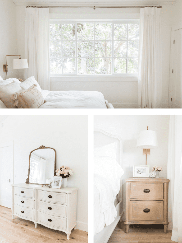
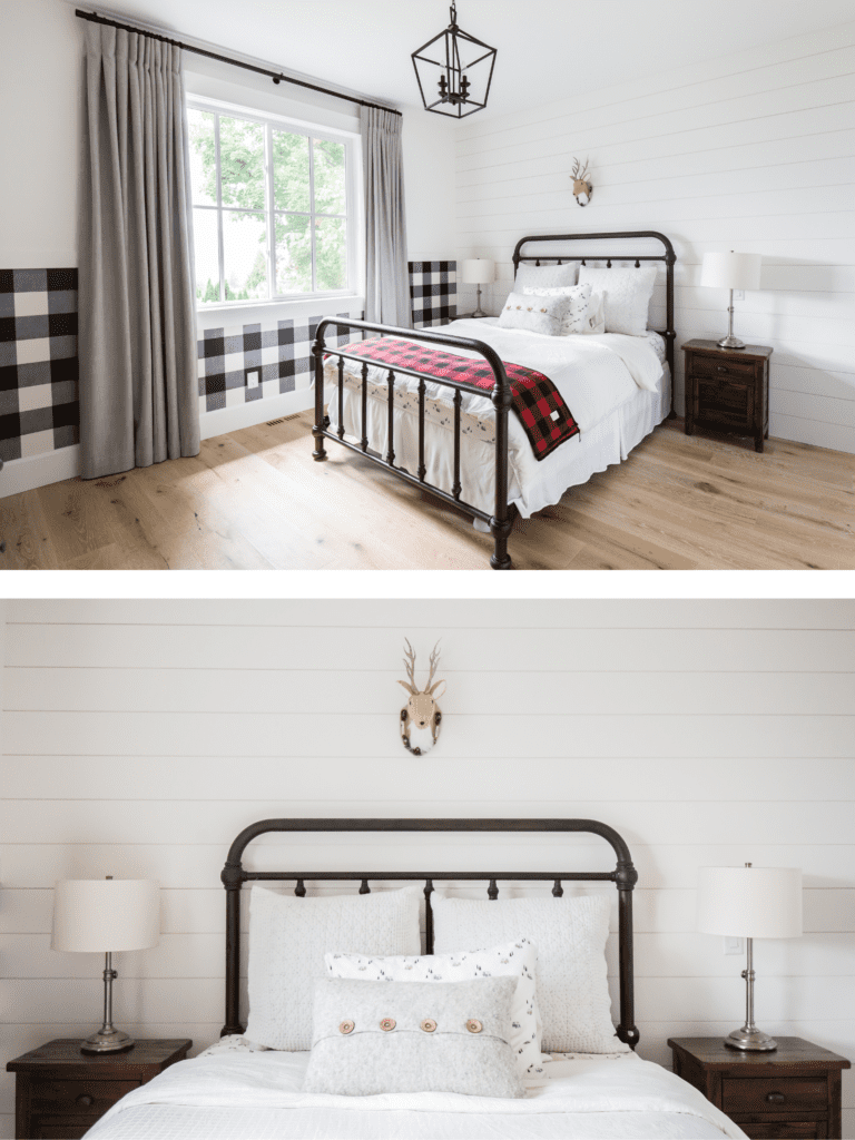
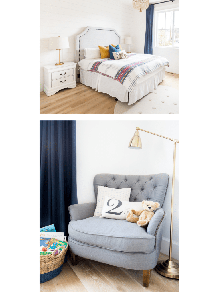
Our bedrooms are all quite simple and not overly big. We have two guest bedrooms downstairs that are carpeted (Shaw flooring) and the others have a hardwood floor. The window coverings really finished off the spaces. We went with 100% linen in Oyster in the master bedroom, a cozy linen in Indigo in Max’s bedroom and the same fabric but in ‘Rhino’ for Charlie’s bedroom. Our guest bedroom downstairs is super girly and has pretty pink curtains and the most dreamy linen bedding from Pom Pom at Home along with an adorable Audrey Hepburn print from Lakehouse.

Play Room
We added a wall mural to this small room to make it more interesting and playful, which I love! A striped black and white shade was the finishing touch. Now, if only it would stay this clean!

Well, there you have it! A complete (virtual) tour of our newly renovated home! Let me know in the comments below what your favourite room was!
xo
Tori

Ummm, ALL of them! Such a gorgeous home! It’s my dream to live in Kelowna! One day! ❤️
Absolutely beautiful! All of them are my favourite!
Love it. Where is the Buffalo check wallpaper from?
It’s beautiful!! No idea how you keep it clean and white with 2 young kids. But all I can wonder is where do ya’ll watch TV?
It would be absolutely to difficult to pick only one room! Your home is absolutely stunning. Everything flows together beautifully as you and your family do. Thank you for sharing this with us.
Looks fabulous. 💯
Your home is gorgeous! You have exquisite taste.
Can I please ask where the doorway and bike prints are from?
I admire your home in all the instastories I watch. I thought it was. Me build, not a renovation. How old is the house originally?
Do the two of you have the same house? I love your style….Can’t think of a better place to live…
Daiana, from Argentina
I really like your blue chair, where did you get it from?
The whole house is beautiful. I love the light and airy feel of it and the minimalist vibe.. Great job! I’m jealous! 🙂
Please link where the gorgeous wallpaper in the powder room is from?!!!!
Awe Tori, just simply BEAUTIFUL!!! As for a favourite room, I just have to say…all of them! I can’t make up my mind! Once again, I will say! You & Jillian Rock!!! Love to you both! I feel so much more connected being able to follow your blogs!!!
love Aunty Jackie
😘😘😘
Being the foodie that I am the Kitchen is my favorite room. I too have a large bright white kitchen and wouldn’t trade it for anything. We are in the process of slowly doing renovations so I love seeing what other people have done. Thank you for sharing!
Beautiful home, inside and out…for a wonderfully, friendly family. Your house is elegant and classy, just like you, but it’s functional and fun and very much a family home at the same time. Makes me dream about building another house!
Where is your hardwood flooring from and what colour code is it please?
Your home looks divine! I love it, it’s all white. It is really a dream home.
Absolutely beautiful & so pristine. I may be wrong, but much of it reminds me of Jill’s casa.
I really like the main color tone is white, it makes me feel the house is very clean and luxurious. Your house has a very beautiful and suitable design. Thank you for sharing <3
Beautiful. Love the white. Can you tell me where you got the picture with the verse in it? Thanks
It’s beautiful!!
Where are the kitchen barstools from?
Gorgeous house!! What size subway tiles are in the kitchen?
Where did you get your wood white kitchen stools from?
I can never really read enough home tours since it’s where I get a lot of inspirations and ideas, I get a great idea from every single article I come across on your blog and I definitely appreciate the tips you shared here. I bought my new home recently from here and I’ve been living in it for a while now and I think I’m ready to welcome a few changes I can make while staying within a reasonable budget. I’ll probably start with swapping out my old light fixtures for a trendier design and other minor changes to get my unit to show a little bit more of my character through subtle design changes. I’m also digging all those white accents and themes from Tori’s house and that may be what my dream home looks like!
Beautiful and tasteful 🙂
Amazing! Gorgeous room, I love the way it turned out! Definitely love the modern touch you add to it. Thank you for sharing!
Hi, what color is the exterior paint? The light gray.