Kelly and Steve’s home needed to break-free from itself – desperately! We often see homes like this: plenty of square-footage but so partitioned that the rooms feel cramped and unwelcoming. It wasn’t easy reconfiguring the spaces, we had to move the laundry room over and make room for a new, spacious kitchen – but we (and the homeowners) think it was well worth it !
Jillian and the design team love white kitchens – they’re elegant, timeless and have a knack for making rooms feel bigger. This kitchen turned out so well – it’s new location opposite the backyard doors filled it with light from the garden, brightening up what was a dark and unwelcoming space.
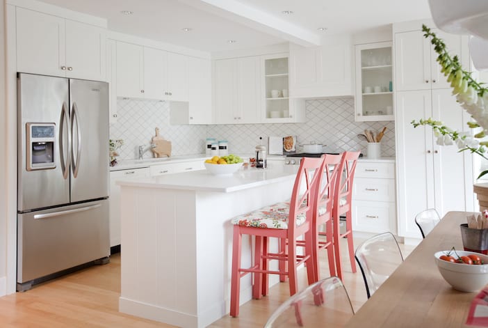
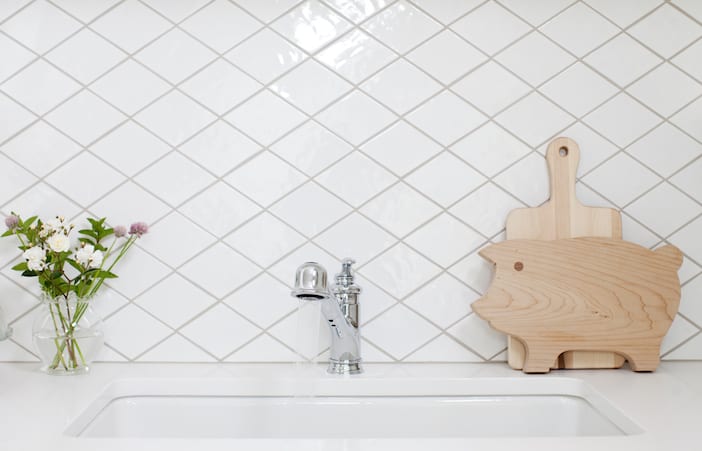
Troico Home Solutions supplied us with a really lovely kitchen, a simple shaker door front painted in “Chantilly Lace” gave the space the “fresh spring morning” feeling it so desperately needed. A simple yet fun backsplash of diamond-shaped porcelain tiles in white gave the kitchen some depth with a little quirk.
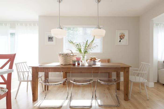
Kelly & Steve told us early on that it isn’t uncommon for them to have upwards of 20 people over for dinner, they both come from large families, and so we knew that the dining table would need to fit a lot of bums on seats! Folk Art Interiors supplied us with a gorgeous custom-made “picnic inspired” table and bench – lots of room for family and friends to gather together!
Laundry rooms are always fun to do – you can go a little bold with finishes as it’s a room you should look forward to spending time in but you also don’t need to see it everyday. We think we were able to give Kelly & Steve a laundry room they may very well host cocktail parties in – it’s so lovely! Thanks to Crown Wallpaper, a simply stunning and fresh Foxglove print gives this room charm and brightness. We had our faithful painters paint the ceiling to echo the blue in the wallpaper, tying everything together.
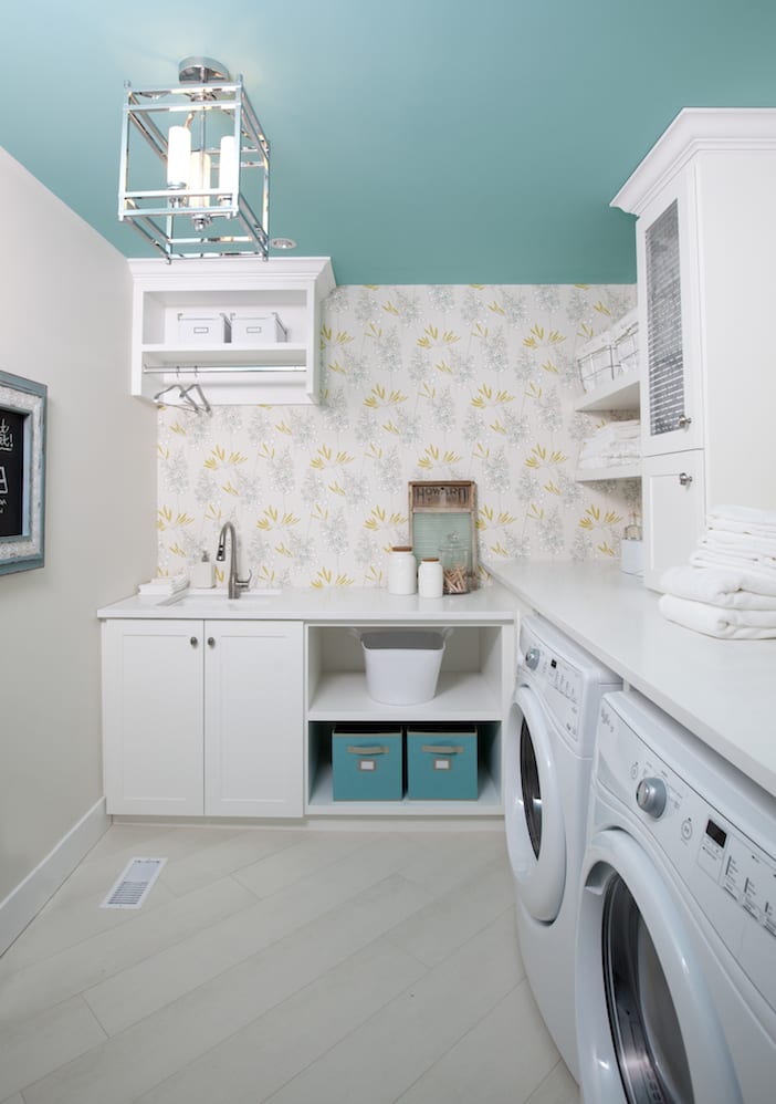
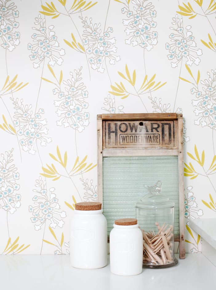
This home needed light. With the new white kitchen, the cheerful wall paper and the open-space the entire extended family can get together and to mingle through the spaces – laundry room included!
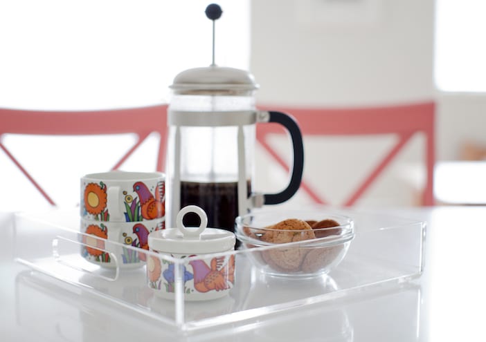
A big thank you as always to Janis Nicolay for the gorgeous photo’s!!
Visit the W Network for more on this episode! To watch the full episode, click here and for more before and after photos, click here!!!


Jillian, can you share where the gray chair is from in the living room?
That chair was the homeowner’s grandfather’s chair we had reupholstered… can’t get it anywhere ! Glad you like it though !
love the Ikea tobias chairs at the dining table! I didn’t know they could look so chic!
Could you possibly supply a source for the white wooden armchairs at the dining table? Simply beautiful. Thank you.
Any details available on the paint color in the main living area? Also, information on the flooring used throughout?
Head to the resource guide for additional info!!! http://www.wnetwork.com/shows/love-it-or-list-it-vancouver/resource-guide
Love the bar stool cushions! where can I get this fabric?
LOVE THE COUNTERTOP IN KELLY AND STEVE’S KITCHEN CAN YOU tell the name and color of the material
Head to the resource guide…. http://www.wnetwork.com/shows/love-it-or-list-it-vancouver/resource-guide
I absolutely LOVE your aesthetic!!! Great site, too. 🙂
I love the chairs at the island, where can they be purchased?
Love Love Love the fabric on the kitchen island stools. I have see it once before and have been trying to find it. Please please please if you can provide me with any information on who makes it, or the name of the print, or were I can buy it. I would be grateful. I have tried yours resource page but it no longer works. Thank you in advance. Karin